Homage to Jacques Tati

If you try to find an exact word to describe the humour of the French comic artist Jacques Tati (1907-1982) you’d probably be most accurate with the English word “dotty.” I prefer it to “whimsical,” or “wistful,” or even “bumbling” — all of which spring to mind, but which seem to place too much emphasis on the person and not enough on the humour.

Tati’s humour is all about the ordinary “man in the street” who is living — and trying to survive in — a world gone slightly dotty. In movies such as “Traffic,” “Mon Oncle,” “Monsieur Hulot’s Holiday,” and above all “Playtime” he explores what the film review site Rotten Tomatoes calls “the infinite mysteries of the modern world.”

When I walk around the streets of modern towns and cities taking street photos I’m constantly reminded of the wonderfully inventive humour of Jacques Tati. Even my current hometown, Colchester, becomes more Tatiesque day by day. A couple of years ago the council installed two cut-out metallic elephants in the High Street, making it more difficult to cross the road to get to the Post Office. Last year they gave us a seven-foot-high sculpture of a running woman who bears a striking resemblance to ousted South Korean president Park Geun-hye. Just what we needed!

Absurdification
Writing about Tati’s 1967 film “Playtime” in “The Guardian” newspaper, Jonathan Romney says: “Tati creates a universe entirely defined by absurdism.” Whereas “Mon Oncle” (1958) showed Tati “scratching his head at the excesses of gadget-crazed lifestyle-modernism,” the later film “pushed the observation of contemporary life further” and placed him in a city where modern design interferes maliciously with every aspect of the inhabitants’ lives.

Half a century later, the absurdification of modern cities is more advanced than ever. If we see a man chattering away to himself while slouching along the street — head down, hands in pockets — we no longer feel sympathy. We just assume he’s using the latest, cordless iPhone. Nine times out of ten we’d be right.

In Singapore, whole areas have been sacrificed to modern design and the entire city is headed in the same direction. It’s a strange process: a vicious circle of self-fulfilling prophecy. Artists and architects tune into the zeitgeist (the spirit of the age) and echo it in their work. In turn, their creations reinforce the zeitgeist to such an extent that everyone becomes governed by it in their daily lives.

That Awkward Moment

That Awkward Moment
For example, take the image immediately above. It shows a public space outside a cinema in Singapore. It’s populated with a surfeit of street lamps — far more than necessary — which assume crazy, twisted shapes, arranged around trees in groups of five. Beneath them are some hard, stone benches that are positively hostile to the user’s comfort, each one designed to hold three people.

The couple in my photo (if they are indeed a couple) look ill at ease. Maybe they’re on a first date. The man reaches into his pocket and stares at the bare paving stones in front of him. Perhaps they’re waiting for a third person to turn up.

I was delighted to see that the film being shown was “That Awkward Moment.” To find a poster with the word “moment” is a gift for the street photographer, let alone the word “awkward” in such a location — at such a moment.

Oh, My Poor Little Feet
As you move around Singapore, the city becomes curiouser and curiouser. It’s long been among the first to get the latest architectural fad, such as vertical gardens and artificial trees. Then there’s the iconic Marina Bay Sands hotel with its three towers spanned by a ship-like structure. To cap it all, Louis Vuitton chips in with a steel and glass space ship where you can buy a new suitcase, if you’re thinking of going somewhere else.

Personally, I love the dottiness of it all, but that’s because I walk around taking street photographs. If I was a citizen trying to live a normal life in these theatrical surroundings I think I might become as eccentric as Monsieur Hulot appears to be. I might start wearing a skull and crossbones on my back, like the girl in my featured image at the top of this article.

At Clarke Quay, one of the most theatrical areas of Singapore, I noticed this girl who was wearing a striking tee-shirt with a skull and crossbones motif. I was so fascinated by her I almost forgot to take the photo. By the time I pressed the button she had receded into the middle distance — where she was obliged to walk around the huge three-legged structures (lights? loudspeakers? surveillance cameras?) in between the open-air restaurants.

Immediately, I was reminded of Jacques Tati zig-zagging his way through the garden of the ultra-modern home where he’s staying in “Playtime,” forced to walk those extra steps because of the absurd design of the pathway. All our lives are now governed by our inventions and environments. As the trailer proclaimed: “Whatever your personality, whatever your job…you are in Playtime.”

If you’re a street photographer– or if you just like looking at street photos — I urge you to get a copy of Tati’s greatest film. It sank into obscurity until its revival in 2014, having never been on general release in the United States. When you view it I’ll think you’ll agree. We’re all in Playtime now.

Don’t Be Afraid of Colour

Colour is both joyful and exhausting. It’s the signature of life: a signal to living creatures that we’re here on Earth instead of far away on a remote, monochrome moon.

Think of how the world would look if everything were in black and white, the two neutral colours of a legal document. It would look dead and lifeless.

Most animals, together with birds and insects, have colour vision. Dogs tend to confuse red and green, but they can certainly distinguish red from blue. Even cats — once thought to see only in black and white — can detect more colours than was once thought.

Our Colourful Vision
Human beings have sophisticated colour vision because of the number of cones in the eye. As a result, we can see that trees have a hundred shades of green in the spring and a thousand shades of red, yellow and brown in the fall. If we wait until winter, when life is hibernating, we see the countryside drained of brilliant colour, leaving brown branches, blue smoke, white snow and little else apart from evergreen trees, colourful man-made objects, and, of course, the birds.

Birds have better colour vision than we do. They see more colours and they have additional color cones in their retina, making them more sensitive to ultraviolet. Even to our eyes, birds appear to have colourful plumage, but to them the feathers of another bird are quite remarkable — and well worth a compliment in birdsong.

We’re Outclassed by the Birds
Don’t just take my word for it. Scientists have studied the colour vision of birds, comparing it to our own. Richard Prum, professor of ornithology, ecology, and evolutionary biology at Yale University, noted: “The startling thing to realise is that although the colors of birds look so incredibly diverse and beautiful to us, we are colorblind compared to birds.”

It appears that birds can see far more colours than they make in their plumage. However, over millions of years of evolution they’re gradually catching up, becoming more and more colourful. The same phenomenon is happening, not in human evolution (as far as we know) but in human culture — and far more quickly.

Professor Prum, with Mary Caswell Stoddard of the University of Cambridge, authored the 2011 paper: “How colorful are birds? Evolution of the avian plumage color gamut.

It’s a fascinating read and raises all kinds of questions that are relevant to photography. For example, at the time of its publication, Professor Prum said: “Our clothes were pretty drab before the invention of aniline dyes, but then color became cheap and there was an explosion in the colorful clothes we wear today.” He added: “The same type of thing seemed to have happened with birds.”

Birds use colour for different purposes: not only as camouflage but also for social signalling and choosing a mate. But what came first: the avian visual system or the complex communication signals which led, via evolution, to increasingly colourful plumage? It’s not a “chicken and egg” situation! Scientists are reasonably sure the visual system evolved first and all the rest followed.

Likewise, we are filling our world with increasingly colourful objects: murals, paintings, bright plastic chairs, anoraks, tee-shirts, mailboxs, and brightly coloured vehicles. When Henry Ford said the customer could have a car painted any colour as long as it was black, he must have realised the policy would eventually have to change. We see colour and we yearn for colour, even when it’s garish and in questionable taste.

The Yellow Car
A while back there was an illustration of our modern attitude towards colour when hundreds of motorists driving bright yellow cars descended on the Cotswold village of Bilbury, in Gloucestershire. They were there in support of Peter Maddox, 84, a resident whose own yellow car had been vandalised by people who thought it looked out of place in the picture-postcard village.

Mr Maddox had no wish to offend and replaced the car with a grey one, but not before news of the dispute spread on the Internet. Hearing that tourists had deprived a pensioner of his car simply because it ruined their photos was more than other yellow car owners could bear. Like a swarm of angry bumble bees they arrived at Bilbury to make “a celebration of anything yellow“.

The story ends happily for some, but not for all. Today in England, you can have your car sprayed in “Maddox Yellow.” Thank you, Mr. Ford.

And the Conclusion Is?
For the street photographer, the only possible conclusion is that the world is getting ever more colourful — often in ways we find hard to accept. We can exclude colour and stick to black and white photography. Or we can embrace it joyfully, like the motorists who went to Bilbury in support of Mr. Maddox.

In my own experience I find a similar conflict between the subtle grey tones of traditional architecture and the garish additions of street signs, posters, graffiti, and brightly coloured hairstyles, clothes and accessories. This is especially true in the northern cities of Europe and North America, where the best policy for the street photographer is to be selective with colour, using it for contrast and emphasis.

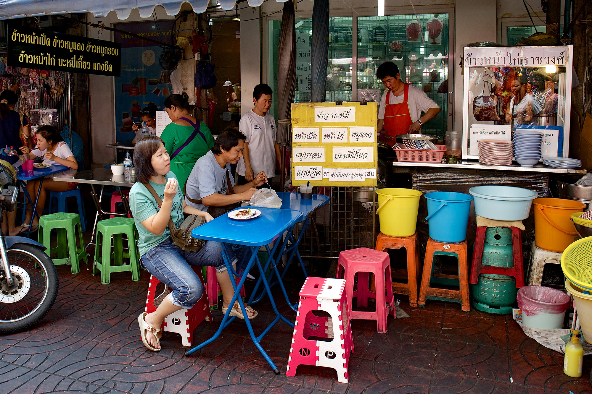
In tropical countries, colour becomes more prevalent in human culture — as it does among birds. I still try to make sense of it when taking pictures in South-East Asia where I’m obliged to see the world primarily in terms of colour. I sometimes limit the range of colour within a single image, as in the featured photo (at the top). At other times I “let it all hang out” and include every colour in front of me (as below).

I don’t expect everyone to approve.

Goals and Projects in Street Photography

In street photography, goals are good but projects are problematic.

There’s a big difference between, on the one hand, setting yourself a simple goal, and, on the other, directing all your efforts into a specific, rules-based project.

Having a goal, such as getting one great shot each day for an entire week gives you plenty of freedom to grow and develop as a street photographer. Projects, on the other hand, are restricting. They tie you down to taking pictures to fit a pre-ordained concept.

The photography world is awash with projects. It’s no exaggeration to say I could list hundreds of them. You could, for example, follow film crews on location at night and “steal” their light for your own street scenes. Kevin Cooley has already done it. Or you could photograph various cities around the world from the comfort of a taxi. Daniel Duart has already done it.

Perhaps it would be a great idea to photograph people running in the rain. Thank you, Danny Santos. Or maybe you’d get great shots if you photographed people looking at electronic screens in dimly lit rooms (Dennis Chamberlin) or took pictures of “Dogs Who’ve Licked Me” (James Friedman).

All of these accomplished photographers succeeded admirably with their various projects, but they were not beginners. Moreover, many of them carried on with other work at the same time, gradually building their themed collections over time.

Why Projects Are Popular
It’s easy to see why projects are appealing. They allow you to focus your attention on certain aspects of the world and they give you direction and motivation. Above all, they increase your intentionality, which makes them very popular in art schools because they help students assemble a coherent body of work before the end of the semester. I’m not knocking them! I just wouldn’t recommend them to anyone who is trying to acquire a full set of skills in street photography.

Projects are a form of “concept art” in which the dominant, organising principle comes from the mind of the photographer rather than emerging naturally through interaction with the external world.

Genuine street photography requires you to have a conversation with reality, to watch people intently and respond to their moods and actions within the city environment. If you’re following some self-imposed directive, such as photographing “women with red hair using mobile phones,” you may end up with a coherent set of pictures, but just think of the opportunities you will have lost!

The Simple Goal
No, I prefer to set a simple goal. When I go out to take pictures I have just one idea in mind. My goal for the day is to get one good shot. OK, I nearly wrote “great shot,” but they’re as rare as hens’ teeth. Let’s say it’s a shot I wouldn’t mind showing as an example of my work.

Having a simple goal is wonderfully liberating. When I get two good shots in one day I think I’ve doubled my work output. I took the featured image (above) on the same day as the one below, and there were a few more besides.

Avoid Restrictions
Because the street photographer already works under a huge number restrictions, it makes little sense to impose more. For example, the first restriction is: “Don’t take posed pictures.” This means you have no control over the poses your subjects assume, so you have to wait for them to occupy the frame as you wish them to be.

Another restriction is: “Don’t arrange the background.” You can be as choosy as you like about the background you include, but you can’t deliberately replace one background for another. Even if you add clouds from your “cloud bank” (some photographers have these!) with ingenious work in Photoshop, you’ll be reducing the veracity of the image. It may look better, but it won’t be as satisfying as an undoctored scene which records a particular moment in a specific place where everything is exactly “as it was.”

Given these restrictions (and I haven’t even mentioned natural light, because some street photographers use portable flash) street photography becomes even harder when you burden it with additional rules. Applying further restrictions may allow you to create images that share similar characteristics, with the result that your works reinforce each other when viewed in succession or side by side. But restrictions can also make them become formulaic and lacking in vitality. I think that’s a trap to be avoided.

When You’ve Found Your Style
Only once you’ve achieved a personal style and found a way of interacting with the world that consistently yields good images, can you branch out into projects without fearing their impact on your work.

I would still add a word of caution: don’t make the project too big. For example, a set of six street scenes with desaturated colours except for bright red letterboxes can be delightful; a set of fifty would be depressing.

My simple goal needs no word of caution. With reckless abandon I’ll pop into London tomorrow in the expectation of getting one good shot….

Why Does Everything Have to Be Awesome?

I’ve seen the Grand Canyon, the redwoods of California, the skyscrapers of NYC and the mighty Mississippi — and yes, America is awesome. But why, oh why, oh why do Americans (and increasingly Europeans, Brits, Aussies, and even the Chinese) want absolutely everything to be awesome?

I’ve just had another email from Awesome Books, but the books are exactly the same as the ones you can buy on Amazon, except there appear to be fewer of them. How awesome is that?

Far From It
As an activity, street photography is a far from awesome, which is one of the things I like about it. It’s all about photographing ordinary people in their everyday clothes, going about their normal business, on regular city streets. I don’t think I’d want to turn this activity into anything more spectacular, although I’m sure others will make the attempt.

For example, you could abseil down a city storefront with powerful flash gear and photograph passers-by as they gaze at you from below. You could “play dead” by lying on the ground clutching your Leica and photograph anyone who tries to steal it from you. Covered in silver paint, you could become a “living sculpture” of a 19th century photographer who springs into life and takes a picture whenever someone gives you a coin.

If you stage any of these stunts, I’m sure you’ll be written about in the media as a street photographer whose work is “awesome.” You’ll be pushing the boundaries of the medium as far as they will go. That’s what “awesome” is all about, isn’t it?

What It Really Means
Awesome means “provoking feelings of awe” but used as a slang word it just means “very good” or “amazing.” The Urban Dictionary describes it one of the three words which make up most American sentences, the others being “omygod” and “shit.”

Awesome things (taken from Internet discussions) include the singer Bono, pizza, a tea party held by someone called Edward, the fans of Veronica Mars, “that Calvo chick,” and “riding a rocket lawn chair through a strange portal while dressed in a disguise with a cat that happens to be a chef on your back.”

OK, the last one is definitely awesome. It would make a great street photo if it were not pure fantasy. In the meantime I’ll have to take what’s possible, namely the pizza (below). At least it’s wood-fired and stone baked!

Awesomeness in Art
Provoking awe has long been the purpose of religious art. The great medieval cathedrals still have the power to leave us open-mouthed as we wonder at the mysteries they evoke.

A new and more down-to-earth human element emerged in the Italian Renaissance beginning with the murals of Giotto, but it quickly became smothered by the awesomeness of Michelangelo and the Sistine Chapel ceiling. Now, in the present era, our most highly acclaimed artists are people who work on a colossal, awe-inspiring scale — like Damien Hirst with his “Treasures from the Wreck of the Unbelievable.”

Even Bansky, who for several years painted wryly amusing urban graffiti, eventually had to “go awesome” with Dismaland, a full-scale funless entertainment park, a nightmare version of Disneyland.

By contrast, to take up street photography is to take a step back from awesomeness. The street photographer has seen the alternatives: the landscapes covered with plastic (Christo), the 100 million handmade porcelain sunflower seeds (Ai Weiwei), the gigantic colour pencils of “Reverse City” (Pascale Marthine Tayou), and has made a conscious decision to go back to basics — to look closely at the reality of urban life.

Looking Closer
To be frank: most street photos don’t seem at all awesome if you print them large for the exhibition wall. They work best as small scale images — fragments of life rescued from the muddle and chaos of the street.

Yet if you look closely at the finest examples of street photography, you can’t help but be amazed at their qualities. After all, it’s possible to be humble and awesome at the same time.

In music, Franz Schubert inspires awe with his small scale works — his songs, chamber music, piano sonatas and impromptus — as well as with his late symphonies. The same is true of the other great classical composers. It’s not the scale of their work that matters so much as its profundity: the degree to which it puts you in touch with the wider workings of the universe.

Does street photography have the potential to bring us closer to the truth? I don’t see why not. If we stop searching for awesomeness by making big statements with Big Art, I think we can find it on the street, in small scale works that enable us to see more clearly what is actually there.

Taking Pictures From Across the Street

I try every possible strategy to take candid pictures in the street. Sometimes I “work the scene” by finding a subject and concentrating on it for while; at other times I keep walking and take the occasional shot here and there.

I’m always on the lookout, calculating the odds, trying to predict people’s movements, and thinking up new compositions which I hope will work. However, at some point during the day I’ll pause and hit the reset button. I banish all the fancy ideas and clever strategies! I tell myself: just do one thing. Go back to basics, keep it simple — take some shots from across the street.

When I say “take shots from across the street” I mean take them at precise right angles to the scene, so the kerb across the way makes a horizontal line near the bottom of the frame. I mean hold the camera without tilting it, so as to keep vertical lines precisely perpendicular to the horizontal. And I mean use a lens that will bring the subject reasonably close: not 28mm, but 50mm or 85mm.

Apart from anything else, changing your mode of operation is always beneficial. Don’t do it if you’re “on a roll,” with your current strategy working nicely. Do it when you feel you need to secure some reliable shots, rather than continuing to hope for that pot of gold (the one-in-a-thousand shot) which always seems to be just out of reach.

Squared Away
I find that by squaring up the scene into straight horizontals and verticals I’m already half-way to getting a reasonable photo. On a busy street in any major city someone interesting is bound to show up, sooner or later. Maybe the person is already standing there, like the well-dressed woman in my featured image (above).

I was looking for a shot which said “this is London” — and there she was. The poster indicates the area and lists some of the streets in its vicinity. The colour scheme is ready-made, with no intrusive or distracting hues. I particularly liked the different textures in the black wall: four shades of black, all underlined by the grey pavement at the bottom.

The image and the technique used for getting it are both very simple, but I think the result is pleasing. The shot is entirely candid: I’ve no idea who the subject is, or why she’s holding an unlit cigarette. Her appearance is so amazingly efficient: with headphones not only keeping her hair in place but which are also entirely cable-free, thus allowing her to avoid the geeky look that usually puts people at odds with their surroundings.

A Slice of Life
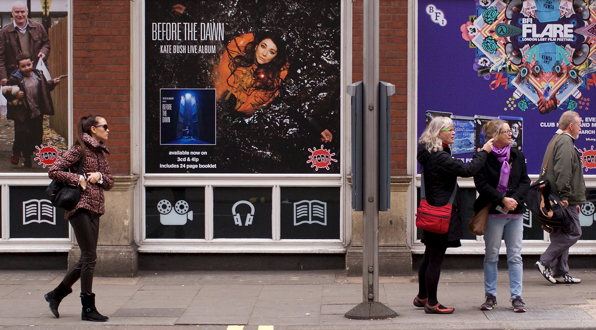
I’d only just switched to my “keep-it-simple” mode when I came across the above subject and the same is true of the one below. I don’t think this next shot is quite as simple, but it does carve out a typical slice of London life, on a certain day, in a specific year. In fifty years’ time any onlooker will be able to identify the fashions, together with the music and events mentioned on the posters, and say: “This was London in 2017.”

Before the Dawn

The photo exemplifies my point about horizontals and verticals. If I’d taken the shot at an angle it really wouldn’t have worked. Not everything would have been in sharp focus. The light was not especially bright, obliging me to work at ISO800 with a fairly wide aperture of f/3.2. In turn, the ISO and aperture settings enabled me to get a fast shutter speed of 1/800th of a second, necessary to freeze the movement of people walking slowly across the frame.

From a compositional point of view, the image is more complex than the technique I used for taking it. There’s an obvious directional movement from left to right, from the gesture of the boy in the poster, right the way through to the man with the shoulder bag who’s about to exit the frame. Normally, such a composition wouldn’t work at all, but here it does — because of several counteracting elements.

For a start, there’s a pause between the woman in the leather trousers on the left and the one with the red bag who is pointing to the right. In between them is the bus stop and the full, uninterrupted width of the Kate Bush poster. Kate, floating in the water, tends to make our gaze revert to the centre of the image, despite the left-to-right movement of the other figures.

I’ve never seen any studies about eye movement and how it relates to street photography, but it would seem to be a promising area of research.

In English, we read from left to right, so our eyes are already trained to perform this movement when we see any visual pattern or representation. Arabic is read from right to left, so we might expect arab street photographers to compose images with a natural right-left bias. Let me know if you think this occurs. I’ve looked — and I think I see it — but the western influence may be too strong for it to become dominant.

In my photo the bold symbols for music, movies and books also help to counteract the movement of the eye from left to right. But what really makes it work is the correspondence between the gesture of the woman on the left (reaching into her pocket) and the pointing gesture of the woman on the right. By contrast, Kate Bush seems at first glance to be making no gesture at all, until you notice that her arms are outstretched — spanning the gap between the two halves of the picture.

Study in Grey
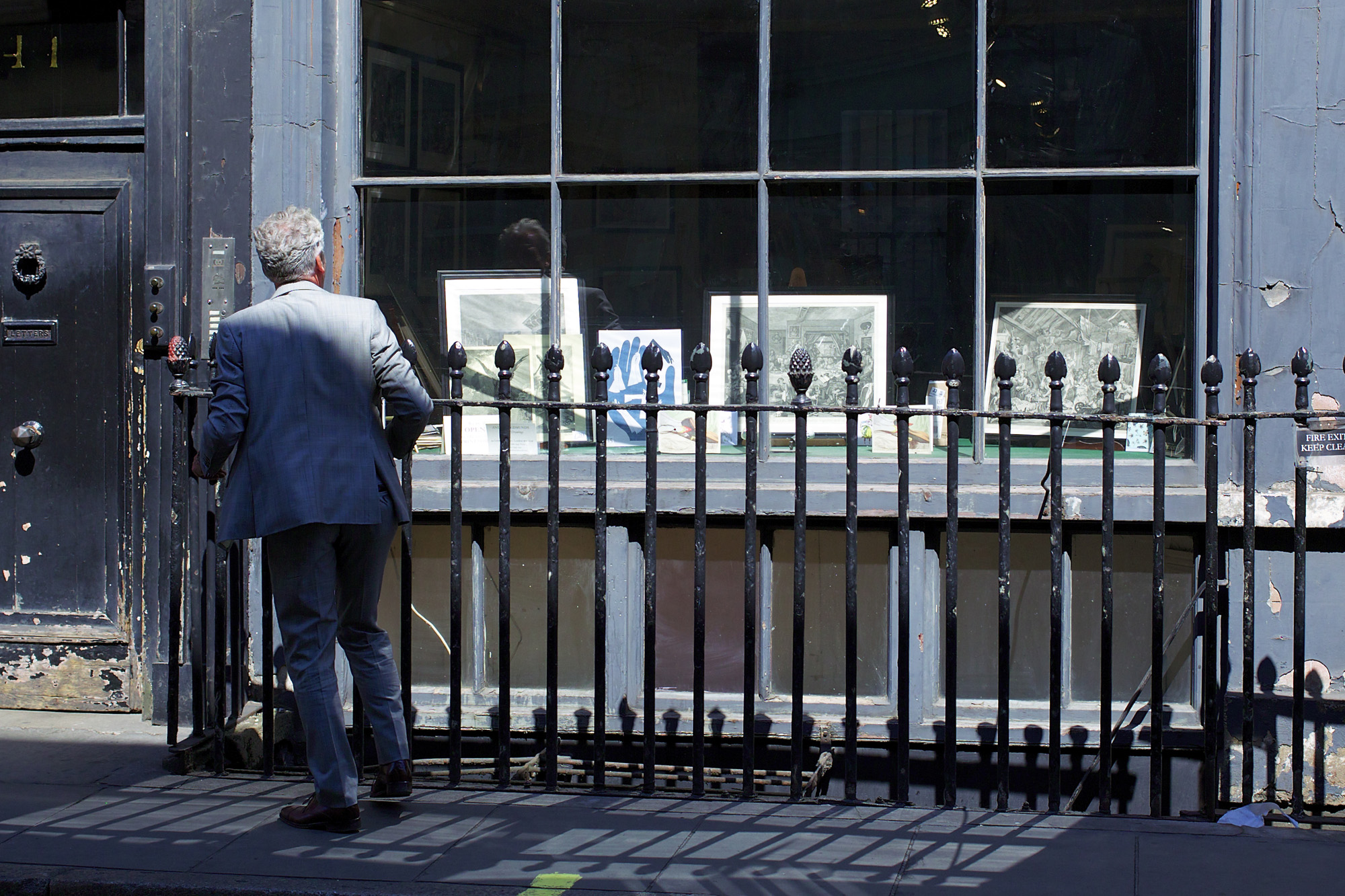
My third shot (below) is a study in grey, in much the same way as the featured image was a study in black. Again, I find this a pleasing shot, despite it being not entirely “squared away” with true horizontals. Something in the window has caught the man’s eye. He pauses for a split second before continuing, one foot lifted an inch above the ground. His grey suit tones with the grey walls and the monochrome etchings. Clearly we’re in a very different part of London compared to the settings of the other two shots.

The Hesitant Buyer

Yet I think this image would be largely without merit if it were not for the subtle colours in the lower panes of opaque glass below the main window. Whereas there’s nothing to be seen behind the row of framed pictures, there’s clearly something interesting going on in the basement.

Pink and yellow light seems to emanate from these basement windows. Whatever can lie behind them? Is it a workshop? A gallery? A brothel? I didn’t investigate as there seemed to be no public entrance.

Like the man in the grey suit we must remain on the other side of the protective iron railings. Just watching. From the other side of the street.

Getting Good Colour in Street Photography

Colour is both the joy and bane of street photography. If you get it right you can make a great photo; get it wrong — which is all too easy — and your photo will be ruined. In that case your only option is to convert it to black and white.

Digital photographers are burdened with colour complexity. Instead of shooting, as film photographers once did, with a particular stock such as Velvia or Kodachrome which imparted a characteristic “colour look,” photographers now have limitless options. Yes, the camera’s sensor has a colour profile, but subsequent processing enables us change colours globally or individually. We’re spoiled for choice.

Problems are compounded by the way in which colours are displayed on various monitors, which may or may not have been optimised. Add to this the capacity of the human visual system to make its own counterbalancing corrections based on knowledge and memory — such as its determination to see white paper as pure white — and you have a cocktail of challenges hard to swallow.

So what’s the best method of tackling these challenges? I think most photographers attempt it by instinct, selecting colours that look right to their own eyes, working with well adjusted monitors — and sometimes by simply forgetting about colour altogether and letting it take care of itself. To use a slang expression with no visual connotations: they “play it by ear.”

The Non-Colour Option
Playing it by ear leads eventually to shooting in black and white. I don’t blame street photographers for taking this option because today’s streets are full of riotous colours that are hard to control.

Ironically, it was never this way in the days of black and white film. Cars were black, people were dressed in black or grey. No one had coloured hair except for redheads who probably wore hats. Even brown “raised a frown in town.” Essentially, the photographer was looking at a black and white scene, brightened only by the peach-coloured complexions of pretty women.

My point is: in the early twentieth century, a black and white photo was a reasonably accurate interpretation of a street scene. Today it isn’t. We have to come to terms with colour and master its complexities.

What Is “Good” Colour?
I’ve called this blog post “Getting Good Colour in Street Photography,” so I need to define what I mean by “good.” This is where my comments become subjective.

I appreciate a wide range of colour styles and combinations when I see them in other people’s photography. On the other hand, I have personal preferences as to what “looks right” in my own pictures. As far as these are concerned, I like colour palettes that are harmonious, perhaps with contrasting notes such as a patch of red in a sea of green.

In fact, green is the one colour that never looks right to me in a photograph. I grew up on a farm surrounded by trees, fields and such like, so I’m aware of the hundreds of shades of green which make up the English countryside. But whenever I see a photo of a closely-mown lawn I simply don’t believe the colour. Go to Google Images and search for “closely-mown lawn” and you’ll see what I mean.

Fortunately, lawns are rare in street photography. Brightly coloured clothes are not. Yesterday I saw a woman wearing a shade of pink I’d never seen before. Its intensity was unbelievable: well outside the gamut of Adobe RGB (along with sRGB, one of the two main colour “spaces” used in digital photography).

I like the colour in my featured image (above), where the storekeeper in Camden Market, London, has cleverly selected an harmonious range of leather coats and displays them proudly on the sidewalk. You could argue that the brilliant yellow of the sports vests on the right tends to upset the colour scheme, but I think they enliven it and make the photo less “tasteful.” After all, the Rolling Stones’ “distressed tongue” tee-shirt indicates taste in a big way, although it may not be to everyone’s taste.

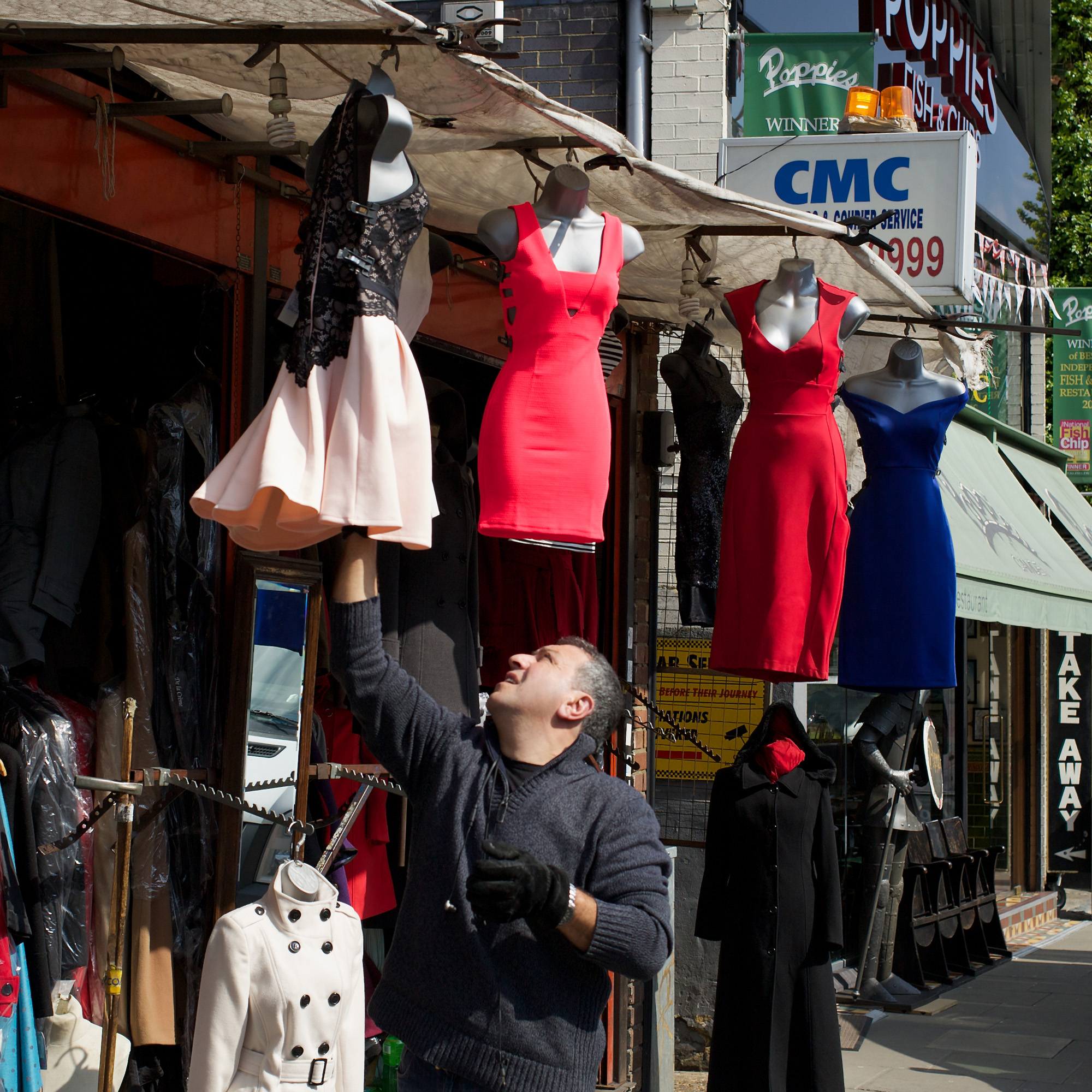
Here’s another shot from Camden, taken shortly afterwards. I like the way the storeman handles the dresses with thick gloves (which would have stood out better in a contrasting colour).

Factors Affecting Colour
In no specific order, the chief factors affecting digital colour are: light, exposure, distance, sensor, and processing.

1. Light is by far the most important factor because it’s the source of all colour. Pigmented objects merely hold back certain wavelengths of light and reflect the rest.

I was tempted to add “time of day” to the five factors, but the change in light’s colour temperature from cool to warm as the evening progresses is (in a sense) a function of sunlight itself: the angle at which it passes through the atmosphere.

2. Exposure makes a huge difference to colour shades, lightening them or making them darker depending on whether you increase or decrease the exposure.

3. Distance reduces colour saturation, the atmosphere eventually adding a blue cast to the image, even on a clear day.

4. Sensor types, as I’ve mentioned, have unique colour responses, some of them favouring green at the expense of red and blue. A photographer’s choice of camera is often strongly influenced by the appeal of certain colour sensors when compared to others.

5. Processing introduces the Joker in the pack: the one factor which can change all the others. If someone’s cyan-coloured bag is ruining the shot you can easily tone it down in your photo editor. In fact, you can alter the hue, saturation and brilliance of any colour individually, or apply either global routines or customised presets to the whole image.

To the above list you need to add all the subjective factors affecting colour vision, such as age, colour memory, retinal fatigue and the way in which background colours strongly influence the perception of colours in front of them.

Subjective factors play a huge role in colour photography. On the xRite Colour Challenge I scored 4 points — pretty good, considering the worst score for my gender is 16,021,602 (low scores are better, zero is perfect).

Colour Affects the Choice of Subject
Inevitably, when I see a colour combination that looks right, I’m always tempted to take a shot, even if the subject doesn’t meet all the other criteria of a street photo: contrast, form, decisive moment, and so on. My solution is often to find the right colours in a scene then wait for a neutral-coloured subject to join them.

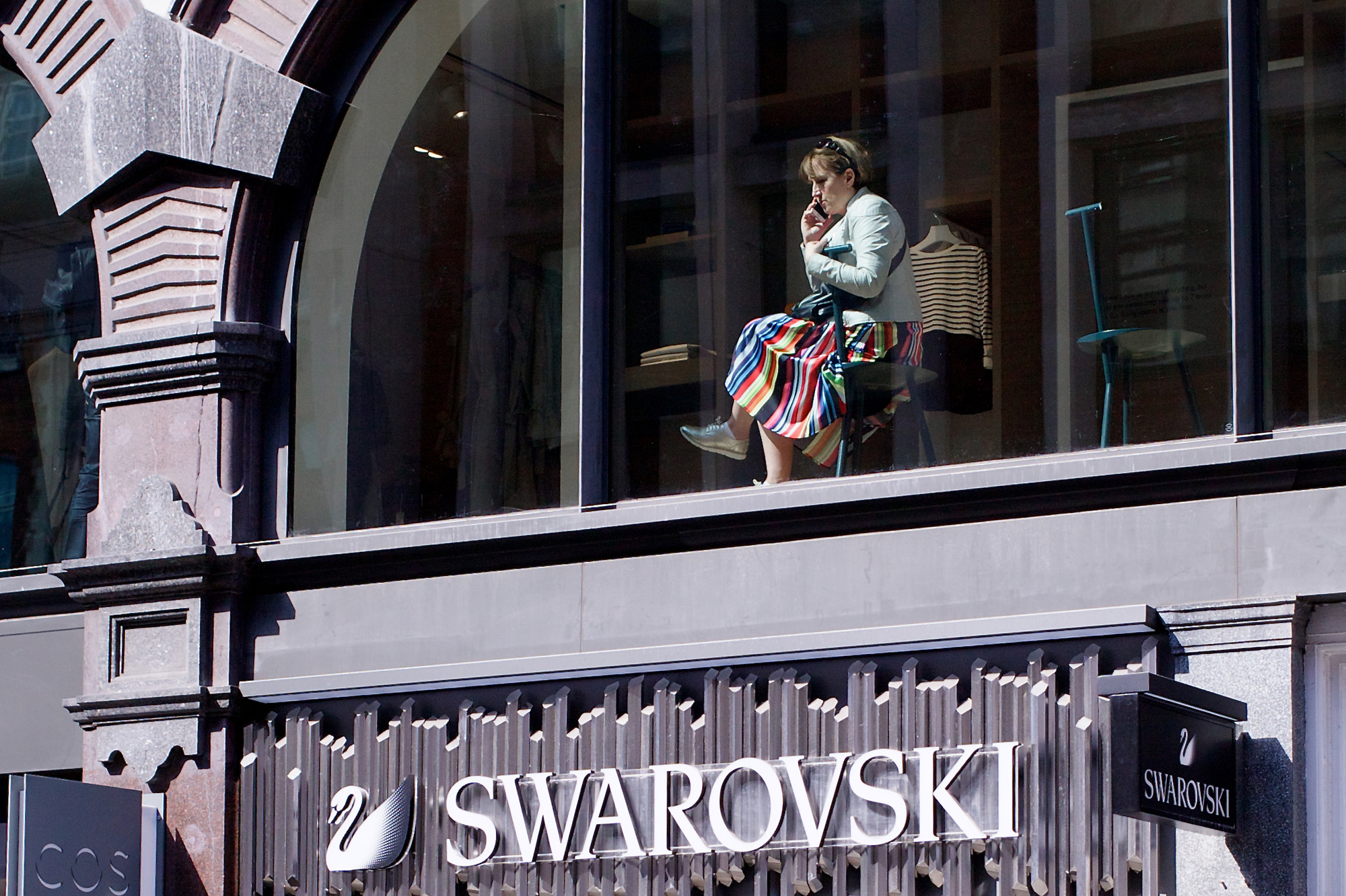
Sometimes a scene is readymade. Here, for example, is a woman in a multi-coloured dress, sitting in a huge window on a sunny day in central London above a costume jewellery store.

There’s hardly any colour in the picture except for her dress, so I can get away with placing her at the top of the image. The eye is drawn naturally towards her, while first reading the name of the store below.

Behind tinted glass the woman’s dress cannot be depicted with accuracy. Does its colour have the freshness of Spring? Not quite, but I’m prepared to compromise — unlike the designer of those viciously uncomfortable chairs.

Those Impromptu Street Portraits: Valid or Not?

Like most street photographers I occasionally take impromptu street portraits. They’re hard to resist.

For example, one day I was walking along a street in London when I spotted a man smoking a cigarette. I managed to get a shot of him before there was any conversation between us, but because he was looking directly at the camera I felt I had to say something afterwards.

We had a brief chat and he kindly let me take another photo. I asked him to look away from the camera. The resulting image (shown above) is very close, super-sharp, and technically more accurate than most street photos. I like it, but it’s not at all the kind of image I normally seek. Let me explain why not.

Why Candid Is Better
As soon as the subject becomes aware of the camera the spell is broken and something is lost. I’m sorry if this sounds a bit obscure, but if you feel the same way you’ll know exactly what I’m talking about.

I want to show the world as it really is, not as it wants to be seen. Most people begin to act as soon as they know they’re “on camera,” smiling, posing, putting on their “best face,” raising a rabbit-ears salute or making some other gesture. There’s no end to the contortions performed by the public when they think they’ll end up on Facebook or Flickr.

Of course, you may be lucky (as I was with the shot above) in finding someone who “gets it,” who sees you taking candid pictures and knows the kind of shot you want. But it’s better to maintain the convention of “the invisible camera,” taking candid, unposed shots whenever possible.

When a subject looks directly at the camera lens a peculiar process is set in motion. After the image has been processed and displayed, the subject appears to be looking at the viewer. But in no sense can the helpless subject make true eye contact with those who view the image. When it comes to scrutiny, it’s a one-way street: the gaze is from viewer to subject, not vice versa. For this reason I find that the people depicted in most street photos often project a kind of defensive, accusatory stare which they seldom use in other circumstances.

The Specialists
Many photographers specialise in street portraits, often gaining considerable critical and commercial success. Brandon Stanton’s series “Humans of New York” is a notable example, a remarkable collection of faces that leaves you marvelling at the variety and beauty of the human race.

Stanton has now divided his collection into various series: “Intimate Stories,” “Refugee Stories,” “Invisible Wounds,” and so on, his project morphing into literary territory, beyond the purely photographic. He writes: “Somewhere along the way, I began to interview my subjects in addition to photographing them. And alongside their portraits, I’d include quotes and short stories from their lives.”

I like Stanton’s approach. It works, especially with the addition of text. I wouldn’t call it “street photography” in the classic sense, but it’s perfectly valid, if not entirely original.

Many photographers have attempted to meld biography and portraits into a new artform. For example, British photographer Adrian Clarke, a former civil liberties lawyer, took the same road, moving from visual images to a combination of words and image. He made an initial impact with his series “Framed” — depicting subjects who had served long prison sentences for crimes they didn’t commit. In later series such as “South Bank is Shrinking” (2008) and “The Road to Low Newton” (2009) he accompanied his images with biographical stories told in the subjects’ own words.

I’m not wholly convinced by these brave attempts to create a new artform. They seem to involve too many compromises. We never learn the real story of the subject’s life, just a personal, one-sided version of it. Only a well researched biography or novel can present a full account of an individual living in a particular place through a particular period of time. By contrast, a street portrait without accompanying words leaves you guessing and prompts your imagination to provide the backstory.

Beyond Travel Photography
When you travel to a foreign city there’s an added impetutus to take street portraits because you can include both the person and the place in which they live: two for the price of one! Even better, you may be able to photograph them in the actual performance of some unusual occupation that’s unique to the area. Three for the price of one!

Their performance may even involve birds or animals. That’s four for the same price — and by now you’re probably in China, photographing an elderly gentleman engaging in cormorant fishing on the Li River in Yangshuo. It’s OK. I’ve seen it before. Yes, he’s very photogenic and the fishing is genuine, but his main activity is not cormorant fishing at all — it’s having his photograph taken.

I think it’s best to avoid the ersatz image: the synthetic, fake, false, faux, mock, simulated photo which takes you away from the nucleus of street photography towards its outer reaches. Keep it candid. Keep it real — even if the resulting photo is less technically correct.

The Revealing Moment
For example, sometimes you can catch people momentarily lost in thought. Maybe they’re actually lost, which is even better. Either way, they’re likely to be unaware of your presence, at least until you’ve taken the shot.

In Bangkok I took this photo (above) of a gentleman with a wise face, not unlike the Chinese figures you see guarding the Royal Palace. There was no time to worry about the background, which is cluttered almost beyond acceptability, but I like the shot. Why? Because it preserves the integrity of street photography.

The camera remains invisible. The onlooker can enjoy the same privileged viewpoint as that enjoyed by the reader of a novel. The photo lets you enter the world imaginatively and without confrontation. You can put yourself in the man’s place rather than confront him with impersonal scrutiny. In other words, this really is a street photo, not just an impromptu street portrait.

Do Cameras Impart Their Own “Look” to Street Photography?

If ever there was a “vexed question,” it’s this one. Time and again this subject comes up for discussion, not always in connection with street photography but with photography in general.

I’ve read hundreds of comments in forums and I’ve taken note of what technical experts have to tell us about the topic and to these (contradictory) chunks of information I can add my own experience.

A surprising number of people deny that cameras and lenses play any part in the “look” of a photo. They say, essentially: “It’s the photographer, stupid,” as if those who detect a characteristic look are deceiving themselves.

Expert Opinion
The experts, on the other hand, are cautious — and I don’t think any of them would be prepared to put their reputations on the line, and, without looking at the EXIF, say: “This shot was taken by a Canon 5DIV or Leica M10.”

A few people — they tend to be enthusiasts who pay a lot of attention to photo quality — insist there’s a recognisable look to images taken with certain camera/lens combinations. By this, they don’t simply mean sharpness and contrast, but something more: call it “personality,” for want of a better word. In digital photography this can be the result of in-camera JPEG processing but it goes further and seems to appear even when the photographer shoots in RAW.

Getting The Look
I bought my first digital camera on account of the “look” that was being achieved by users of the Fuji S5 Pro. Their shots seemed to have more appealing colours and a greater dynamic range while lacking any harshness in their overall image quality. Based on a Nikon body and hence able to accept Nikon lenses, the S5 Pro featured a sensor with two different sorts of photodiode (cells), one of which was specially designed to receive extremely bright light. Fuji marketed the camera to wedding photographers (think: white wedding dress; black suit) but people like me used it for landscapes and other types of photography as well.

I loved the dynamic range of the S5 Pro and I still take it out occasionally. My featured image (above) was taken with it — and it coped well with both the shade and the intensely lit areas in this Bangkok street scene. Its only drawback is its limited resolution: 6 megapixels devoted to each type of cell, yet not giving a true 12MP spatial resolution, just 6MP+.

The point I’m making is that my experience with the Fuji S5 Pro confirmed my suspicion that cameras can indeed produce images which have a unique look. If it was true for the Fuji, could it not also be true for other brands and models?

The Leica Look
The most talked about “look” is, of course, the Leica look. But is there really such a thing — and can it not be replicated by any quality camera with a great lens and appropriate processing?

For street photographers willing to splash the cash, Leica is often the brand of choice. These cameras are reasonably light to carry, with sturdy engineering and compact lenses of terrific quality. But I think they also get chosen because the “Leica Look” shows up particularly well in black and white. Their characteristic look is less noticeable in colour, which Leica photographers tend to use less, maybe for this very reason.

Let me try to analyse the Leica Look because I agree it’s real, but I don’t think it necessarily applies to all Leica cameras and lenses. The Leica Q in particular, with the strong corrections it makes to lens aberrations in software — even in RAW — give its output a “look” all of its own.

First, Leica images tend to be tack sharp across the whole photo, always a sign of a top quality lens. Second, the images have an appealing glow, especially in flesh tones. Third, even images taken with digital Leicas look a bit less “digital” than those taken with other cameras. Clearly, there is something going on that Leica have succeeded in making part of their brand — a bit like the fabled Scottish Highland water which is supposed to be a key factor in the unique quality of Scotch whisky. Funnily enough, both seem to have almost indefinable qualities like “depth” and “pop.”

Another parallel, somewhat closer than whisky, would be the violins made by Stradivarius at the end of the seventeenth century. Every musician admires the sound of a Strad and nearly all violinists would like one if they could afford it. Christian Tetzlaff is an exception in preferring a modern instrument, having switched from Strad to a 2002 violin made by Stefan-Peter Greiner (greinerviolins.com). Equally, few photographers give up their Leicas for other brands once they’ve made the initial investment.

Like or Leica?
You can find a really in-depth analysis of the Leica Look (and how to replicate it) on a website called Like-a-Look (but the URL is: www.leicalook.com). Today, there’s an app for everything, and in photography there’s a Photoshop plug-in or a Lightroom preset. Like-a-Look is a Lightroom preset. Its aim is to simulate the look of photos taken with classic rangefinders such as the Leica M.

The developer of Like-a-Look refers to Colour Rendering, Micro-Contrast, and Sharpness as being the three main factors involved in producing or reproducing the Leica Look. Unique colour rendering in certain cameras “may not be as technically accurate as other cameras when measured electronically, but they give a more realistic ‘feel’ according to many viewers.” As regards micro-contrast: “We use a method that enhances contrast without creating thick dark lines and unnatural shadows.” Sharpness also gets addressed by the preset: “A lot of the perceived sharpness is due to low noise, reduced flare and the colour shifts produced in-camera.”

Like-a-Look’s developer is firmly of the opinion that the Leica Look can be simulated, up to a point: “If you…have a good camera with a good sensor and a good lens, then it’s possible to get a similar ‘Leica Look’ without having a camera with a red dot.”

Substitute “outstanding” for “good” in the above paragraph and I’d tend to agree. Digital images are infinitely malleable. Their resolution now easily matches the resolution of 35mm film and you can, if you wish, use older lenses with their unique quirks and capabilities. It’s also possible to simulate the look of various types of film (and the processes used to develop them). Given all these tools at our disposal, the uniqueness of the Leica Look — and other “looks” — is gradually being eroded.

Back to Fuji
However, what remains is the ease with which you get The Look if you use the original camera that produces it. Fuji cameras, for example, are renowned for the appealing way in which they render colour. It is, say the experts, the result of Fuji’s long experience with colour film processing. It’s in the DNA of the company and its products. If you print the out-of-camera Fuji JPEG you’ll get proper Fuji colour.

Can you get Fuji colour from a Canon? Yes, after fixing up the image in Photoshop. It will take you a while to get it just right, but you’ll be able to get very close to the look of Fuji output, providing you work with an image from a camera/lens of equivalent or superior quality. A friend who is a Photoshop expert helped me make the above photo of a lady with multi-coloured hair (who is probably NOT searching her phone for a Lightroom preset) into something resembling a Fuji X image (although not one from the S5 Pro).

In summary: I personally think you can recognise the characteristic look which certain cameras/lenses impart to an image, but it’s impossible to identify it every time. I also think it’s not especially important because (if the truth be told) you can take great street photos with any good quality camera.

So why not have a glass of Suntory Yamazaki 18-Year-Old Single Malt Whisky, check out the musicians who use a Greiner violin — and have a think about it?

Can Street Photography Be Picturesque?

When I was a boy, my parents bought me a set of Cumberland Pencils with a vividly coloured landscape on the front captioned “Keswick on Derwentwater.” I was amazed at the picture. My home county (Suffolk) had no lakes or mountains — and it certainly wasn’t as colourful. Even then I was a bit suspicious of pictorial representation.

What we call “the pictorial” or “the picturesque” is essentially a way of looking at the world, discovering its most appealing features and presenting them to their best advantage. It is never completely truthful. The artist or photographer will probably remove any ugly or discordant elements from the picture. He or she may intensify the colours, lighten the shadows, and make sure the image looks more cheerful than the original subject.

At its most extreme, the process of prettifying the subject can end up as “chocolate box art” — or indeed as pencil box art. In other words, it’s a form of advertising in which there’s an element of persuasion involved.

The Techniques of Advertising
I think such persuasion is acceptable in commerce. After all, you’d hardly expect chocolate manufacturers to place unappetising pictures on the front of their products. But when the product is neither chocolates nor coloured pencils — when there’s no product as such, just a photo — why do so many people try to give it the pictorial makeover? Why prettify the image when doing so will make it less truthful?

The answer is that photographers are constantly tempted to use the techniques of advertising to make their images more appealing to the viewer and hence more popular than those of other photographers. Their photos will say: “Look at me! I’m more attractive than the photo next door.”

As a result, the art of landscape and cityscape photography has progressed hand-in-hand with commercial and advertising photography, becoming ever more beguiling and seductive. Only the hardened street shooter seeks out the general truth of reality, not concentrating on specific subjects as a documentary photographer does but selecting various and unrelated subjects that make good images.

Collectively, the best images of the individual street photographer add up to a vision of the world that will give the viewer an insight into reality that cannot be gained from painting or literature. The vision needn’t be unpleasant or depressing. For all its ills the world is not unremittingly awful. In places it is joyful, colourful, and alive with beautiful people. There’s nothing wrong — or untruthful — in showing the good things of life. Let’s not give our descendants the impression that we never enjoyed ourselves. That would be blatantly untrue.

Back to The Lakes
What I failed to appreciate as a child was the fact that Cumberland — now part of Cumbria, the Lake District — was, and still is, extremely beautiful without any exaggeration being needed to make it so. It has all the necessary elements: soft light, subtle tones, lakes, islands, mountains, and buildings made of local stone. Perhaps not by coincidence it was the birthplace of William Gilpin (1724-1804) who was one of the first to use the word “picturesque” (in his 1768 “Essay on Prints”) to describe “that kind of beauty which is agreeable in a picture.”

Today, cultural critics have a habit of dismissing Gilpin as a progenitor of middle-brow aesthetics, but I think this description does him a disservice. He helped to bring the beauty of nature to the attention of a wider public, especially to city dwellers for whom the railways were making the countryside newly accessible.

Cruelly satirised even in his own day for suggesting that artists should “add a tree” here and there to improve their compositions, Gilpin eventually became the quixotic figure of William Combe’s comic poem “The Three Tours of Doctor Syntax,” the first of which is titled “The Tour of Dr Syntax in Search of the Picturesque.” Riding around the countryside on his old mare Grizzle, the earnest curate Dr Syntax searches for the picture-perfect landscape but succeeds only in getting lost.

The “Acceptable” Subjects of Street Photography
Are we in danger of getting lost when we search the streets for appealing subjects, then try to compose the image in the best possible way?

Clive Scott certainly thinks so, and says as much in his book “Street Photography: From Atget to Cartier-Bresson.” Noting that photography quickly became the “chosen medium for representing the picturesque,” he notes: “…the photography of the city seems simply to have become obsessively preoccupied with a new range of visual topics: people leaping puddles, empty chairs, road sweepers, markets, shop windows, café mirrors.” These subjects, he argues, are essentially a “photographic record of what is already a picture.” In other words, they are picturesque.

So what is the proper subject of the street photographer? Where should we point our cameras? Is what we’re doing worthwhile or are we not simply selecting scenes that have already been authorised by other photographers?

There are more questions, too. When we look for the most compelling arrangement of figures, when we balance our pictures by making sure “that lamp post” is in the right position, are we not guilty of following Dr Syntax — sorry, William Gilpin — in his advice to add a tree here and there?

Academic Over-Think?
If you read Clive Scott, or even this blog post, you’ll probably come to the conclusion that it’s possible to “over-think” street photography and worry too much about your motivation for doing it.

There really is nothing wrong with presenting a pictorial image that evokes pleasurable feelings in the viewer. If the viewer’s response has been conditioned by seeing other, similar images — well, that’s something you need to bear in mind. There’s no point in perpetuating the obviousness of a worn and tired aesthetic. As William Egglestone says: “I am at war with the obvious.”

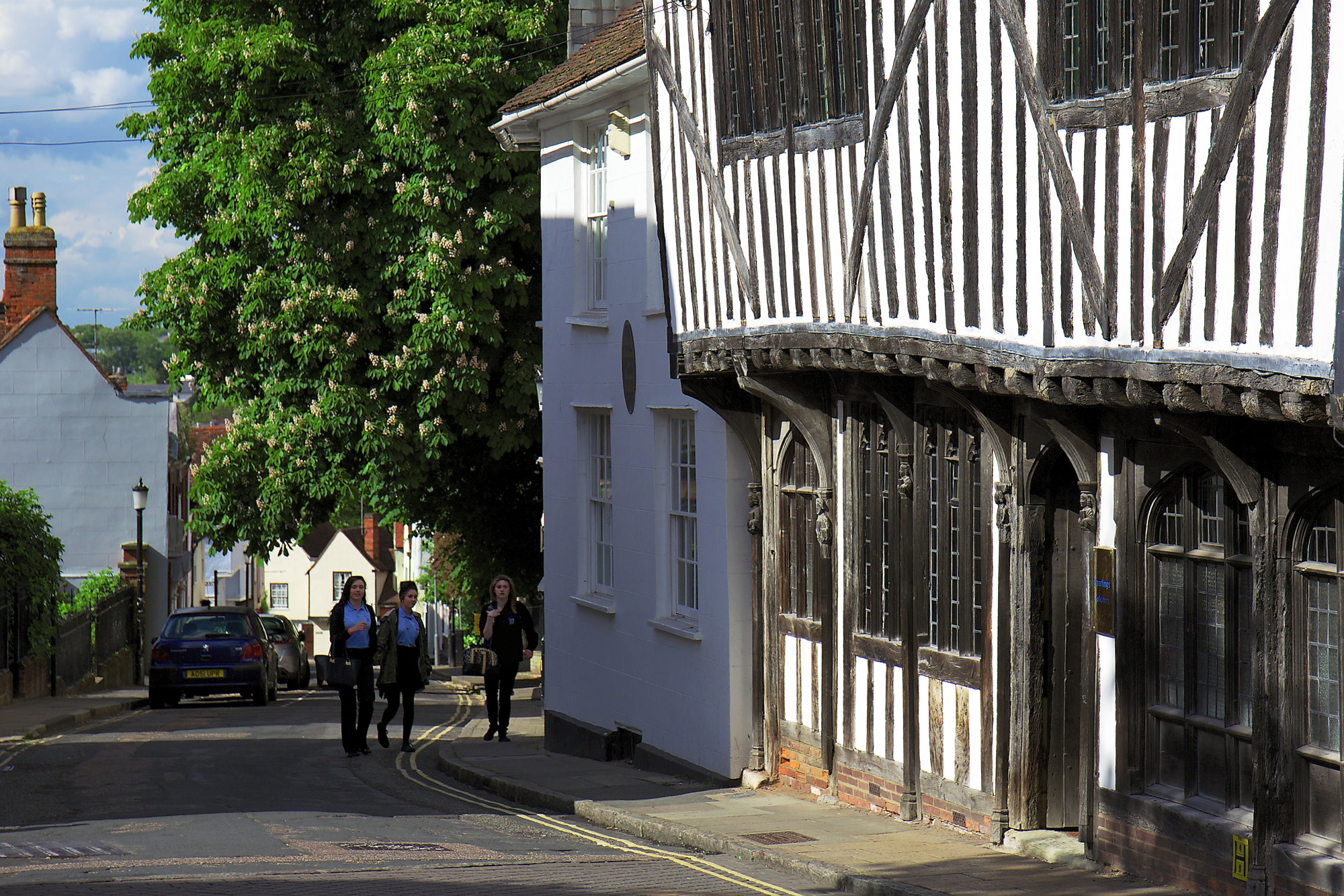
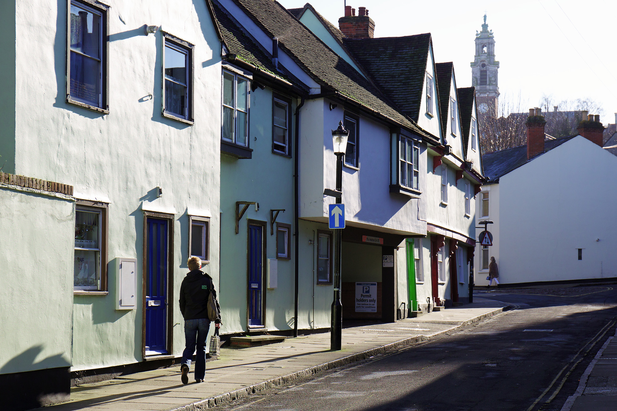
I’ve illustrated this post with some accurate and largely unimproved images of the town where I live. Yes, they’re picturesque, but the town really does look like this — perhaps not as beautiful as Gilpin’s Lake District, but not unattractive in parts. In good light, on a fine day, I wouldn’t dream of searching for anything else.

Softcore Versus Hardcore Street Photography

Way back in December 1995 Bill Gates said Microsoft was “hardcore about the Internet.” He couldn’t have been blunter. Hardcore was the strongest word he could have used — and absolutely necessary in the circumstances as Microsoft’s entire business was threatened by the rise of Netscape and the prospect of its browser killing off the descendants of Windows 95.

When you juxtaposed the words “hardcore” and “Internet” in 1995 most people thought of pornography, which represented a larger proportion of Internet content than it does today. But the word had only recently become associated with sex and at one time had been two words, hard core, as in “there is always a hard core of trusty stalwarts…” (who are the most active, committed, or doctrinaire members of the group).

Today you can buy “hardcore” by the ton: bags of shingle to be used for building or ballast. Rarity is not a quality you can attach to anything hardcore, despite the implication that’s it’s somehow extreme or exceptional.

Hardcore Street Photography
All of which brings me to so-called “hardcore street photography,” a sub-genre of our art-form which, by virtue of its chosen epithet, claims to be the essence of street photography rather than a mere category of it.

If you’re a hardcore street photographer you don’t linger on the other side of the road with a 100mm lens, waiting for that woman in the black hat to drop her West Highland white terrier and pick a shopping bag. No, you’re right there in front of her with a 28mm lens, blinding her with flash, scaring the dog — and getting a dramatic image full of contrast, scowls and yelps.

Tough not gentle, gritty not smooth, urban not suburban (and definitely not country), threatening not inviting, unfussy not thoughtful, ugly not beautiful — those are adjectives that spring to mind when I think of hardcore street photography. There’s much to admire in it, but certainly not the Apollonian ideals of order, intellect and beauty. With hardcore street photography you’re getting down and dirty in the gutter, not looking up at the stars like Oscar Wilde but just looking at the gutter.

From what I’ve written you might think I don’t care for hardcore street photography, but that’s not so. For example, I have huge admiration for the work of Barry Talis whose pictures on the Flickr HCSP (Hardcore Street Photography) group are outstanding. Viewing his photos is like reading “Lord of the Flies,” William Golding’s tale of schoolboys stranded on a desert island without adult supervision. But there’s a difference. In Talis’s world, even the adults seem to behave as badly as Golding’s kids, displaying their own brand of sub-rational confusion beneath which lies violence, cruelty and despair.

I could write pages about Talis’s photographs: their portayal of religiosity, obsessiveness, angst, people looking guilty, dogs, raw meat, fire, water, hooks, chickens, dramatic incidents, arguments, accidents, threatening atmosphere and suggestions of cruelty and violence. But I mustn’t harp on about hardcore; I need to mention softcore street photography, as that’s more my scene.

Softcore Street Photography
The snag is: no one ever seems to use the expression “softcore street photography”. There was once a group on Flickr of that name, but “standards slipped,” according to the moderator, and the group was shut down. Photos are still online, but at last count it had 162 members and 4 discussions. By contrast, Flickr’s Hardcore group has 80,000 members and 3,107 discussions.

From these statistics you can deduce that viewers of street photography prefer to be shocked rather than titillated. They’re looking for extreme moments rather than decisive moments: for images can that take them to places they can’t reach by themselves.

In fact, as well as HCSP there’s an Extreme Street Photography group on Flickr (boasting 19,742 members) and, by serendipity, several Decisive Moments groups, most of them with fewer than a thousand members. One, called just Decisive Moment, does have 38,000 members — but that’s still less than half the size of the Hardcore crowd.

In street photography, the vast majority of participants want to be known as “hardcore” — not namby-pamby softies who are scared of getting their lenses dirty. However, I found one participant of HCSP who likes to take pictures of homeless and mentally ill people and who says: “I do drive by shootings from the comfort of my car, and I use a telephoto zoom lens 55-250[mm]….I could [sic] care less what the ‘purists’ have to say about my style.”

Well, what I can I say? He breaks every guideline. He comes nowhere near approaching the exuberance of a hardcore street photographer like Barry Talis or the formal perfection of David Solomons — but I wouldn’t dismiss his work out of hand. He has enthusiasm, an eye for an interesting face, a sense of humour and a recognition of absurdity. Unfortunately, he’s allowed the hardcore “rebel” streak in his personality to screw up his development as an artist and human being.

And so it goes with people who attempt street photography but don’t quite get there. The Flickr guy with the telephoto zoom isn’t hardcore at all. He’s not as hardcore as I am — and unlike him I don’t place my work into that category.

What About Me?
The featured image (above) is about as hardcore as I get. After all, there’s nothing more sinister than cuddly toys — unless you include clowns. The shot is in-your-face, the subject’s dismay at being photographed contrasts nicely with the total lack of concern shown by the toys, all of whom — along with the passers-by — are looking elsewhere. It’s a brutal image, but in a cuddly way.

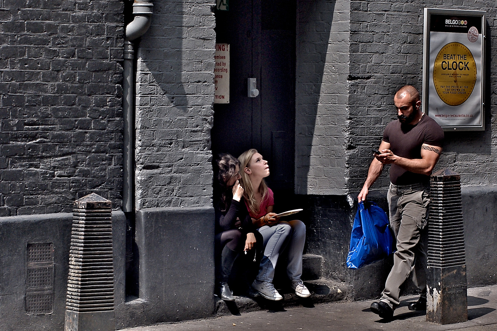
Alternatively (see the image below), I’ve been known to intrude on people eating an uncomfortable lunch somewhere behind the London International Film School, where I once worked. The backstreet location in Covent Garden lacks any feminine charm of its own and here its toughness is augmented by the presence of a tattooed and heavily muscled man who hurries along the grey street past the doorway with its half-concealed red warning sign. It couldn’t be grittier or more urban, could it? But hardcore? Not really.

So if you’re asking for definitions, I’d say:

“Hardcore street photography is a style of candid photography that takes an uncompromising approach to depicting people in an urban environment, mainly by getting close to the subject to show action, interaction and raw emotion.”

“Softcore street photography is a style of candid photography that cannot be considered ‘hardcore’ because it places aesthetics above content and in so doing tends to dilute the rawness of the street.”

Or maybe softcore street photographers tend to gravitate towards the classier part of town, which, after all, is still a great working environment. Perhaps I’ll see you there.