Window Shopping for Street Photos

Sometimes I like to go window shopping for street photos. Well, why not? If I see a shop window with a particularly intriguing display I like to match it with a real-life subject of equivalent interest.

I need hardly add that this technique works a lot better in London than it does in Bangkok: the two cities where I take most of my pictures. London teems with glass fronted shops, their windows packed with the latest fashions, from elegant to quirky. Bangkok, on the other hand, is a city of malls; its street shops tend to be open at the front, with all the goods further inside.

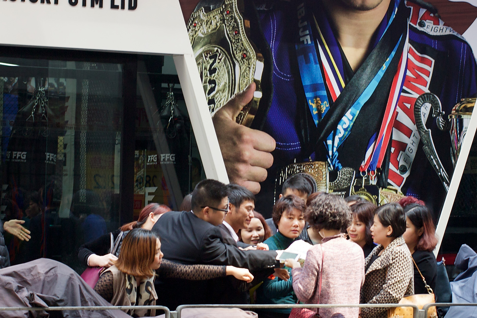
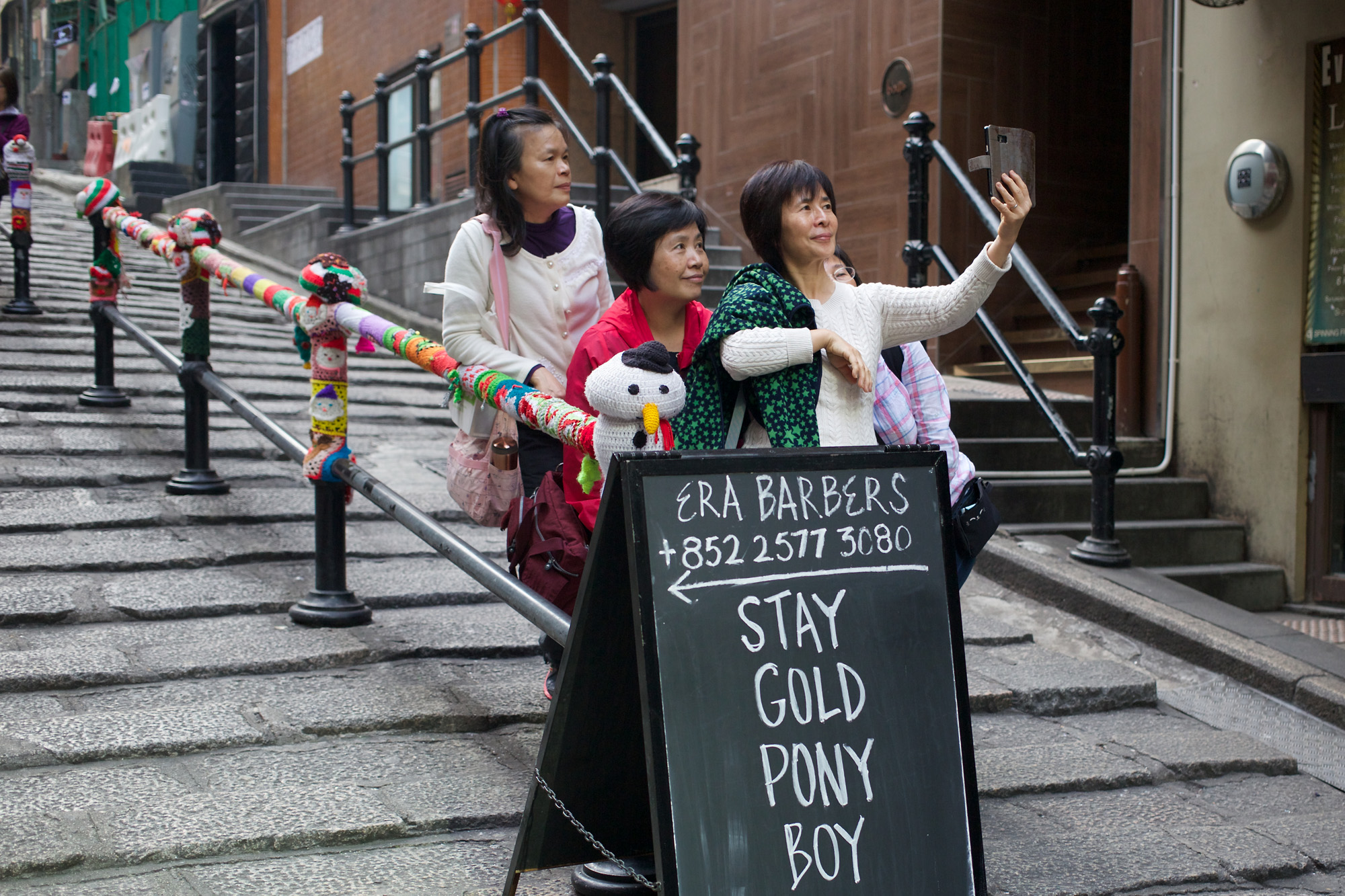
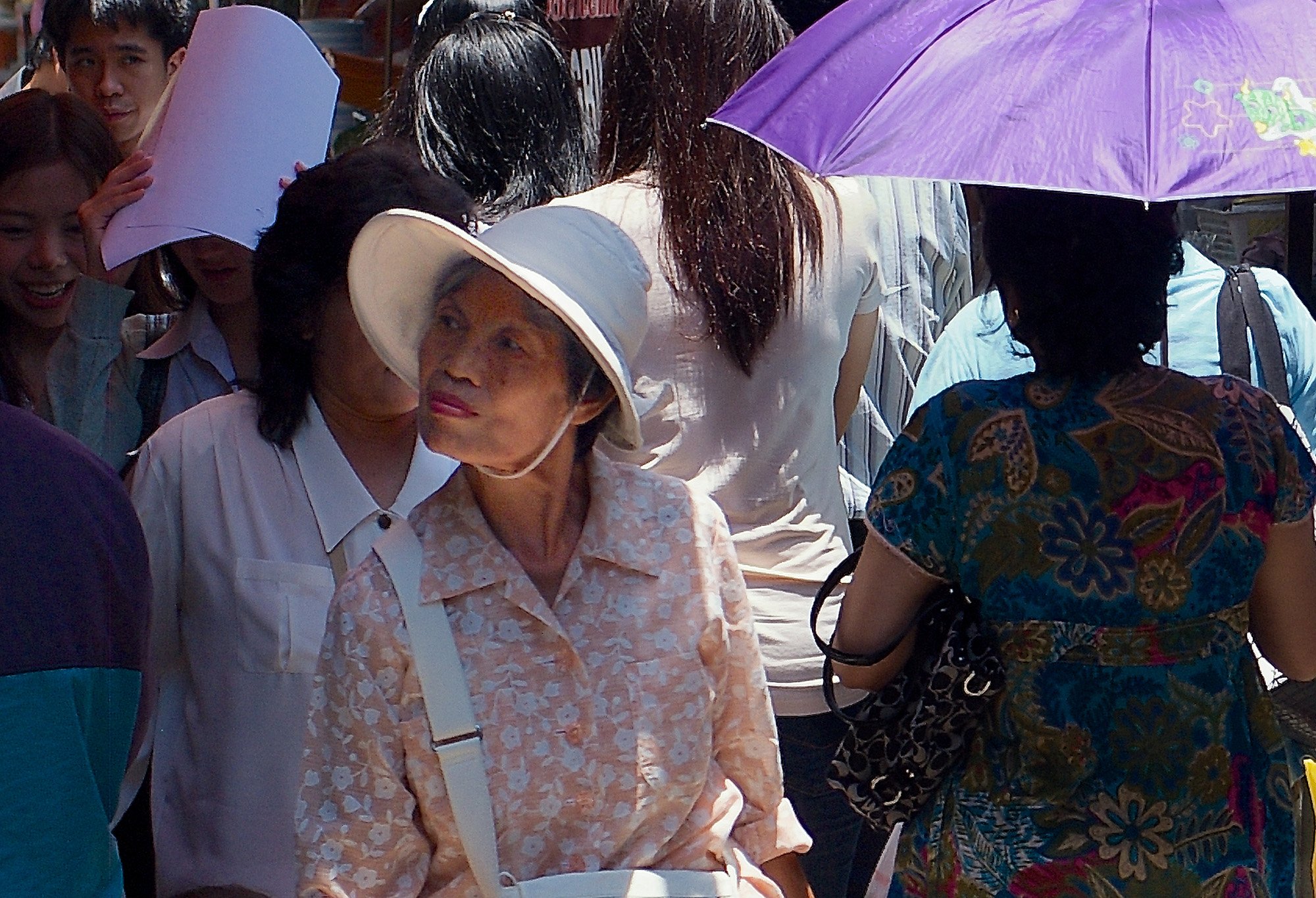
If you’re a street photographer you can’t really ignore shops altogether — they’re too ubiquitous — so you’d better make the best of them. The potential variations on “person walking past” or “person standing in front of” (the shop) are pretty much endless.

For example, you can have people arguing in front of, canoodling in front of, reading, stretching, yawning, crying (and doing all those things that people normally do elsewhere) in front of the shop.

They could be going into a shop or coming out of it or simply lingering inconveniently in the doorway, much to the annoyance of everyone else. I very much like the idea that life carries on, despite the attempt of shops to persuade us that theirs is the only show in town.

The Good and the Bad
For the street photographer, shop windows have both good points and bad. In their favour is the fact that they’ve mostly been put together by a professional window dresser with a good sense of colour and design. They’re sometimes stunning, often original, and nearly always visually striking in one way or another.

The only big disadvantage of using shop window displays in street photography (apart from them becoming a cliché) is that they tend to be about two feet higher than the sidewalk. The effect is to give all the mannequins a godlike appearance, so that anyone browsing the display will see a race of superbeings, unwilling to stand alongside the common crowd.

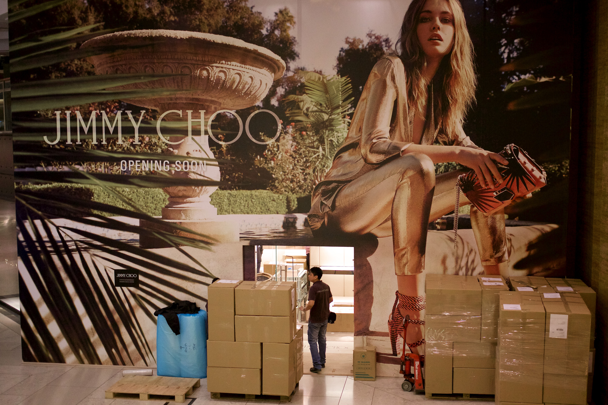
Disassembled Mannequins
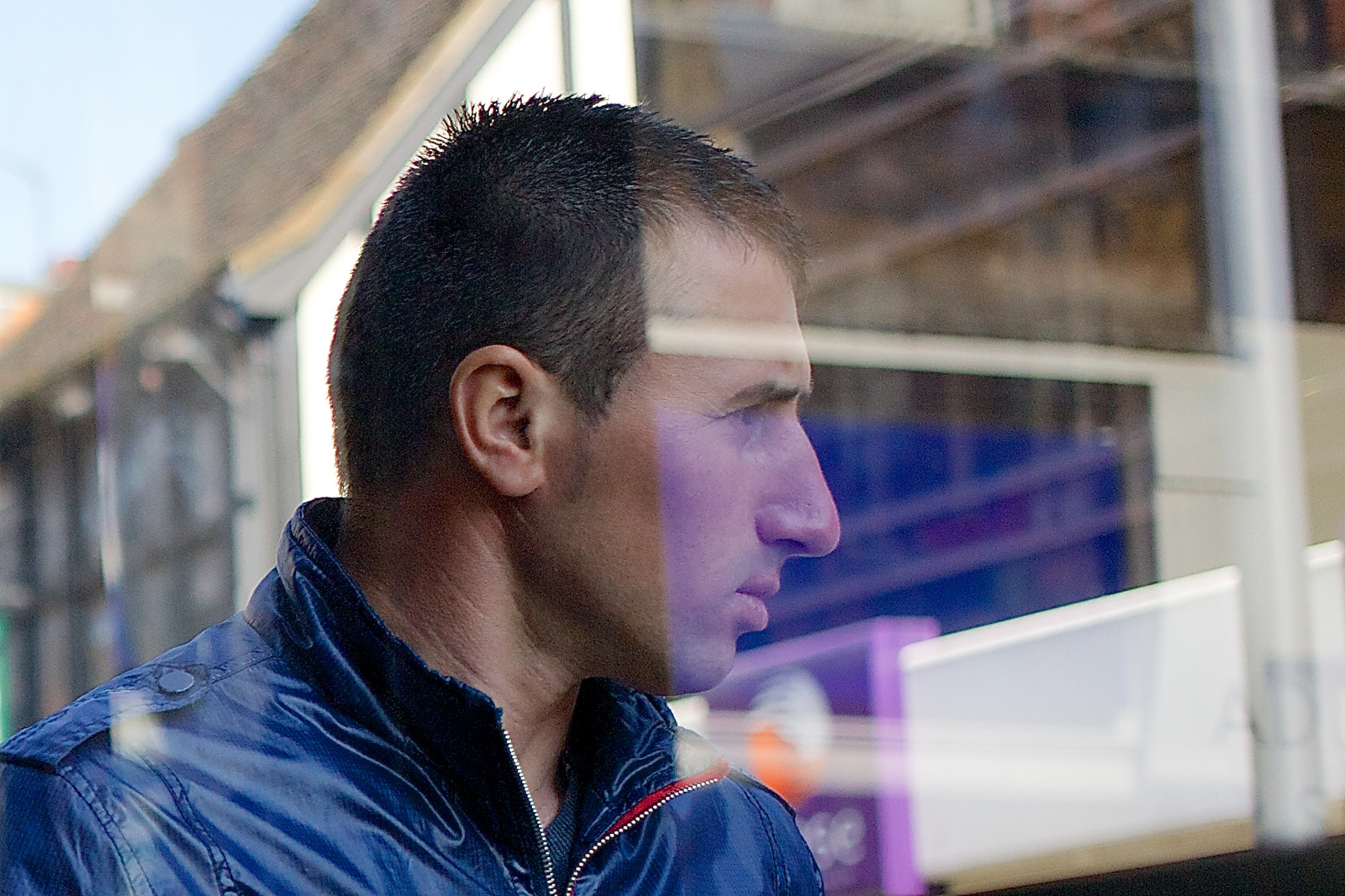
In one photo (my featured image, above) I’ve solved the problem by selecting a display which has yet to be installed. I loved the way the disassembled mannequins had been arranged — one torso revealing an unusual shade of grey.

I’d noticed the two pedestrians a minute or so previously and saw them approaching the window. Getting a shot without them looking directly at me — yet turning their heads in my direction — was possible because they’d emerged from the other side of a parked van. It was natural for them to look around it, but hard to see anything specific in the first split second. As you can see: you need several strategies to work in your favour if want to get a satisfying shot.

In the above photo, the pedestrians appear to be higher (and hence more prominent) than the figures in the window. There’s also an absence of colour, except in skin tones and from the warm light at the back of the window. The stonework is not entirely neutral and for once looks less severe than it normally does in photos.

The Avoidance of Cliché
As I say, it’s vital to avoid cliché when you combine real people with shop windows. If you can’t avoid it altogether — because “shop window + real people” is itself a cliché — you need to find an original variation.

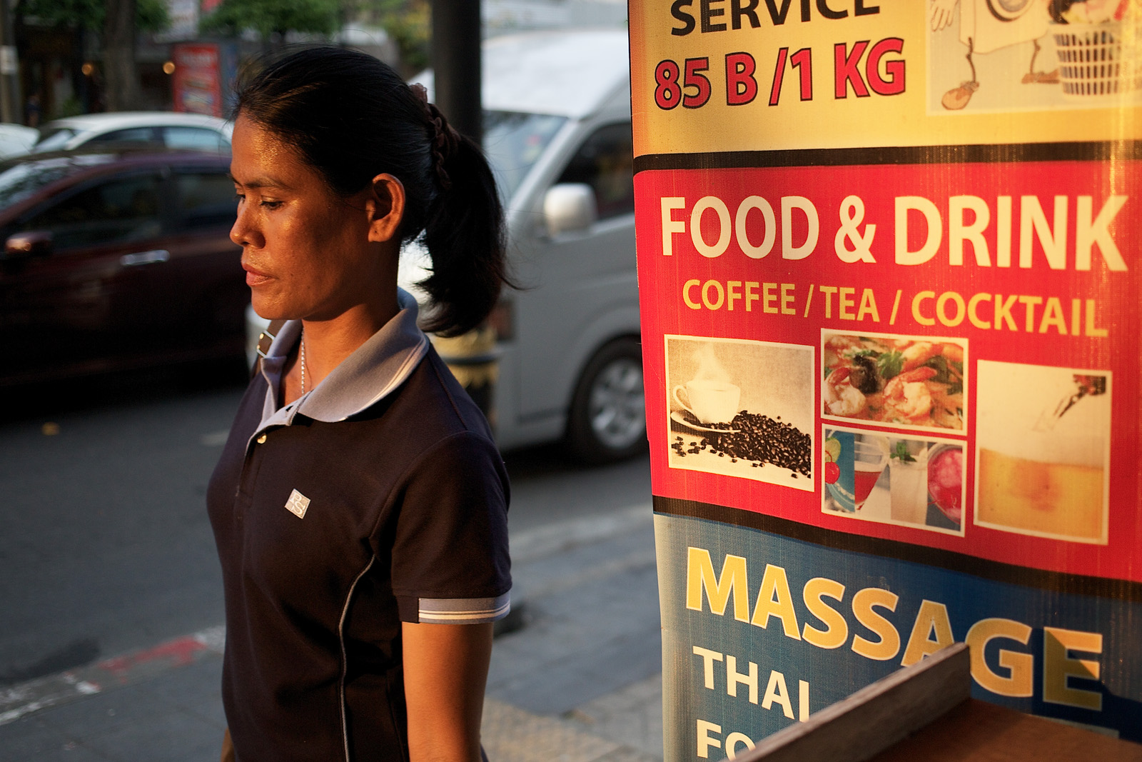
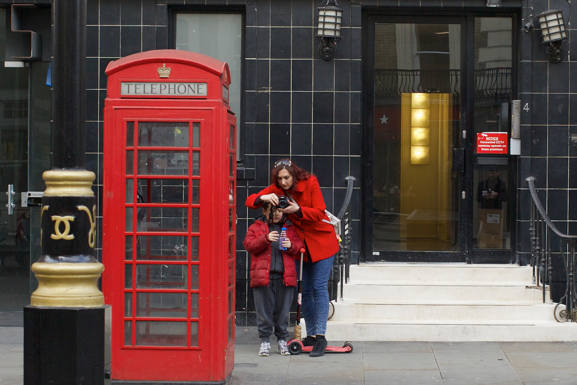
I think I’ve done this in the next photo (below), partly because the man is himself highly individual: leather hat, matching leather waistcoat, chewing gum in one ear (or is that a hearing aid?). However, what makes it slightly out-of-the-ordinary is the fact that he’s not looking at his phone (if that is indeed what he’s holding) but at something else, out of frame.

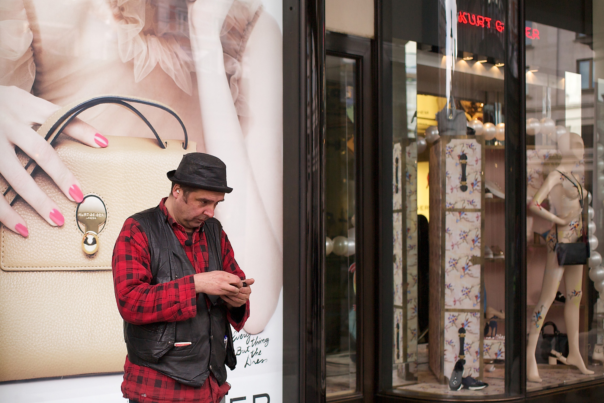
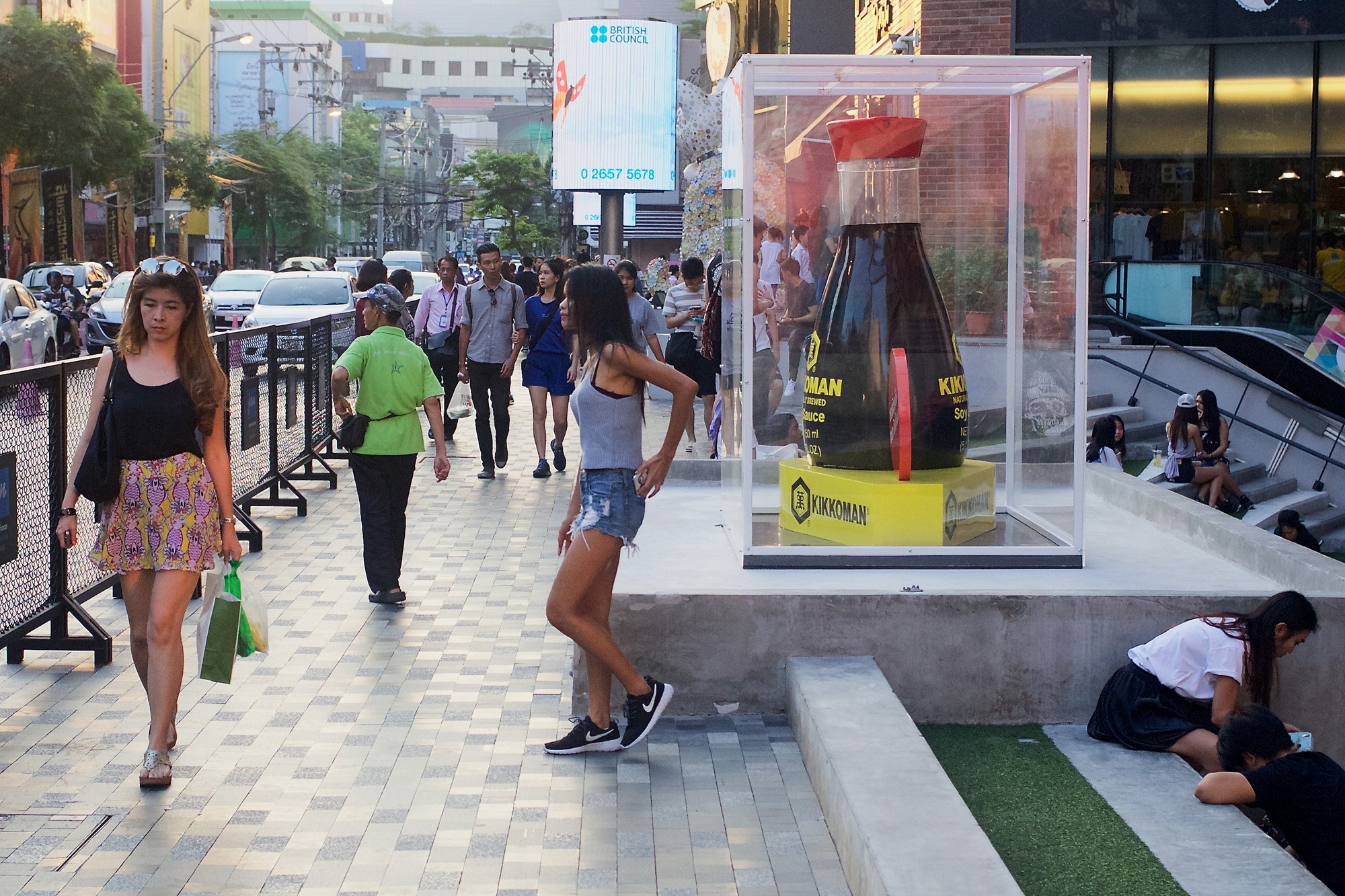
In both of these pictures the subjects are looking beyond the frame, having spotted something of interest in the wider world.

I often like to show people gazing, staring into the distance, or simply looking at something other than what I’m looking at (i.e., them). The same is true in the next picture (below), where I’ve tried to make good use of the greater elevation of the sightless mannequins, their non-existent eyes contrasting with the intent gaze of the real woman standing in front of them.

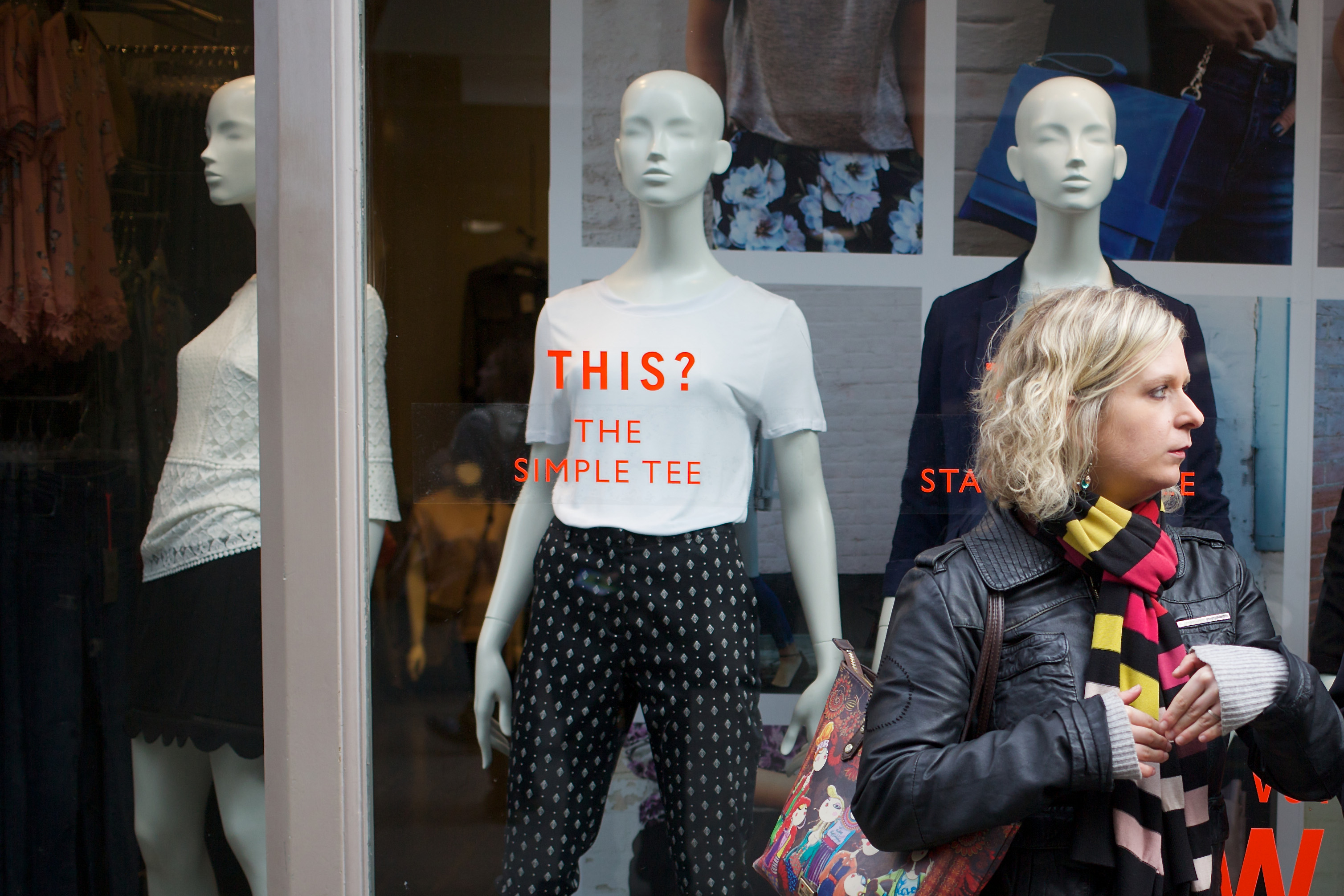
Here I’m drawing attention to the difference between the idealised world of visionary ideas (our many possible futures) and the individualised reality of the human race (our “here and now”). The mannequins are like a race apart, with their distended necks and identical faces. Amazingly confident in their stance they seem to herald the future: robotics, androids, artificial intelligence.

“But no” — the real woman appears to be saying — “the future really belongs to me.”

I hope she’s right.

What’s at the Centre of Your Street Photo?

When a street photo has a central core, you can take liberties with the rest of the composition. A central core establishes a pivot point around which other elements can dance.

Can you make a great composition without such a pivotal object? Yes, of course, but it certainly makes life easier.

I’ve spent more time than I care to calculate on thinking about composition and what looks right and what looks wrong. I don’t expect everyone — or indeed anyone — to agree with me, but I can honestly say I’ve explored thousands of possibilities.

My conclusion is: the central core is the one element that’s most likely to give the onlooker a sense of rightness, even when there’s a jumble of other shapes and colours around it.

Returning from a recent trip to London I discovered that a high percentage of my photos had an “object of interest” right in the centre — or at least somewhere along the vertical line that divides the image into two halves.

Big Earring
Take the featured image (above), for example. The object of interest is the woman’s large, circular earring which catches the light and seems to echo the swirls of the graffiti wall in the background. In fact, it’s this correspondence between the two that pulls the image together and makes it worth showing, despite the somewhat hackneyed concept of “people walking past graffiti.”

The earring is not dead centre, either vertically or horizontally, but it’s close enough to become the pivot of the composition. I’ve deliberately placed it slightly to the right because the two people are walking from right to left. The eye anticipates their direction of travel and compensates for the offset.

Now I need a good excuse for not having the earring exactly halfway up the picture. This is an entirely different issue. This object looks better above the central point rather than below it because the main subjects are people. When you include an entire, upright, human figure in the image, the onlooker’s attention has a bias towards the head (in the absence of interest lower down). We expect the head to be in the upper half of the picture.

Incidentally, the two subjects in question seem to form a pyramid shape, with their elaborate backpacks and floppy trousers. This is all to the good because the pyramid points to the earring (and the woman’s eye-catching hairstyle).

Rainy Colour
Shortly before the day brightened up and enabled me to take the above image, there was a rainstorm which flooded the streets and attracted my attention to the pavement. A woman in a vivid dress walked towards me, carrying a red-handled umbrella (below). Her dress in primary colours matched the colours of the motorcycles in the background. I picked up focus from the pavement and hoped for the best.

The shutter speed of 1/500th sec. has not quite frozen the swinging umbrella, but at least some of the subject’s hand is in sharp focus. Fortunately, the red wristwatch goes perfectly with the colour scheme. The reflected hues from the rainy pavement create a mood of “the storm is over, there’s a bright day ahead.”

And so it proved. For much of the day I had to cope with sunlight washing out the highlights while condemning everything else to deep shade. It’s not my favourite set of conditions, but I tried to find strategies to cope with them.

Where’s the Drama?
Central to my coping strategy was to focus on figures or objects in sunlight against a dark background. After all, if you can’t beat the conditions you have to join them: try to enjoy the high contrast and seek out dramatic subjects to make use of it.

In Soho I headed towards an area where several lorries were delivering liquid concrete (below). If I could play you the soundtrack to this image you’d be amazed. It’s completely at odds with the calm, orderliness of the composition! Two or three men were yelling instructions at the tops of their voices as the driver revved his engine and reversed his truck towards some expensive limousines with only inches to spare.

I took a dozen pictures — “working the scene,” as they say. I’m glad I did because only two of them had decent composition: one of a fashionably dressed passer-by and this one with the woman who seems to be enjoying a quiet cup of coffee despite the cacophony going on around her.

OK, you can argue about its merits, but I think it works because of the central figure: the man in the white helmet. Everything in front of him (to our left) is work, movement and action, whereas everything behind him (our right) is a world of leisure, stillness and relaxation. He stands between these two worlds, dressed in tough, working gear but assuming a calm, unflustered attitude — as if he were a guardian angel to the woman at the table.

Going to Extremes
Here’s another example, from earlier in the day (below). I’m know I’m pushing my luck with this one. There’s a woman in the foreground on the extreme left of the image and very little to balance the composition on the right. Yet I insist it works, chiefly because of the strength of the mysterious central figure.

I spotted the man coming towards me from the other side of a busy street. There was no time to lose. I got as close as I dared and took the shot before he moved into the dark passageway.

Now here’s the trick. The woman’s profile is set against the narrow pillar on the left. I delayed the shot a fraction to make sure this would happen. As luck would have it, the angle of view makes the pillar on the right look wider (we’re seeing two sides of it instead of one). As a result, it helps to balance the picture without destroying its disturbing quality.

So there we have four, very different compositions, each with its own feeling and atmosphere. Yet all four pictures have a central core that holds them together. It’s a technique anyone can use. I thoroughly recommend it.

Celebrating the Ordinary

Is anything ordinary? Sometimes I look at the world and everything seems in some way exceptional or out-of-the-ordinary. I once looked at the large black telephone on my desk at work and felt as though I were seeing it for the first time, even though I’d used it every day for a year.

Seeing the world afresh every time you go out to take street photos would be a useful knack, but it’s not easy to turn on and off at will. You need to wake up to a higher level of awareness — but not too high, otherwise you’ll start revelling in the sensation rather than taking pictures of what you see.

Elsewhere, I’ve suggested “limbering up” by taking a few shots almost at random, just to get in the mood. All you need is one lucky hit to place yourself in the right mental zone. Once there you’ll begin to see where the world deviates from the ordinary, where people and their surroundings become elevated to a plane of existence higher than you’d previously noticed.

I think it’s essential to “see” the image in reality rather than shoot first and hope something in the frame meets the criteria you’ve established. Some street photographers shoot and hope for the best, but I’m sure their hit rate is very low.

In the Mood
Of course, once you get into a mood where everything looks extraordinary, your rate of success should go through the roof. Every frame should be a winner! You may begin to wonder what’s happened, but the world has not changed. You’ve changed. You’ve begun to see the city with the clarity it deserves.

For example, have you noticed how adjoining buildings can be almost ludicrously different from each other, yet form a harmonious whole?

I shot my featured image (above) in London after a couple of hours shooting. By this time I was seeing shots I would never have attempted earlier in the day. I waited no longer than a minute or so for two dissimilar passers-by to cross at the intersection of the buildings. In the event I was obliged to settle for two blonde women, who, fortunately, differed in their style of dress while sharing two or three colours in common.

Does Anything Go?
If it were possible to “celebrate the ordinary” without really seeing it for what is — which is often extraordinary — then the street photographer could photograph anything and claim it as a celebration. That doesn’t work. A picture really needs to have some information within it that says: this is why you should look at me.

Take individual people, for example. Most people are not exceptionally good looking or physically imposing. If photographers limit themselves to beautiful subjects they’re presenting an overall picture of the world that’s fundamentally untrue. I think this is a serious problem with any personal style which cannot embrace all-comers. The same applies when you photograph the grotesque and neglect the beautiful. The world is neither one nor the other. It’s a mixture of opposites and everything in between.

Before the Parade
Sometimes I see ordinary people in circumstances that reveal their beauty, character, or a barely definable quality such as inner strength. It usually occurs during a pause in some action, perhaps in anticipation of a forthcoming event.

Here’s an example (above). I took the following image during the build-up to a Chinese street festival in the old quarter of Phuket Town in Thailand. I think these young women had been given certain duties — and were certainly not among the celebrants, as such. It was a blistering hot day and beads of sweat are visible when you view the photo at full size. Something, clearly, is about to happen.

I remember taking this image and when I look at it today I can recall my heightened awareness of the moment. I can remember noticing the matching colours of the jacket and the hanging fronds, the dark background (obviously) and the contrasting brightness of the women’s tunics.

But it’s the woman’s distant glance which makes the picture — and I’ll like to say I remember seeing that, too. If I did, I think I felt it rather than saw it. Sometimes there’s just too much going on in the ordinary life of the street to appreciate it all.

Getting Faces in Big Close-Up, Candidly

Let’s be candid. It’s not easy to take close-up photos of people’s faces when they’re walking towards you in the street. Here are four reasons why that’s so:

1. It’s too rude to shove your camera in a stranger’s face.
2. People will see you taking the shot and react adversely.
3. It’s hard to get focus when a person is approaching you.
4. If you attempt it at a distance you’ll need a telephoto.

Let me take these in turn.

1. It’s too rude to shove your camera in a stranger’s face.
I agree entirely. I’d be cross if someone shoved a camera directly into my face while I’m walking along a public street, wouldn’t you? This really isn’t an acceptable strategy for the street photographer. Apart from being rude, it doesn’t get very good results.

2. People will see you taking the shot and react adversely.
Strangers know when they’re “on camera,” so they look directly into the lens and scowl, or else they look away or take evasive action. Is this the kind of reaction you want to photograph? You can say “yes,” but it’s not candid street photography. The story is no longer about them, it’s about your interference in their lives.

3. It’s hard to get focus when a person is approaching you.
Yes, it’s difficult but not impossible, given the sophisticated focus tracking systems on today’s cameras. However, switching from normal mode to auto-tracking is adding complication to an already complex task. Even an experienced sports photographer, accustomed to auto-tracking, may have a problem trying to implement it on the street.

4. If you attempt it at a distance you’ll need a telephoto.
That’s certainly one option, but there are huge disadvantages to using telephoto lenses in street photography. People will shout “Hey, look, there’s a pap!” and give you a wide berth. (Pap = paparazzo, a freelance photographer who pursues celebrities). It will also stop you from taking shots discreetly, closer to the action.

Most street photographers switch themselves out of “candid mode” and enter what is sometimes called “conversational mode.” This is the tried and tested method of chatting to the subject to ask if they mind having their picture taken. Does it yield great photos? You bet it does! You get interesting faces, perfect framing, sharp focus — the whole works. But it’s not candid.

Once you leave out the candid element in street photography you’ve lost its soul.

So maybe we should simply pack it in, go home, and leave the big facial close-up to the portrait photographer. After all, there are plenty of other compositions to explore. It’s not absolutely essential to include large, candid facial close-ups in your street photography portfolio.

My Solution
Don’t give up too easily! There’s always a way of getting the job done — and I don’t think you need to resort to really sneaky tactics like concealing your camera in a briefcase or under a coat.

I took all the pictures in this blog post by sitting in cafés, enjoying a nice cup of cappuccino in the afternoon. This is frowned upon in Italy where no one drinks cappuccino after lunch. Macchiato yes, marocchino OK, but cappuccino — “stai scherzando!” (You must be kidding!)

The Images
The featured image (above) and the two below make a nice set because I took them all from exactly the same angle, with the same lighting. Looking at them today I keep wondering why I didn’t take more. The light was excellent and I had the ideal position near a corner — one that would probably be occupied by another customer if I returned to the same place.

One snag was the fact that people didn’t often walk close to the window, so I couldn’t get focus consistently. To take these images I had to pre-set the focus and wait for someone to pass at a specific distance from the camera. A second snag was the lack of people in the Suffolk market town I was visiting, not at all like the huddled masses I’m more accustomed to in London.

Nonetheless, I like these images because I so rarely succeed in getting large, candid close-ups of people’s faces. Although they’re not “full frontal” they’re clearly of people walking at speed in front of the camera — without being interrupted by the presence of the photographer.

I tried the same technique in Bangkok, where the late afternoon sun illuminated people’s faces with sufficient intensity to allow me to use a fast shutter speed. When you can’t pan the camera you need to have a fast shutter setting to freeze the movement of people walking past.

I’m not as happy with the result as I am with the pictures I took in England. Maybe it was the coffee! The trouble was, I couldn’t get close enough to the passers-by because of the notice board. Lacking glass, the café made me highly visible so the notice board was important, but still…

There are other faults, too. The colour of the setting sun was a bit too intense and the woman is not in tack-sharp focus. (That’s what can happen when you have the aperture wide open.) Yet for all its faults it’s not a bad image. I like the woman’s quiet strength and dignity. When you get a picture that shows human qualities such as these you know it’s worth keeping.

The Pleasures of Red

Red is a wonderful colour. For the Chinese it’s the colour of good luck and for others it’s the colour of passion. Too much of it is said to cause people to become agitated and lose their temper; too little leads to lethargy, caution and lack of vitality.

Street photographers in search of red usually have to rely on finding someone wearing a red dress or standing against a red background. It’s rare to find an entire collection of subjects and settings composed primarily of red or even vaguely reddish colours. In fact, at the risk of being overly cautious the street photographer may choose to avoid red altogether. It’s not the easiest colour to incorporate into a picture.

Personally, I love red — and orange and yellow — and I find them uplifting in comparison to the pervasive greys and browns of the typical city street. Any image composed primarily in red will be eye-catching. If you can offset this intense colour with some deep black, so much the better. You may have to wait for Chinese New Year before this combination comes along, but the wait will be worthwhile.

My featured image (above) was taken during Chinese New Year when workers were bringing extra lanterns for a street festival in Phuket Town. It was the Year of the Snake — or “little dragon” — so the twisting cables of the crane on the truck are significant. It’s best to represent the snake symbolically as it doesn’t like people seeing its body — or so the Chinese believe.

As you can see, the photo is not exclusively a composition in red. It contains orange (the side of the truck) and yellow (the worker’s tee-shirt and the lanterns’ tassles and inscriptions). There’s hardly any green or blue in the image. Do we miss them? Not really, although the picture may seem unusual because of its restricted palette.

Fortunately, anything unusual tends to go down well in street photography. Street scenes are all too familiar to most people, so you have to find ways of showing them in a new light. Hence, “unusual” equates to “good” in the street photographer’s lexicon.

When a Red Scene is Ready Made
The best source of red is undoubtedly red paint. It’s not always welcome, especially in the more conservative parts of London. There was, for example, the notorious case of the woman who painted her house in vertical, candy-coloured red and white stripes, taking revenge on her neighbours who’d prevented her from demolishing the house and adding an underground swimming pool to its replacement.

Red is often seen to be too “forward,” too provocative — as though it were being worn by a particularly aggressive Parisienne prostitute. That seemed to be the case in Kensington, where the adjoining houses now look unusually drab in the dull light of a typical London day. Nobody of class wants to look like a prostitute (or live next to one) but neither does anyone wish to seem dull and uninteresting. Neighbours! Don’t you just love them?

Red is not inappropriate on the facade of a public house (a London “pub”). Here it is (below) on The Coach and Horses in Soho. The paintwork is imaginative and bold, with white highlights and black window frames to alleviate the pervasive red — which seems to step forward towards us.

For the photo, all I needed was a man using a red phone (he was already in position when I walked past). This time there’s no yellow or orange, although the red itself has an orange tendency. The only jarring note is the blue bin on the right, but even that is counterbalanced by the vertical blue strip on the left.

Incidentally, this is the pub made famous by the patronage of the late Jeffrey Bernard — immortalised in the play “Jeffrey Bernard is Unwell” in which Peter O’Toole returned to the London stage to take the part of the hard drinking journalist beset by various ailments.

The lone, male figure in my photo may trigger some people’s memories of the journalist, the play, the actor, and the legendary performances that followed.

When Red is Over the Top
The residents of London can breathe a sigh of relief that no artist has painted a mural as overwhelmingly red as the one (below) in Bangkok. This work, by the Japanese artist Motomichi Nakamura, is one of the most startling — and gigantic — murals I’ve ever seen.

Of course, the mural doesn’t lend itself to street photography, because what else can you do except reproduce it? Any live action in the street will always be completely smothered by the tormented expressions of the red creatures on the wall. Here I’ve done my best, cutting off most of the mural while capturing a glimpse of the street alongside it.

In a curious way, the photograph works because the hugh graffiti-like mural — for all its jumble of alien forms — is actually better organised than anything on the street. The real world seems to be a mess compared to the jolly gathering of ghostly life-forms with their impassive stares and rictus grins.

Motomichi is a philosopher and scientist when he speaks of the colour red. As he says on his website: “(It) increases the pulse and heart rate, and raises your blood pressure. Red also has the smallest refractive index and visually it appears closer than reality.” By using it together with black and white, he makes his creatures — what he calls his “cryptozoological monsters” — look larger than life.

The Tendencies of Red
As pure colour, without being darkened by black or lightened by white, red can tend either towards yellow or blue. Red with a yellow tendency can be called “tomato red” (Coach and Horses) while red with a blue tendency is a kind of “berry red” (Motomichi).

It good to be aware that red has as much variety as any other colour, not only in appearance but also in meaning. Stock market prices are dropping if they’re shown in red in New York or London — but red figures in East Asia denote a rise in value.

Whether it means plus or minus, “passion” or “danger,” red in the street photo is impossible to miss. I never leave home without it.

Finding Great Compositions in Unpromising Subjects

If you were to ask me what I like most about street photography I’d have say it’s this: looking at an unpromising scene then somehow finding a composition that pleases me.

The sensation gives me a real buzz. It’s like winning a bet on the horses. You’re hoping your horse will come in, but you don’t really expect it. When your horse actually wins you feel you’ve cheated the odds, because the odds are nearly always against you.

For the street photographer, an unexpected winnings in an unpromising situation is “something for nothing.” It’s catching a bird with your empty hand. It’s manna from heaven.

On a Quiet Day
Recently I was taking shots in London’s Camden Market on a morning when most of the day’s visitors had still not arrived. It was early in the tourist season. Only a few people were walking around the food stalls which were just beginning to get ready for lunch.

I didn’t expect to find a single composition in the lunch area and was thinking of moving elsewhere. At that point, several things came together at once. Three chefs in a shabby kitchen started rummaging around in an interesting manner. A girl wearing a lovely stripey jumper walked into the scene, then a man paused in front of me holding a blue coat (see the featured image at the top).

With luck or judgement (I don’t know which) I managed to get each of the foreground figures so their profiles appear clearly against the background. Given the jumble and complexity of the background this was a definite bonus. If the man had moved a few inches forward the shot would have been ruined.

Getting Technical
Fortunately I was fully prepared for this kind of shot, although I didn’t expect to get it. With the camera in Aperture Priority mode I’d stopped down my 40mm lens from f/2.8 to f/5.6, giving 1/1000th sec. in the bright sunlight. I usually “expose to the right” (i.e., ensure that the shadows get enough exposure) but the mixture of white shirts and black stalls made me avoid setting any exposure bias.

Now, you may or may not think this is a good shot. It depends on how you look at it. All I can say is: it’s the sort of shot I really like — whether taken by me or someone else. There are plenty of diagonals in it to give a sense of dynamic movement. By contrast there are static items piled up in makeshift fashion behind the stall.

However, it’s not just the many diagonal lines that lead the eye to the centre of the photo, there’s also the gaze of the two visitors. These two potential customers don’t seem to know what to make of it all. The stall may be a bit too exotic for them — like the hot-air balloon tattoo on the back of the chef’s leg. You, the viewer of the photo, are invited to see the stall through the eyes of these two people with their respective — and clearly different — reactions of amusement and cool evaluation.

Forcing the Composition to Work
Later in the day I’d moved back to Covent Garden which was intensely crowded on a Friday afternoon. After taking shots of multiple people I began to look for isolated figures, just for a change of tempo.

Two men sprawled in awkward positions on the pavement beneath a colonnade do not make a promising subject, especially when their heads are bent down over their mobile phones. My first thought was to walk past and find a different subject. I prefer the challenge of photographing people who are moving around rather than lying down in “sitting duck” mode.

Then it occurred to me: why not give equal emphasis to the column and the cobbled street? By the simple expedient of squatting down, unnoticed, in front of the two men, I took the shot you see below.

I don’t really like to force a composition to work, but in this case I think it’s successful. The two working men are resting during their lunch break. Their extremely casual positions are in sharp contrast to the formality of their surroundings. Gravity seems to be pulling them towards the ground, almost matching pound-for-pound the weight of the stones and the column. Behind them are feminine fripperies in the shop windows (including the season’s “must have” handbags) so different from the building and the sort of men who built it.

The Streets Are Surreal

The Surrealist movement in art predates street photography by only a few years. Yet back in the 1920s when it first got going, there would have been little chance of finding suitable subjects on the street. How the world has changed!

Walking down a city street in the early twenty-first century you could easily come across three giant fried eggs on which it’s possible to jump up and down. Or you can crouch in a large crumpled coffee cup, or admire a disembodied bronze hand taller than yourself.

Quite apart from all the deliberately surrealist modern sculptures, the cities’ inhabitants contribute surrealism of their own with multi-coloured hairstyles, lurid tattoos, piercings, and elaborate accessories.

In European cities we retain many of the old, classical buildings, against which the weirdly-presented passers-by seem even more surreal. A man with a high-viz jacket and a blue Mohican haircut, leaning against a white Doric column, is a ready-made street photo.

In fact, there are so many oddly dressed and outrageously coiffured people walking past the Georgian architecture of London that I don’t photograph them unless there’s a compelling reason for doing so. All I can offer for my featured image (above) is a scene from Bangkok: of a giant bottle of Kikkoman sauce with a scantily-clad girl standing in front of it.

The Mind of Freud
Surrealism sprang from the imagination of artists, inspired by the psychological explorations of Sigmund Freud into the subconscious mind. There was a tinge of Romanticism in the way it challenged rationality, introducing illogical elements into the picture, made all the more impossible by being depicted with the utmost realism.

From the outset, photography was a useful tool because it reproduced objects with great exactitude — much faster than Salvador Dali could paint a melting clock face. However, anyone wishing to make surreal photographs was obliged to create the scene, using ingenious sets with strange perspectives and incongruous figures.

Man Ray, the American-born artist who often used photography as his primary tool, became a master of the unexpected juxtaposition which delighted the eye while (slightly) disturbing the mind.

The Pioneer
Henri Cartier-Bresson, the pioneer of street photography, was strongly influenced by Surrealism — even though his work never became as overtly surrealist as Man Ray’s. In Paris he mixed with the Surrealists who gathered at the Café Cyrano in the Place Blanche and absorbed their ideas. In particular he was struck by the emphasis they placed on spontaneity and the subconscious.

On the streets in the 1930s and 1940s, Cartier-Bresson didn’t find the bizarre mixture of surrealist people, objects and artworks we have today, but he succeeded in taking images which have a surrealist edge. He found ambiguities, juxtapositions and gestures that communicate meaning where you least expect it.

Because of Cartier-Bresson’s continued influence, street photography has always been at least slightly surrealistic. It’s what sets it apart from photojournalism. A street photograph tries to capture the attention of onlookers by drawing the eye towards something remarkable, then rewarding it with other qualities such as great composition, vivid detail, or even emotional content.

Just Desserts
I’m quite shameless in using advertising hoardings, street sculptures and promotional events to bring surrealism to my images. Here, for example, is an outlet for mango desserts in Bangkok, topped with an Austrian-style feathered hat. (That’s on the outlet, not on the dessert).

If I could have shown this image to the artists and photographers in the Café Cyrano in the 1920s I think they’d have been very impressed. Would Cartier-Bresson have guessed that the two girls were taking a “selfie”? With a phone-on-a-stick? Probably not.

Gigantism Always Works
When you photograph the human figure, expand it to enormous size and place it on a poster — or create a three-dimensional model from it — you’ve surely entered the world of surrealism. Such works have the effect of dwarfing those on the street, while possibly inflating people’s sense of importance as they identify with the man or woman in the poster.

Highly realistic images of martial arts champions occupy a vast hoarding outside a gym in Hong Kong, their belt buckles alone being the height of a man. Walking past, I found a cluster of people huddled beneath them, probably placing bets. If I showed you the whole of the poster you wouldn’t see the people very clearly, so I cropped the image to leave just the “thumbs up” and the fighter’s medals. The long-fingered hand, on the left, seems particularly surreal — until you realise it’s pushing against a pane of glass, causing the fingers to splay.

Slightly Incomprehensible
Personally I prefer surrealism to be more subtle, dropping little hints of incomprehensibility here and there.

Pottinger Street in Hong Kong is one of the best-known photogenic hot-spots (Kai Wong, formerly of Digital Rev, goes there from time to time). The hairdresser’s notice board changes frequently. When I was there it said “Stay, Gold, Pony, Boy” which presumably means something to somebody. And, oh yes, the railings are covered in knitting.

That’s really how I like my surrealism. You can keep your burning giraffes and “honey sweeter than blood.” For me it’s “Stay, Gold, Pony, Boy” and knit me a jumper for the Bank of China. It can get quite chilly in Hong Kong.

Is Street Photography Riddled with Clichés?

Street photography is an acquired taste. It’s often criticised for showing people in unflattering situations and invading their privacy. Some critics claim it to be contrived or even faked. Yet by far the most damaging criticism — and one which is hard to deflect — says street photography is (to use a hackneyed phrase) riddled with clichés.

The definition of the word cliché normally refers to stereotyped expressions, such as an over-used phrase or a popular homily. We now apply it to other forms of expression beyond spoken language: to art, design, fashion and, of course, photography. Anything that’s trite or commonplace through constant repetition can be considered a cliché.

Sadly, clichés are a bit like faded movie stars who’ve lost the unique look for which they became famous. Every cliché starts out as a strikingly original thought — embodied in art or language — only to become trite with overuse. The phrase “familiarity breeds contempt” is a prime and self-referential example.

Street photography, taken “en masse,” certainly betrays a high level of cliché, a fact which is surprising when you consider how life in the street is constantly changing. I’m not a mathematician, but I reckon there are more potential combinations of figures, objects and environment in street photography than there are molecules on Earth.

Where the Problem Lies
The problem lies chiefly in two places: in reality’s superficial similarities — where one man in a grey suit looks much like any other — and in how we interpret what we see, selecting subjects which other photographers have previously chosen with demonstrable success.

Let’s take the similarities first. Street furniture in every big city normally conforms to a pattern: the bus shelters are similar to each other, the street lamps identical, the storm drains indistinguishable.

Take my featured image (above), for example. The brightly coloured plastic chairs say “Thailand,” the storm drain says “Bangkok.” I think you can also see the remains of a telephone kiosk on the right, now derelict thanks to the mobile phone.

However, in my treatment of the subject I’ve used these clichés to original effect, ironically by drawing attention to them. By chopping off the heads of the diners I’m left with a stereotypical meal, enjoyed on the sidewalk like a million other meals that day, with bowls, plates and beakers in clichéd pastel pink and green. I’m hoping the clichés have devoured each other. Am I right?

Now let’s turn to how we interpret what we see in front of us. In looking for shots we’re undoubtedly influenced by the work of other photographers. It’s hard to gaze into a shop window without thinking of Vivian Maier’s self portraits, or to see a vagrant without recalling Berenice Abbott’s “Bowery Bum.” There’s a temptation to take a similar shot, as if to say: “Look, I can do it, too!”

Puddle-Stepping Man
Is it wrong to imitate in this way? No one’s going to stop you, but only if you come up with something truly original and effective will people take notice. They’ll praise you, make you famous, and very soon they’ll start to copy you. In fact, they’ll turn your present-day originality into tomorrow’s cliché. Seriously, doesn’t Henri Cartier-Bresson’s puddle-stepping man in “Behind the Gare St. Lazare” (so original in 1932) look a little bit trite after so many imitations?

There’s a touch of Cartier-Bresson in my photo (below) of a mother and son taking a photo outside the former site of the Photographer’s Gallery in London. The clichés are obvious: the fancy decoration on the lamp-post, the ubiquitous phone kiosk (affectionately retained by popular demand), the counterbalancing red of the frequently seen CCTV notice.

But what delights me is the boy’s momentary lapse of concentration as his mother attempts to show him how to take a photo. He’s probably tired from skateboarding and fascinated by the bottle of water he’s carrying. The way in which his hand is frozen in mid-movement competes for “the decisive moment” with his mother’s adjustment of the camera (alarmingly pointed in my direction).

My shot does not imitate any photo ever taken by Cartier-Bresson, but his influence is there and I’m happy to acknowledge it. Despite the presence of ubiquitous objects — and despite the influence of HCB — I think I’ve avoided cliché.

In Quirky Mode
Does my final photo (below) do the same? I’m not so sure. Once you embrace the quirky mode of street photography there’s a greater danger of falling into cliché.

Visual humour has an obviousness that can be unsatisfying. We look at the image, we “get it” immediately, and move on. There’s no reason to linger if the point of a photo is (say) the apparent substitution of a football for a man’s head because the subject is standing in a certain position. These visual quirks have been done to death. I’m no longer amused.

Nonetheless, I couldn’t resist taking a shot of the Jimmy Choo shop in Hong Kong, prior to its opening. I wonder, did the shop designer plan this amusing scenario deliberately, with candid photography in mind? Or was it the PR company, looking for snaps that go viral?

I’ve no idea. But I have huge admiration for the original image, shot by Los Angeles-based photographer Cass Bird, with the Danish model Nadja Bender. Their whole photo shoot for the project was outstanding — and based on the idea of juxtaposing vintage and modern designs.

My juxtaposition — with the storeman at the receiving end of the fashion world’s chain of command — is somewhat more quirky. I think it works. You tell me.

Finding a Face in the Crowd

The street photographer can take distant shots of people in the rush hour and the result is nearly always the same: cut-out, cardboard figures in an urban landscape.

It’s so easy to see a crowd of people as being composed of anonymous, faceless individuals — scarcely individuals at all, just components of a seething mass of humanity.

Then suddenly you spot someone who doesn’t quite go with the flow. Maybe this person is trying to move in the opposite direction. Maybe her expression is out of tune with the rest. Perhaps she is laughing, or crying, or merely turning her face towards you — and you notice how beautiful she is, how she contrasts with the sullenness of the rush hour commuters.

The person who stands out in the crowd can be a man or a woman, but seldom a child. For the “face in the crowd” shot you need the subject to be reasonably tall.

Yet while height is one factor, it’s not the only one. The subject’s face, seen in the context of an otherwise anonymous crowd, must have “something about it,” something memorable and therefore worth committing to the long-term memory of photography.

Realisation
Finding a face in a crowd is not a theme I’ve developed to any great extent — on the whole I tend to avoid preconceptions — so I don’t have a stack of photos to illustrate the concept adequately. However, my featured image (above) shows you the gist of what I mean.

Taken in a busy market place, the picture is a detail from a crowd photo. I’ve cropped it because otherwise the lady in the white hat is too far over to the left — and the purple parasol becomes the main subject. Cropped further, centralising the “face in the crowd,” results in too great a loss in resolution. (I took the shot with my old Fuji S5Pro).

For all its faults, I’m reluctant to reject the image because it captures something that moves me, a quality that would be lost in a posed portrait.

I think it’s because of the crowd.

The subject seems to be so very much at home among a crowd of people, even when they pass her in the opposite direction. She is thinking seriously about something, but she is not “lost in thought.” She glances to one side — and it’s this glance which, for me, makes the picture.

In the next photo (below) we can see the faces of other people besides that of the main subject. The man looks towards us, but doesn’t quite make eye contact. Again, people are passing him — this time in both directions — but he stands steadfast without any outward sign of frustration. He seems to have caught the eye of the blonde woman on the right, but others jostle their way past him, looking for goods in the winter market.

I’ve called this photo “Face in the Crowd,” although not without a touch of irony. Most of the colours tone together reasonably well, except for one. The vivid pink of the Muppet-like toy at the back jumps out at us, drawing our eyes to its one eye.

Unlike the lady in the first photo, the man in the grey overcoat is not glancing, as such. He seems to be more like a character from a movie: Jason Bourne perhaps, pausing impassively while calculating the odds of survival.

The Cinematic Style
When the subject is a “face in the crowd” the photo immediately makes you think of the movies. That’s because you’re using a cinematic technique: the long shot before moving in for a close-up.

In films, the star is instantly recognisable, so it’s easy to pick out him or her from the rest of the crowd, especially when helped by framing, tracking or zooming. In street photography, where a single still image is usually the entire work, when you borrow the cinematic style it allows you similar freedom of composition.

Foreground figures can be out of focus; people at the edge of the frame can be chopped in half. The onlooker will see the still image as being filmic: with the extras moving in and out of frame while the camera dwells on the starring actor.

This is true of the image below, which I took at around the same time as the featured image at the top of the post. The girl with the pink parasol looks round and sees my camera. She doesn’t have time to react self-consciously, unlike the woman on the left, who may have seen the camera and is deliberately looking to one side while primping her hair. The whole composition could be a frame from a movie.

On the Waterloo Steps
Where better to find a face in the crowd than on the steps of London’s Waterloo Station during rush hour? I often find myself here, having crossed the river to chase better light at the end of the day.

I wonder how many people who pass through Waterloo Station’s main entrance appreciate that it’s a memorial to the dead of the First World War? The steps are spanned by Victory Arch and flanked either side by gigantic lamps supported by obelisks.

In this place I’m always reminded of “The Face on the Waterloo Steps” at the beginning of John Cowper Powys’s novel “Wolf Solent.” Powys’s anti-hero — on his way to the West Country of his childhood to take up a new job — sees a vagrant wearing a look of “inert despair.” The man’s face haunts Wolf for the rest of the narrative. It’s an echo of the war. Thus begins a search for identity and meaning in one of the twentieth century’s great literary works.

Alas, I’m already haunted by other images, so I have no wish to photograph my own version of inert despair. I prefer this image (below) of a man with a bicycle, struggling with determination against the flow of the crowd.

Unlike Powys’s anti-hero he seems to exude heroism, with his camo jacket, tight grip, and deliberate movements. He is surrounded by much younger people who, like Wolf himself, are still undefined by their limited life-experience, but this man with his own transport clearly knows who he is — and where he’s going. He’s more than a face in the crowd. He’s a complete figure.

Busy Foreground, Plain Background

I’m always keeping half an eye open for subjects framed against a plain background, although I don’t make it a firm stipulation. Usually, I let my creative impulse play with jumbled backgrounds, but sometimes a critical voice in my head says: “Go on, take those guys against the darkened doorway. They’ll look great.”

All photography experts say: “Simplify! simplify!” and the sensible person follows their advice. Ninety percent of “good photography” is uncluttered — the image paired down to essentials so that the main subject makes an uninterrupted statement. However, not wanting to follow all the rules I try to enlarge the scope of what seems possible in photographic composition. I like to include bits of chaos here and there.

The background in my featured image (above) is not, of course, entirely plain. It’s the back of a bus. It has rivets, tail lights and lettering; it even has two different colours. Yet compared to the normal cluttered background of the street it’s very plain indeed. I liked the fact that its prevailing colour is Girly Pink, whereas the two people on the scooter — trying to weave their way through the traffic — are tough-looking men who’ve clearly done a good day’s work.

I call the image “Hemmed In,” which sums up the situation of these two men, caught up in the Bangkok rush hour. It’s precisely the kind of image I like to get. Significant visual content fills the frame. There are details in all the corners — glimpses beyond the rectangle — a sense that life is going on all around, not just in front of the camera.

Finding plain backgrounds in a city like Bangkok is not easy. The Thai people love to decorate everything with elaborate carvings, quirky sculptures, intricate garlands, keepsakes and mementoes. Add to these the lush, dishevelled growth of tropical plants and the chaos of overhead cables and you get a background that’s not at all conducive to traditional, paired-down, western photography.

Blurring the Background
With close-up photography you can rely on “bokeh” to give the subject the prominence it needs, while still retaining a sense of context in the image. Personally, I don’t find this technique as rewarding as keeping the background in sharp focus — as in my featured image. We see portraits against out-of-focus backgrounds so often.

In the image below I’ve attempted a compromise between the two approaches. The tuk-tuk driver is in sharp focus, but so is the red light at the top right of the frame. The rest has varying degrees of blur and you can just make out a figure in blue, walking behind a tree.

I was lucky to get the shot, because drivers don’t often engage in such earnest conversation. This one was explaining to my partner how he would take us, free of charge, to our destination if only we would allow him to introduce us to a couple of jewelers and a tailor along the way. We agreed — and managed to survive the next half-hour without buying any jewels or suits. I even got a couple of other good shots during the trip.

Really Busy Foreground
I’m not entirely sure whether the subject of my next photo (below) is the decoration on the window bars or the drowsy man on the other side of them. Necessarily it’s a combination of the two, as both are in sharp focus. The background is a darkened interior with a hint of illumination on the left. It provides a good foil for the double subject in the foreground.

You’ll probably think the image is too relaxed for Bangkok — and you’d be right. I took it down south, half-way toward the equator in Phuket Town on a very hot day. No glass separates the man from the road, so there is clearly little pollution. I like the way the gilded leaf echoes the shape of the man’s ear. He grasps the window sill with a sense of rightful ownership. In this place he is very much at home.

When there is sufficient visual information you can tell a lot about the subject. You don’t have to be Sherlock Holmes to notice that the two men on the scooter are returning from work (the passenger’s hand is covered with dust, the sun is low in the sky), or that the drowsy man by the window takes great care of himself and his home (his freshly styled hair, the recently painted grille).

So it’s important to avoid eliminating too much detail from your image. You can achieve a balance between simplicity and detailed description by looking for plain backgrounds and using them when appropriate. Just don’t expect the background to be as plain as the paper roll in the studio. In street photography every subject needs context. I never like to lose it completely.