Working With Layers in Street Photography, Part Two

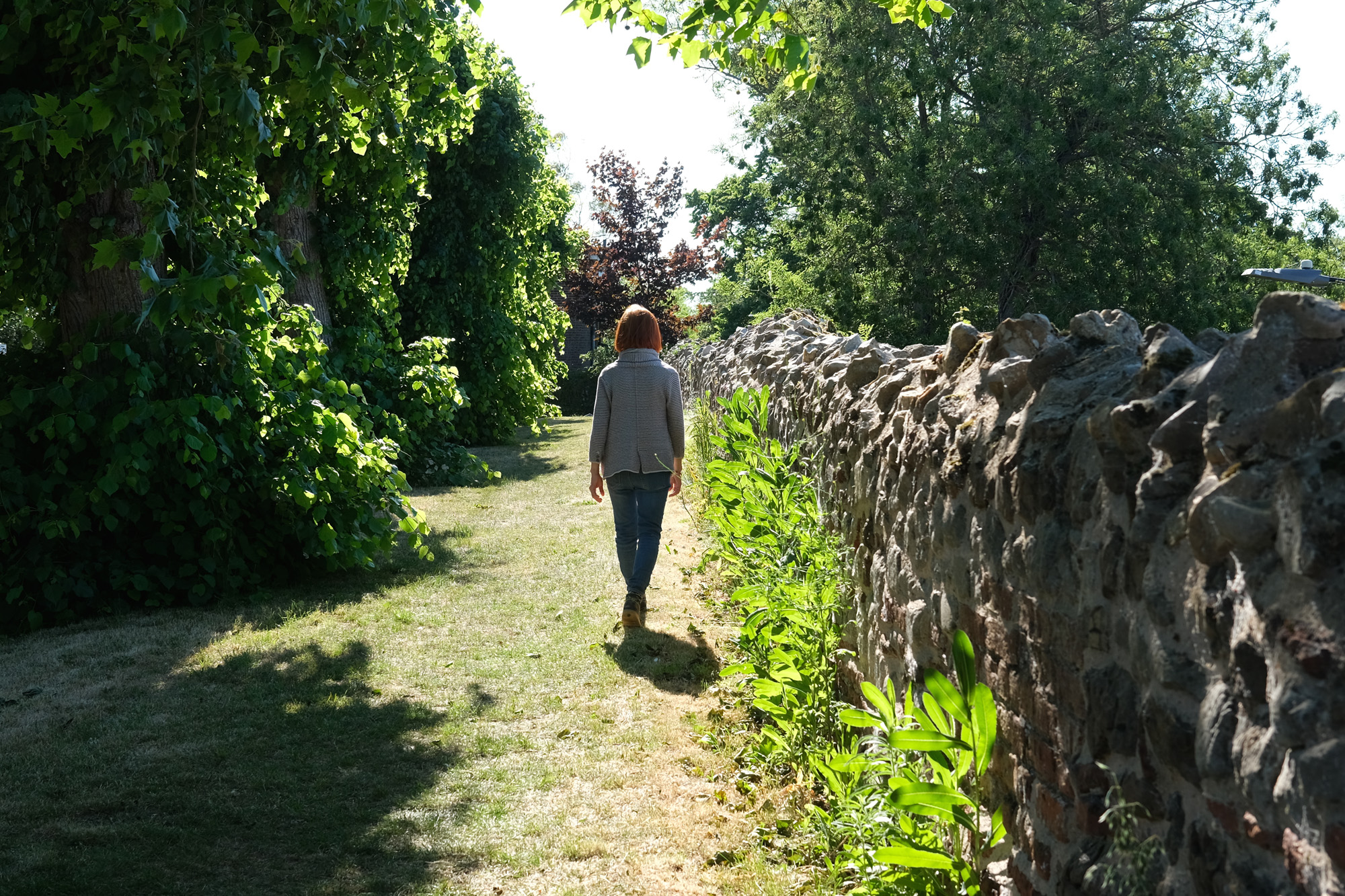
One of the keys to success in layering is to have meaningful correspondence between the different layers: between subjects in the foreground, middle-ground and background.

It’s not enough simply to fill up the image with layered content. There needs to be something more, such as capturing each element in an aesthetically pleasing position within the frame. You may need some luck to get it exactly right because you can’t control the subject. You can adjust only your viewpoint or the settings on your camera.

Three Steps

  1. The best way to capture a moment in time and preserve the various layers of interest is to use a wide-angle prime lens, such as 35mm or wider. You can still obtain a layers shot with 40mm or 50mm, but it becomes harder because you’ll lose focus in some of the planes.
  2. The next step is to start fishing in the right pool. Go somewhere that has an interesting background and plenty of action between you and it.
  3. Thirdly, you need to move in to get close to the action. While doing this, think about colour and form — the abstract elements that go into making the picture — as well as literal content, such as: what’s that guy doing? Will the kid jump? What are the words on that carrier bag?

If you’re lucky, you may achieve a composition in depth, especially if you get a clear view of distant action.

Easy? No, it’s like playing three-dimensional chess. But if you’re aware of any potential for these “layers of interest” then you are at least open to the possibility of achieving a good image.

I used these three steps in taking the featured shot (above), so let’s talk more about them:

One: Seriously, Which Lens?
It’s vital to keep foreground and background in reasonably sharp focus, a task that becomes harder with focal lengths longer than 35mm. However, if your lens has too wide an angle it will distort vertical lines at the edges: scarcely ideal if you’re shooting anywhere near buildings or street lamps.

Cameras with fixed 28mm lenses (Ricoh GR/GRII/GRIII; Leica Q/Q2) are clearly a great option, as are mirrorless cameras with lenses that give you 24mm or 28mm on full frame, or their close equivalent (such as 16mm or 18mm with the APS-C sensor format). I used 40mm on a full frame camera for the featured shot.

Two: Fishing In The Right Pool
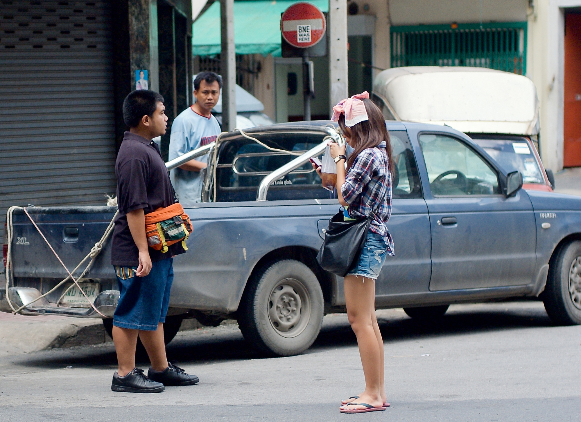
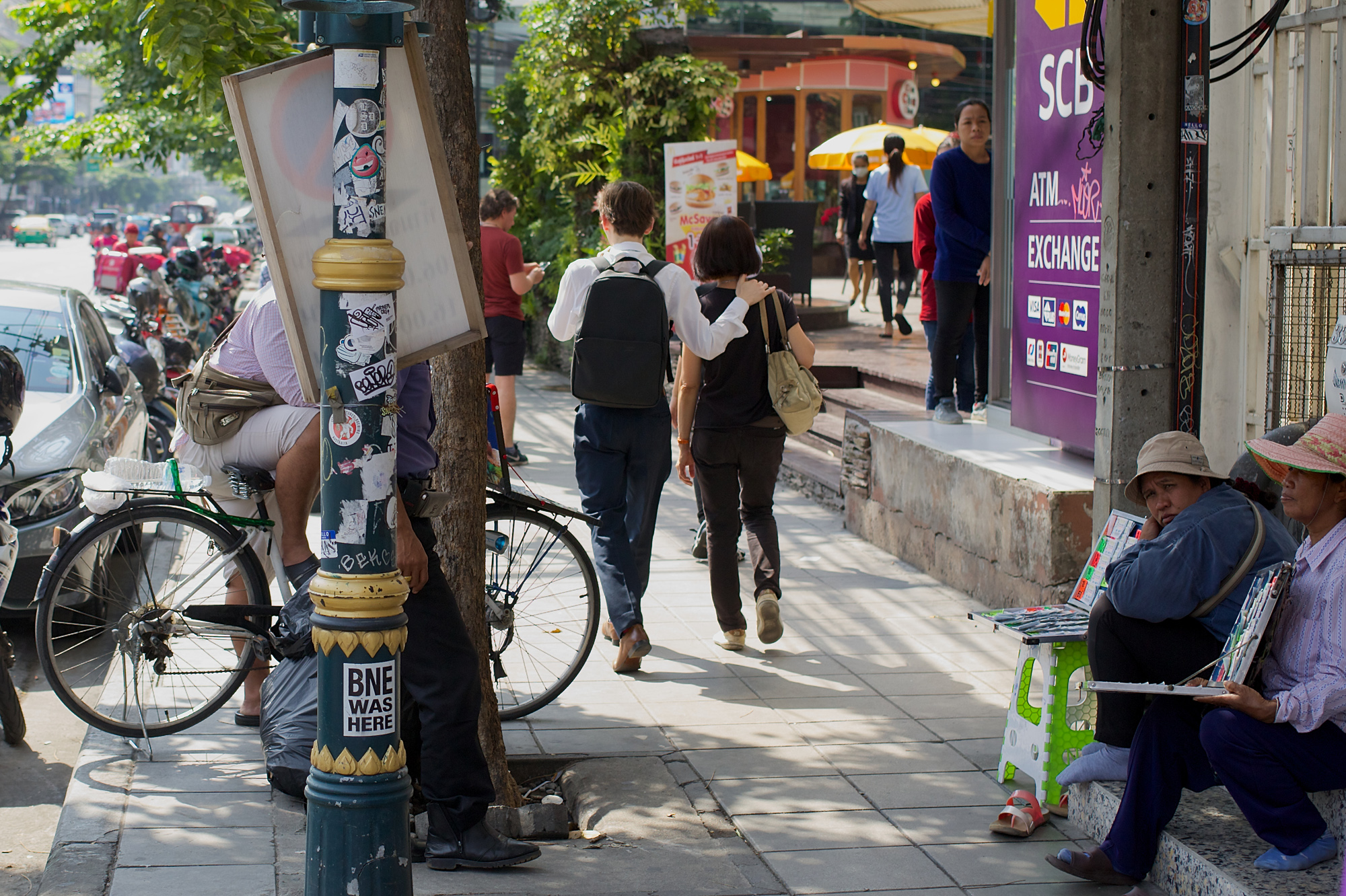
The best kind of location for layers shots is one where there’s some open space in either the foreground or middle distance. With this feature you’re more likely to find “planes of interest” rather than a continuum of background objects. (Needless to say, you don’t have to feature anyone actually fishing, although I’ve done that, too, in the shot above!)

Three: How Close?
You need to be within a few feet of the closest object, otherwise you’ll not get the all-important foreground layer to offset — or perhaps even frame — the more distant elements. As a rule of thumb, six feet is about as close as you can go without blurring the foreground when your focus is on something just beyond it.

I hasten to add that with an ultra-wide angle lens, a narrow aperture (and hence a longer exposure) you can get closer than six feet, although this combination rarely works for handheld street photography in average light.

Experience gives you the confidence to find the best point on which to focus for each particular lens and setting. Always remember: stopping down the lens will greatly increase the depth of field. Never attempt to take a shot with layers in mind if you have a fast lens with its aperture fully open. You’ll simply get one layer in focus. It may still be a nice shot but it’s not what we’re discussing here.

Focus How?
Camera reviewers are keen on cameras that have a touchscreen enabling you to select a focus point simply by tapping it on the screen. These days they tend to bemoan any camera that lacks this facility.

However, in street photography you don’t often have time to fiddle with focus points. If you have a split second to spare you should pick up focus from the appropriate distance (10 metres in the example above) and then quickly recompose the image by framing the subject as you wish. Alternatively, if even a split second is too long a delay, pre-focus manually.

Is There an Easy Rule of Thumb?
If you insist! Roughly calculate where your layers of interest lie, then choose a focus point about a third of the way into them. You won’t be far out if you’ve stopped down your lens. For this reason, I think it’s convenient if you have your camera set to Aperture Priority. This means you can adjust the aperture before taking the shot — and the shutter speed will look after itself.

How Many Layers?
My personal view is that three layers are quite sufficient in street photography. Going beyond three layers introduces levels of complexity that are completely out of control, unless some of them have objects that are fixed. In landscape photography you often see wonderful shots of rolling hills in the mist, with five or six layers gradually receding into the distance. On the street you rarely find that kind of subject, unless it’s a slow-moving queue of people lining up in zigzag fashion for a popular event.

Avoid Overlapping Figures?
Some photographers recommend it, others disagree. As in so many aspects of photography there is no hard and fast rule. If you try to keep all the moving figures completely separate you may end up with a somewhat disjointed image in which every figure occupies an island of space. I prefer to see some overlap, while always keeping a clear view of heads and maybe a limb or two.

It’s really important to prevent the onlooker from thinking “What a pity we can’t see what that person looks like.” At the same time, you don’t want unintended effects, such as a street sign that appears to be sticking out of someone’s head. Much of the challenge in taking layered shots involves keeping the layers apart and keeping the various components firmly in their right place.

What Works Best?
My personal preference is for locations where the background is not too far away. If you can see boats floating on water or if you catch a glimpse of the infinite sky your attention tends to wander off into the distance. This is not the dynamic response the layers technique demands. You should keep the eye moving backwards and forwards between layers, not dwelling on distant things.

Fill the frame
Wherever possible I like to fill the frame from edge to edge and from corner to corner. That’s the secret of a great layers shot. You can’t do it if one corner has a chunk of sky in it because all the visual energy will simply leak through into the ether beyond. The very fact that the most distant layer is an integral part of the subject means that your image will have an intimacy which is normally missing from standard street photos.

A layered photo may even be slightly claustrophobic because you’ve compressed the spatial elements in front of you and hemmed them into the image rectangle. Personally I love this effect, but it works best when there’s a focal point of interest near the middle of the frame with other supporting elements at the edges.

Not Just the Squirrel
The above image fulfills most of the criteria for layers that I’ve outlined in this post. There are three planes: the flag, the boy plus the squirrel, then everyone else. Most notably they fill the frame from edge to edge.

But what exactly is going on here? For me, the picture is filled with menace. I snapped it during a troubled period of demonstrations in Bangkok in an area where legendary American photographer James Nachtway had already taken a bullet on the previous day.

Despite outward appearances, these events with their rabble-rousing speeches and numerous side-shows were decidedly unsafe. Just ask the squirrel! Dressed up, coaxed and tormented, he delights the children but he’s watched with an evil eye by the balding lady on the left. The bare legs on the right belong to a person of indeterminate sex, as indeed does the hand that holds the boy’s wrist (strong hand, man’s watch, high heels).

Several faces are partially hidden but in this instance it all seems to work aesthetically. The balance of the image would be upset if we could see the whole face of the little girl with the tee-shirt. Her pink message: “Cool! Cool!” and the squirrel’s anthropomorphically effeminate gesture complete the image.

Working With Layers in Street Photography, Part One

In street photography, layers are successive planes of interest and action, occupying the foreground, middle ground and background, each one holding information that captures the viewer’s attention.

Together, these layers form a complete, “symphonic” image, taken in a single capture.

I use the term symphonic in much the same way as E.M. Forster used it in Aspects of the Novel. The symphonic novel represents the pinnacle of a writer’s achievement, being the most difficult form to create successfully but also the most rewarding for the reader.

For example, the symphonic novel will have multiple themes, each of which brings contrast or reinforcement to the main thrust of the work. Instead of “symphonic” you could speak of a novel as having “layers”: as in, for example, D.H. Lawrence’s complex work The Rainbow rather than in Thomas Love Peacock’s amusing but essentially one-dimensional satire Headlong Hall.

Alas, layers of complexity are even harder for the street photographer than they are for the novelist. For that reason, it’s not a good idea to say: “Today I’ll concentrate on taking photos with layers” because opportunities for them are few and far between.

Not Too Blurred
A shot that exemplifies the layers technique is one that has each layer in reasonably sharp focus. If any layer is severely blurred then it is automatically seen by the onlooker to be less important.

For example, I think I can claim the shot (below) to contain layers, but the foreground is really very blurred. I don’t think it matters too much in this instance because it creates a sense of mystery. It also provides a foil for the main subject — the two figures — and beyond them the people looking towards us, and beyond them the diners, and beyond them the layer of columns.

Stopping Down
To banish a blurry foreground you have to forget about using ultra-fast lenses wide open and instead make sure your lens is stopped down to capture sufficient depth-of-field from foreground to background. Mobile phones fulfill this criterion very well, but the downside is their lack of image quality when you want to make a big enlargement. The good thing (there’s always an upside!) is that you can stop worrying about bokeh, that lovely creamy out-of-focus effect you get only from the most expensive lenses.

One of the best-known layers shots was taken by Alex Webb in Mexico, entitled Tehuantepec, Oaxaca, 1985 (please Google it!) and shown in his La Calle exhibition. It depicts Mexican children playing in a courtyard with one boy at the front, in soft focus, spinning a blue ball on the tip of his finger. Behind him are successive layers of interest: more boys, passers-by, and some spectacular examples of blue and white ecclesiastical architecture, with striped columns and pilasters.

In an interview with The Guardian, Alex Webb said of his work in general: “The words ‘planning and forethought’ imply a level of rationality. Instead, I sense the possibility of a picture.” I know what he means because that’s exactly how I work myself.

Generations Through Time
In my featured image (above) I’ve deliberately used the layers technique to express the march of the generations through time. I took it at a local carnival, the sort of street event that offers plenty of good photo opportunities.

My point of focus is on the tall woman with the brown hair, hence both the girl nearest the camera and the elderly couple are in slightly soft focus. I think this is acceptable, even preferable, in this case. After all, it is the central figure who’s in the prime of life, surrounded by those much younger or older. She seems to take her responsibility very seriously, as if reflecting on the ephemerality of the event.

Yet I think the single most telling element in the picture is the fact that the two tallest of the marching girls, both of whom are in sharp focus, are those furthest away from the camera. They, as well as their chaperone, tower with the vigour of youth above the old couple.

This is the point about layers: they help you communicate an idea. They’re not just a visual trick to add “eye candy” to your photo.

In Painting
You can find all the compositional tricks of layers in western art from the Renaissance onwards.

For example, take Raphael’s great mural The School of Athens (1510), a virtuoso performance of five or six layers including three occupied by human figures. You can examine this painting for hours and still find visual delight in it. With its complex arrangement of groups of figures, each with its own dynamic, plus the overall effect of recessional space and all its intriguing literary qualities (which philosopher? which mathematician?) The School of Athens keeps the onlooker’s eye questing and moving across the image plane.

It is precisely this reaction we seek when presenting a layered photograph to the onlooker. When the onlooker is compelled to “read” the photograph rather than merely glance at it, that’s when you can deepen the bond with your audience and earn more appreciation for your work.

I’ll post Part II of Working With Layers at a later date. I promise: this next part will be more practical, with tips and advice on how to take a layers shot!

Hacked Off

If you’ve visited this site during the past month or so, you’ll have noticed the lack of updates and the absence of featured pictures at the top of the posts.

Sorry! The site got hit by the dreaded “Japanese Keyword Virus,” one of the most difficult computer viruses to eradicate, even given the many helpful “10 step” processes that security bloggers have posted.

The Japanese Keyword Virus turns your keywords on Google into links to Japanese sites selling clothes and accessories. It’s a kind of SEO spam that hijacks legitimate sites (like this one!) and ruins your reputation on Google.

Moving On
My son transferred and rebuilt most of the site to a new server, and I added the missing pictures. It all seems to work now, but there’s the also the impact of the more serious Covid-19 virus which has prevented me from getting fresh photos on crowded city streets.

I can post a few more articles, but it’s likely that their appearance will be intermittent, rather than on a normal weekly basis. I want to continue to entertain everyone (like the guy below) but eventually I’ll run out of decent shots.

At that point I’ll just provide an index to the existing articles (currently buried deep in the blog) and then update only when I have something new.

Because of this, it’s best to sign up for the newsletter if you’ve not done so already.

May you all be virus-free!

Is Imitation the Sincerest Form of Flattery in Street Photography?

Like everyone else, photographers learn from other people’s experience.

If you want to succeed — at cooking, carpentry, or rattlesnake venom extraction — you need to bear in mind how people have done it before.

The real problem arises when an original idea is at stake, as it often is in the creative arts. So is it OK to nick it?

A Glorious Past
Great painters of the past had no qualms about borrowing ideas from their teachers and peers. A few of them, like Raphael, even borrowed from their own students when a particularly talented apprentice joined their studio. Nonetheless, the whole process of “invention followed by imitation” can be irritating, especially when you’ve not yet had time to exploit your original idea.

I remember toiling in the hot sun, walking around Thailand’s fabled “Ancient Siam” — a 200-acre tourist attraction otherwise known as “Ancient City” or “Muang Boran.” It’s a favourite place of mine for personal reasons rather than because it’s a good location for street photography.

On one occasion I found an unusual but effective angle for taking a shot, only to be interrupted by some tourists wielding DSLRs. They noticed my viewpoint and crouched down beside me to get similar pictures.

I know I can’t claim ownership of a camera angle, but, even so, such blatant imitation was annoying. Photography is all about “Look at this…look at this” — and even more about “This is how I see this…this is how I see this.” Yet even acquaintances who notice me take a picture, sometimes walk back to the same spot and snap it for themselves. That’s a good reason for working alone.

Inspiration or Imitation?
If you imitate a photographer who’s in the process of taking a picture you’re little better than a karaoke singer belting out “My Way” in the style of Frank Sinatra.

Don’t be silly: you’re doing it his way!

But what about someone who sees your work, becomes inspired by it, and then tries to make something similar? Do you complain about it in a vicious blog post, or do you blithely accept that “imitation is the sincerest form of flattery”?

There are key differences between inspiration and imitation, the first of which is the time lag. It’s OK to be inspired by masters of the past. After all, they’ve had their day in the spotlight. They won’t mind if you learn from their work, or even if you copy some of their ideas. That said, it would be stupid of you to copy their style in its entirety as critics would soon point out your plagiarism. But you won’t mind if the critics say: “She was influenced by….” or “He built on the work of…”

A Transfer of Spirit
Inspiration is much less specific than imitation. It’s a transfer of spirit which leaves you free to express yourself, using the uniqueness of the moment to create something fresh and new. Imitation, on the other hand, is slavish copying, an attempt to reproduce an original effect by looking for the same composition and using an identical technique to record it.

Even so, there’s a thin dividing line between inspiration and imitation.

If you bop down and photograph a dog walking alongside its owner are you imitating Elliott Erwitt or being inspired by him? That’s a good question because you may never have heard of Elliott Erwitt yet you may have glanced at one of his most famous photos and entered that experience into your understanding of visual language. The entire process of “imitation” may happen below the level of your consciousness.

Such was not the case when I took the featured image (at the top of this post). Just before I took it I muttered under my breath: “I can’t resist it. Sorry Mr. Erwitt.” In fact, I didn’t think I was taking a serious shot which I could ever use. But then, looking at the photo on my computer I can’t help liking it.

Yes, I know it’s derivitive, but there are significant differences between it and Erwitt’s photos. For a start, it’s in colour. The dog looks more festive and jaunty than one of Erwitt’s sweatered chihuahuas. My dog is going places, not just hanging around looking snobbish-but-cute. Looking at the picture I can recognise my own style, not just a pale remnant of Erwitt’s style.

Territories of the Mind
Novelists have a habit of staking out certain “territories of the mind” that often correspond to territories in reality. Think: Thomas Hardy and Wessex or Emily Bronte and the Yorkshire Moors.

In this respect street photographers are no different.

Martin Parr began his career by making the English seaside resort his “territory of the mind,” later going on to colonise other places at home and abroad where he could photograph similar subjects with minor alterations to his style.

Even before looking it up for confirmation on his website I can detect that Martin Parr was heavily influenced — inspired — by the late Tony Ray-Jones. He, too, photographed the British on their days off at the seaside and did it so successfully that I would have been inclined to leave the subject alone, had I taken up street photography in the 1970s. It’s to Parr’s credit that he wasn’t deterred.

I hasten to add: I’ve never been inspired by either Tony Ray-Jones or Martin Parr.

Another example is the American photographer Berenice Abbott who took her lifelong inspiration from Eugène Atget. You can see his influence in her compositions, for example, in the way in which she would photograph a shop front, not head on but slightly to one side. (I’m always doing that — see below — but not because of Berenice Abbott or her mentor).

mannequin peeps out of shop door

A Transference of Culture
I don’t think you could accuse either Parr or Abbott of imitating the photographers who inspired them. They were simply participating in the transference of culture, a phenomenon in which we all take part.

Yet there are obvious dangers if you visit a place where an accomplished photographer has taken shots that have already brought him attention and critical acclaim. If the place and its inhabitants haven’t changed very much, you’ll find it hard to photograph them in a style of your own.

It’s easier in prose. Writing allows you to dig below the surface of things beyond which the camera cannot venture. In his book “Lacon, or Many Things in Few Words,” Charles Caleb Colton — the 18th century English writer who incidentally coined the phrase “imitation is the sincerest [form] of flattery” — wrote: “Nothing is more common than to hear directly opposite accounts of the same countries. The difference lies not in the reported, but the reporter.”

We can take heart from the Reverend Colton: there’s no permanent ownership of territory, whether of the mind or place. You can be inspired by others but look with fresh eyes and trust your own judgement.

Walking Around a Roman Wall

What did the Romans do for us? Well, here in my home town of Colchester (Essex, UK) they built a rather nice wall, much of which is still standing after nearly 2,000 years.

Not being able to venture too far afield during the recent (and seemingly endless) pandemic, I started to wonder whether the wall could serve as a backdrop for some street photos.

I took all of them with the new Fuji X100V, intermittently over a few days.

One Shot
On one day I took just one image (above).

Walking into Lower Castle Park, I was struck by the sudden appearance of yellow blossom in some shrubs near the railings.

There’s a great view of the wall from this viewpoint — and I noted the lone figure of a man in the distance. All it needed was something more… then the cyclist arrived with not one, but two bikes!

Changing the Direction of View
Here’s the same stretch of wall (above), looking back towards the gate through which the cyclist passed in the previous shot.

It was a lovely summer’s day in The Lockdown, with small family groups enjoying the sun. Recently, everyone had been “on tenterhooks,” waiting anxiously for the virus to disappear.

Oddly enough, I can say that the tenterhooks themselves have quite literally passed. For it was on this piece of land in the seventeenth century that Flemish weavers stretched their cloth – on devices known as “tenterhooks.”

The presence of the Roman wall makes the seventeenth century seem like modern history. Meanwhile, weeds constantly colonise the ancient structure, giving it a beauty never intended by the original builders.

Walking the Wall
One day I set out, with my partner, to walk around the wall in its entirety. It’s not a major trek, the wall being around 2,800 metres long, in the shape of a rectangle.

Today it varies slightly in height, according to its state of preservation, but much of it is 6 metres high and nearly two and a half metres thick. Its construction is said to have required 40,000 tonnes of building material.

Walking around it is far less onerous than building it, but don’t thank the Romans. They made the local Britons do most of the work.

The western stretch, running up Balkerne Hill, has little archways set within it, bricked up in the modern era to help preserve it.

One of the best preserved parts is the long stretch at the top of Balkerne Hill, past the huge gate (the Balkerne Gateway) which served as the main entrance to the town in Roman times.

Pressing On
OK, so this mini-project is degenerating into “wall photography” rather than street photography, so we’ll press on quickly to the far side of town where the wall is buttressed in Priory Street with huge bastions.

Another man walks past a wall! Oh dear!

I guess if I waited in a given position for a couple of hours, something more interesting might happen, but, remember, there were very few people around during this stage of the 2020 Lockdown.

So to conclude: here, in rapid succession are shots I took to complete the journey. First, I asked my partner to walk on ahead.

Yes, I know it’s cheating, but the light was great and I could have waited here for hours before anyone else passed this way.

Next, I snapped a cyclist heading towards the wall.

I did, in fact, wait a couple of minutes for someone to provide a point of interest in this shot (below) near Duncan’s Gate. No, there wasn’t a Roman called Duncan! The gate was named after Dr P. M. Duncan who excavated it in 1853. The little boy in the picture probably doesn’t know that.

And finally here’s a closing shot of a girl hurrying through a small archway set within the wall on the northern stretch where we started.

At least the above shots have something in common, so I think the idea of walking the wall was valid in street photography terms. However, such a project needs more time. I’ll work on it some more.

After all, neither Rome nor Colchester was built in a day.

If you’re visiting Colchester and would like to know more about its Roman history, take a look at:

Friends of Colchester’s Roman Wall

Visit Colchester, Britain’s First City

The Colchester Archaeologist

The Problem of Public Art in Street Photography

As a street photographer I’ve been keeping an eye on all these quirky bits of sculpture that keep appearing in places where you least expect them. I quite like one or two of them, like the Oscar Wilde memorial (above). Yet so many public sculptures are beyond awful.

What on earth were people thinking when they decided to ruin a lovely street corner with a cluster of fried eggs (Santiago, Chile), a crumpled plastic cup (Bristol, UK), or a drift of mischievous pigs (Adelaide, Australia)?

I usually avoid photographing statues and sculptures — in the same way as I avoid street performers, beggars, vagrants, and undercover police officers who are posing as beggars and vagrants. From a photographic point of view they’re all sitting ducks. Some of the sculptures are sitting ducks quite literally. An 85-foot tall duck sculpture by Florentijn Hofman supposedly “spreads joy around the world.” No it doesn’t, Florentijn. Stop it.

A Sample Collection
You can find collections of ghastly public art on Pinterest (including the duck sculpture and the others I’ve mentioned), where every piece contrasts unfavourably with all those wonderful examples of slick design elsewhere. Here’s my own collection — sample above — put together for this article. It’s called “Whose Idea Was This?” (click the link to see the full hideousness). Just imagine yourself taking a serious street photo anywhere near them.

…Thank you for coming back to read the remainder of this article after being exposed to those “amusing” examples of (mainly taxpayer-funded) public sculptures. I didn’t include any with real quality.

Quirky But Brilliant
You see, I’m not opposed to quirkiness per se. London’s distinguished memorial to Oscar Wilde (the featured image at the top) who is shown reclining in a coffin-shaped piece of polished granite in Adelaide Street, conversing exuberantly — his hand dangling a cigarette — is genuinely entertaining and moving. Created by Maggi Hambling and installed in 2004, it makes a real and meaningful contribution to London life. Its inscription, from Wilde’s play “Lady Windermere’s Fan” is: “We are all in the gutter but some of us are looking at the stars”.

My image shows how naturally Londoners interact with the Wilde memorial. However, the piece has not been without controversy.

Charles Spencer, former theatre critic of the Daily Telegraph, found the representation of Wilde “loathsome” and threatened to break it up with a sledgehammer and pneumatic drill. But then, he was equally disparaging of Hambling’s wonderfully evocative tribute to Benjamin Britten on Aldeburgh beach, calling it a “hideous pile of rusting scrap metal.”

Such philistinism! When widely published critics are so bone-headed about visual art it’s not surprising that local councils give the OK to mediocre work elsewhere. Hambling’s Wilde memorial emerged from decisions taken by a committee of distinguished artists, including the poet Seamus Heaney and actors Dame Judi Dench and Sir Ian McKellen. It’s the genuine article: fine art for the street.

Serious But Aloof
In our photos we can mock — or celebrate — the sculptures that have taken up residence in our cities. They vary in size from tiny busts on pedestals to huge structures that can be seen from miles around. Some of them disrupt the flow of pedestrians, others provide welcome shade. The worst of them are sometimes placed there as “photo opportunies,” in front of which people can take family snaps and selfies.

The coil at the entrance to Singapore’s Scotts Square (above) is an example of the “aloof style” of street sculpture: large, in keeping with the size of the buildings around it, but not in any way intrusive. Called “Undetermined Line” it’s by the New York-based French sculptor Bernar Venet, who once said: “It is not art if it doesn’t change the history of art.” Primarily a conceptual artist he explores ideas about indetermination, disorder, chance, and unpredictability — very much what I try to do in street photography. I like his work!

Unserious But Intrusive
I wish I could say the same for some of the sculptures closer to home. Britain is regularly assaulted with kitsch projects designed to involve the public not only in admiring but actually in creating the sculptures. They’re later put on display, mercifully for a short time, before being auctioned as garden ornaments. In the last few years we’ve had outbreaks of multicoloured cows, giraffes, even Wallace and Gromit figures, dotted around the streets.

Are they fun? Well, yes, they’re amusing and for that reason you can’t disapprove of them. They come and go, unlike some of the permanent installations that appeal to the same craving for visual stimulation. The street photographer has to find ways to come to terms with temporary sculptures, otherwise there’ll be a gap in the history of our artform when it comes to be written.

Whoever came up with the concept of painted giraffes had little consideration for the street photographer. Making a composition with such a tall object is too difficult. In the image above, I’ve solved it by chopping off the giraffe’s head.

Here’s my alternative solution (below). It’s the same giraffe, but head-only. I rather like the contrast between the figure of Victory on the solemn War Memorial in the background compared to the fatuously smug expression of the giraffe in front of it.

Mr. Spencer, can you bring the sledgehammer and pneumatic drill, please?

Do Street Photographers Need the Validation of their Peers?

Comedians get validation when people laugh. Politicians get validation when you vote for them. Street photographers get validation when you look at their work and don’t complain about it too loudly.

Among the many definitions of validation is this one from the Oxford Dictionary: “Recognition or affirmation that a person or their feelings or opinions are valid or worthwhile.”

I love the way “or” is repeated four times in that sentence! It’s like one of those vague recipes which says “use chicken, or beef, or lamb or turkey.”

However, if you think about it (and it’s actually a very well crafted definition), the most important words are not mentioned at all but merely implied by “recognition or affirmation.” The words omitted are: “by other people.” Hence: “Recognition or affirmation by other people that a person or their feelings, etc…”

Validation isn’t about you. It’s about other people.

Sub-Atomic Validation
In 1964 physicist Peter Higgs (and colleagues) proposed the existence of a particle which came to be known as the “Higgs boson.” If it did not exist then the entire structure of modern physics — the Standard Model, our framework for understanding the universe — would be seriously undermined.

There was little more Higgs and his colleagues could do except depend on other people to detect the Higgs boson with super-expensive equipment. After all, the particle breaks apart after a ten-sextillionth of a second, so it needed something powerful, like the CERN Large Hadron Collider to detect it. Nearly fifty years went by, then in March 2013 CERN announced its discovery. According to Forbes: “..the total cost of finding the Higgs boson ran about $13.25 billion.”

This vast expenditure was made, not to validate Peter Higgs, but to validate the Standard Model of physics. I’m sure Prof. Higgs was chuffed (as the British say) and he added the Nobel Prize that same year to the many other awards which had acknowledged (but not validated) his work.

I’ve mentioned the elusive Higgs boson because the story of its discovery sheds a little more light on our use of the word “validation.” By all means apply validation to scientific theories. It’s still one stop short of outright proof. But we should be wary of seeking validation for ourselves — our selves — because no one can be defined entirely by the opinions of others, except in the eyes of the world.

Photographic Validation
So what does it mean to validate someone who takes photographs? Does it mean you have to like their work? Or does it mean you want to acknowledge the sincerity of their motivation even though you may have reservations about their approach and the results they get with it?

In both psychology and photography, validation does not have to mean agreement.

The Psychology of Validation
For example, a close friend may have done something stupid that has landed them in a lot of trouble. You don’t want to condone their action but if you want to stand any chance of influencing them you need to validate them in such a way they can come to terms with what they’ve done. To invalidate them is to abandon them: a sure way of encouraging repetition of the mistake.

Psychologist Dr Karyn Hall has written: “Validation is one way that we communicate acceptance of ourselves and others. (It) doesn’t mean agreeing or approving. When your best friend or a family member makes a decision that you really don’t think is wise, validation is a way of supporting them and strengthening the relationship while maintaining a different opinion.”

Psychologist Dr Marsha Linehan (cited by Dr Hall) has identified six levels of validation from which you should always select the highest level appropriate to the problem.

The first and lowest level of validation is “being present,” listening to the person’s problem or dilemma. The second is “accurate reflection,” summarising and commenting to show you understand it. Third is “mindreading,” or making an intelligent guess about it. Four is understanding the person’s actions in terms of what’s happened to them in the past. Five is generalising: saying “anyone would have done the same.” Six is sharing their experience as an equal, based on similar experiences of your own.

Getting Straight To It
If you can go straight to number six and share your own experience directly then do so. Failing that, work your way back down the list. Your only option may be to listen and occasionally reflect, much as an expensive psychiatrist does. (Yes, I’ve seen “The Sopranos.”)

Apropos Street Photography
What does this have to do with street photography? Everything.

Whereas the person who photographs friends and family needs no validation other than a few likes on Facebook, the street photographer takes images of and for the public at large. Your friends may not be interested in pictures of people they don’t know, but you want to show your photos to someone besides yourself.

Some photographers work around this issue by joining online communities where they build a clique of admirers by exchanging mutual praise. Invariably the comments you read in these community galleries are very cryptic: “Nice capture!” “Gorgeous subject!” “Your shot reminded me of when I was there.”

Friendships develop and validation, of a kind, takes place. But I think a person can be left with the nagging sensation that it’s all a bit fake. You start to question: how long has the other person actually spent looking at my pictures? Wasn’t that comment about the composition (“Great composition!”) a little bit glib?

You end up thinking: isn’t the whole “community thing” an elaborate charade, a theatrical performance where everyone afterwards says: “Darling, you were wonderful”?

Many photographers join societies, such as the Royal Photographic Society, which give official validation in the form of “distinctions,” enabling you to place letters after your name. I’m mildly irritated when someone ignorant of photography asks: “Are you in the Royal Photographic Society” then loses interest in me and my work when I say I’ve never applied.

I’ve nothing against the RPS, but any institution that claims to arbitrate in matters of art is fallible, however stringent their procedures.

In the 1860s, the Salon de Paris, run by the Académie des Beaux-Arts, rejected the work of Monet, Renoir, Sisley, Pissarro, Cézanne, and Degas so frequently the artists clubbed together and formed their own association. I don’t know if Sotheby’s could put a current value on the works refused by the Salon, but it would be interesting to get an estimate.

Every artist desires recognition, but it’s quite possible to function perfectly well without it. Vincent Van Gogh famously never sold a painting, but his work was none the worse for it. Franz Schubert had only a small circle of admiring friends, few of whom came anywhere close to appreciating the full extent of his genius. His reputation is still growing after 200 years.

Finally, I would mention that “Validation” was the name of a 2007 movie, starring T.J. Thyne as a parking attendant who not only validates tickets but the customers themselves. He compliments them on their appearance and their personal qualities, in the process becoming hugely popular. He even finds himself in the news, validating George W. Bush and Saddam Hussein. Then his life hits a snag when he meets a beautiful woman, a photographer who won’t smile at his compliments…

Who won’t smile! We’re back to the comedian. “They laughed when I said I was going to be a comedian. Well, they’re not laughing now.” (Bob Monkhouse).

Validation? Forget it!

Will Street Photography Last for a Thousand Years?

I’m sorry for the ambiguity of the title. There are two questions here: will people still be taking candid street photos a thousand years from now? And will they still want to look at the street photos we’re taking today? Please note: I’ve already discussed the latter question from a 500 year perspective (“Will Anyone Want to Look At Our Street Photos 500 Years From Now?“)

Looking Back
To help us think about it, we can look back a thousand years, and, in the absence of photography, consider other media such as writing, painting, and sculpture.

For example, in The Pillow Book of Sei Shonagon, those charming observations of daily life in Heian Japan are still vivid and alive, much like the best candid photography of today. Although the incidents the author described took place a thousand years ago, they have an immediacy that speaks to us directly across the centuries.

So, yes, literature stands the test of time. Painting is more problematic. A thousand years ago painters in the West had not yet felt the need to portray daily life in their work, concentrating almost exclusively on religious themes. Eventually, artists like Pieter Bruegel the Elder could make ordinary life the subject of their work, as in his painting The Peasant Wedding of 1567 (below).

Ceramics and Sculpture
In both East and West, ceramics and sculpture from two thousand years ago bring us closer to the subject of daily life than do the more recent paintings of the early middle ages.

For example, in China, the funerary statues of the Terracotta Army, buried with the Emperor Qin Shi Huang around 210 BC, depict thousands of soldiers with individually modelled faces and physiques. Other figures, of acrobats, dancers, musicians — even bureaucrats — are probably the nearest we can get to “street portraits” in the art of that period.

For greater realism, for really candid poses and “decisive moments,” you would need to leap forward to China’s Tang Dynasty (618-907) for the finest quality wooden and ceramic figures like the one shown below: a woman playing polo. I think the person who made this figure could look at today’s street photos and find much to admire in them, while being a little surprised that so many photographers still cling to black-and-white, but that’s another matter.

[Woman Playing Polo, Tang dynasty, Art Gallery of New South Wales. Photo: Sailko. CC-BY-SA-3.0 via Wikimedia Commons]

Back to The Future
Having glimpsed the past, let’s turn the clock forward.

According to the late Professor Stephen Hawking, the human race will not survive the next thousand years unless it escapes planet Earth and heads off into space.

As the juggernaut of civilization moves forward, internal threats to human life become added to those from space itself. Professor Hawking noted: “I believe that life on Earth is at an ever-increasing risk of being wiped out by a disaster, such as a sudden nuclear war, a genetically engineered virus, or other dangers.”

A genetically engineered virus? Heaven forbid!

People of the thirty-first century, voyaging the universe, will view our landscape photography and be reminded of how the Earth developed over millions of years; then they will check out our street photography to see what happened on Earth in the twentieth and twenty-first centuries.

Changing the Viewpoint
By looking both backwards and forwards I’m doing what all street photographers do: changing the viewpoint — the angle, the perspective — trying to understand our role and position in the world, while all the time recording what I see around me.

Does it all matter? Clearly the future of the world matters hugely, but it’s less clear whether humanity’s future is of the greatest importance.

We may find ourselves replaced by beings of superior intelligence, when AI (artificial intelligence) runs amok and figures out ways to outwit us. Maybe AI will apply the brakes to stop us from destroying the planet, keeping us under control as pets in much the same way as we keep cats and dogs.

Perhaps intelligent robots will demand all the fun of doing street photography.

If there’s any photography.

If there are any streets.

When Your Street Photo Really Has to Be Square

Just before taking the above image I felt the familiar set of mental signals that tells me: “this is potentially a good shot.” The composition has all the elements I like: movement, purpose, engagement, colour matching (orange), colour distribution (blue), a curious object — no, two or three curious objects!

Yet even as I took it I had a sinking feeling that it didn’t quite work. There was a blank area at bottom left, too much car at top left and distracting detail on the other side of the pillar on the right.

I didn’t store the photo with the ones I like best until after I’d thought generally about the square format. I’d made several other images square by cropping them — and now I saw the potential for rescuing this one.

As a square image this photo works in a way it never could as a rectangle. I’d already tried it in portrait format, but that was even worse than landscape because it gave a distant view of the street beyond, distracting attention from the woman’s activity. Only a perfect square can counteract the diverging verticals, as long as one of them (I chose the grey pillar) is nearly upright.

Taking Another Look
If composition plays a major role in your street photography, as it does in mine, you’ll find that even slight adjustments can make a huge difference to the overall effect. Heavily cropping away two opposite sides is considerably more than a “slight adjustment,” so you need to know what you’re doing.

It helps if you go back to your work after a month or two and view it objectively. Once you’ve done so, try to recall what prompted you to take the shot and what you felt about it at the time. By cropping to a different format you can stay more true to your original intention than if you simply retain the entire image.

But be careful!

Cropping to square can lead you to places you’ve never been before. You’ll gradually start to see square compositions in reality. You’ll become a square street photographer. You’ll turn into Vivian Maier.

We readily accept Vivian Maier’s images because she shot with a square format Rolleiflex and saw a square image in her viewfinder. Today, the ubiquity of the 35mm format with its 3:2 ratio means that we’ve come to expect street images to be landscape or portrait, not something in between. Even the layout of web pages in WordPress (as here) makes the square image look slightly out of place, like an intruder in an otherwise well ordered world.

One Focal Length, One Aspect Ratio?
Nearly all good street photographers recommend the use of prime lenses rather than zooms. They do so because there’s no time in the heat of the action to mess around with changing focal lengths. Yet there’s also another reason: encouraging beginners to see subjects not only in terms of the subtended angle but also by the rectangle it creates.

Their advice is good. However, as you gain more experience you can start to become more adventurous and versatile. I’m not suggesting you mount a heavy zoom on your camera, but I do think you can start to vary the rectangle in your mind’s eye — changing occasionally from landscape/portrait options to seeing the composition as a square.

The Studio vs. The Street
Fitting people into a square format is easier in the studio. For example, in the days of Page Three glamour shots, photo editors on “The Sun” would urge photographers to use short models who could curl up into a compact shape to fit the tabloid page.

man on phone, squatting

In taking candid shots on the street we can’t be as deliberately selective as the pin-up photographer. Yet sometimes a person assumes a position that positively invites a square frame. Here’s one example (above). I took it from a boat on a canal with the camera in a portrait orientation.

Above the subject’s head to the left was a long fluorescent light which I’ve cropped out because it unbalances the composition. The result is a neatly composed and very candid portrait of a person in an everyday (if somewhat unusual) environment, taken from an angle that’s rarely possible on a normal street.

What’s Wrong With Square?
Finally, I think I should mention one problem I’m sure you’ve encountered with square photos: their static tendency. With all sides perfectly equal in length there’s no natural dynamic to encourage the onlooker’s eye to move from left to right or up and down. The invitation is just to stare at the centre because you can see the whole photo at one glance.

It’s because of the static nature of the square format that I’ve introduced diagonal lines in both of the images I’m showing here. The first one has the orange pipe on the left while the other has the foreground pole on the right. These two elements do much to enliven the images, making both of them more aesthetically satisfying than they would have been otherwise.

I could never make the square format my standard aspect ratio. Street photography cries out for dynamic rather than static treatment. But on some occasions there’s really no alternative to using the balanced, symmetrical, traditional, honest, totally conformist, hundred-percent kosher, strait-laced square.

BNE Was Here, There, and Everywhere

Going through my photos from Bangkok from last year, I came across the featured image (above).

It has the kind of juxtaposition I like: with the surfeit of visual messages on every object, including the woman’s body.

Most prominent of all the messages is one that says: “BNE Was Here.” It’s a message you’ll come across again and again if you take street photos in the cities of the Far East.

For example, here’s another one (below). I took it because of the distinct oddness of the couple: a girl with a big floppy ribbon in her hair and a boy furtively holding a cigarette while carrying in front of him a multi-coloured bag as though it contained something of especial value.

an awkward situation

The man, about to get in a pick-up truck, glares at me — perhaps worried lest I record some kind of illegal transaction.

Can you see the sticker in the background: “BNE Was Here”? I think this adds something extra to the image — not mystery, exactly, because these stickers are so ubiquitous — but a reassuring sense of familiarity when it’s most needed.

The BNE Affair
In case you missed the media coverage of BNE I suppose I should provide a brief explanation. BNE (or B.N.E.) is the logo used by a person who started scrawling traditional graffiti nearly thirty years ago. After a few years he turned to stickers, churning them out in their thousands and covering our cities with them: especially New York and Tokyo, but also Prague, Hong Kong, Kuala Lumpur and Bangkok.

Especially Bangkok. Here’s another example:

prominent sticker on lamp-post

(I snapped this shot on the way to lunch: that’s my son in front with his arm on his mother’s shoulder.)

Of course, there’s so much graffiti and so many stickers in Bangkok you could be forgiven for not noticing them. However, the media did start to pay attention and articles about BNE appeared in The New York Times and Forbes magazine.

Journalists even succeeded in tracking BNE down and getting his comments, learning that he not only generated about 10,000 stickers a month but also had help from colleagues to put them in place. His presence on key websites, like Flickr and YouTube, was greater than that of many multinational corporations.

Man With a Brand
Having built a brand that sells nothing, “BNE” saw the light (so the story goes) and decided to donate it to a good cause. He explained to Forbes magazine that he was spray-painting a wall in Jakarta when a woman said it must be wonderful to be rich enough to use paint in this way. So he agreed to paint her fence as well, listened to her life story, and learned how people in her city had to go without food because they spent so much money on water. This was the beginning of the BNE Water Foundation.

“BNE is a global movement dedicated to helping people in need get access to clean, safe drinking water and basic sanitation. We raise funds + awareness with art and BNE products.”

Click on BNEwater.org today and you get taken to a Water Damage Restoration Removal & Air Conditioning Repair service. Oh dear, whatever happened to all those donations?

Scandal Breaks
In 2014, scandal rocked the BNE venture when ANIMAL (animalnewyork.com) announced: “In a brazen act of chutzpah even by the standards of the graffiti world, where gaming each other is commonplace, pseudonymous global sticker-bomber, BNE, has fraudulently claimed to have collaborated on t-shirts with Banksy, the undisputed king of street-art, for the benefit of World Water Day.”

Apparently, BNE had falsely claimed to be collaborating with Banksy, whose work, unlike BNE’s ubiquitous stickers does at least have the combined virtues of invention, variation and humour.

Failing to receive any t-shirts — and aware that the product would not be authenticated by Banksy — donors started to ask for their money back. PayPal reversed all the payments and shut down BNE’s account. In a follow-up post on ANIMAL, BNE was described as “the sticker-bombing con artist BNE.”

The Unseen Tee-Shirt
This is a story of our times. Hundreds of people were prepared to believe an anonymous street artist when he said: “You do not get to see the artwork on this tee until it arrives at your door.”

Oh, that’s OK. Don’t bother to show us the product. Don’t tell us your name. We’ll just give you the money. And don’t tell us how you spend it.

BNE relied heavily on the power of photography to spread the word and establish a presence on the Internet, taking his “brand” beyond the city street and into the minds of people everywhere. I guess I’m continuing to promulgate the same virus with this article.

If it was genuine, I salute BNE’s intention to help solve the water crisis in the developing world. If it was not genuine, then I’d cry “Shame!” The message itself: “BNE Was Here” was certainly not always truthful. In many instances, “BNE Was NOT Here” would have been closer to the truth.

The BNE stickers will probably appear in future pictures, next time I walk around the streets of Bangkok. I’m not too worried. It’s unobtrusive compared to the Sainsbury’s bag in the UK. Its in-your-face colour ruined a lot of my local street photos, until I finally accepted it in the shot below. Thank heavens THAT’s gone.

Couple with four bright orange bags