Will Street Photography Last for a Thousand Years?

I’m sorry for the ambiguity of the title. There are two questions here: will people still be taking candid street photos a thousand years from now? And will they still want to look at the street photos we’re taking today? Please note: I’ve already discussed the latter question from a 500 year perspective (“Will Anyone Want to Look At Our Street Photos 500 Years From Now?“)

Looking Back
To help us think about it, we can look back a thousand years, and, in the absence of photography, consider other media such as writing, painting, and sculpture.

For example, in The Pillow Book of Sei Shonagon, those charming observations of daily life in Heian Japan are still vivid and alive, much like the best candid photography of today. Although the incidents the author described took place a thousand years ago, they have an immediacy that speaks to us directly across the centuries.

So, yes, literature stands the test of time. Painting is more problematic. A thousand years ago painters in the West had not yet felt the need to portray daily life in their work, concentrating almost exclusively on religious themes. Eventually, artists like Pieter Bruegel the Elder could make ordinary life the subject of their work, as in his painting The Peasant Wedding of 1567 (below).

Ceramics and Sculpture
In both East and West, ceramics and sculpture from two thousand years ago bring us closer to the subject of daily life than do the more recent paintings of the early middle ages.

For example, in China, the funerary statues of the Terracotta Army, buried with the Emperor Qin Shi Huang around 210 BC, depict thousands of soldiers with individually modelled faces and physiques. Other figures, of acrobats, dancers, musicians — even bureaucrats — are probably the nearest we can get to “street portraits” in the art of that period.

For greater realism, for really candid poses and “decisive moments,” you would need to leap forward to China’s Tang Dynasty (618-907) for the finest quality wooden and ceramic figures like the one shown below: a woman playing polo. I think the person who made this figure could look at today’s street photos and find much to admire in them, while being a little surprised that so many photographers still cling to black-and-white, but that’s another matter.

[Woman Playing Polo, Tang dynasty, Art Gallery of New South Wales. Photo: Sailko. CC-BY-SA-3.0 via Wikimedia Commons]

Back to The Future
Having glimpsed the past, let’s turn the clock forward.

According to the late Professor Stephen Hawking, the human race will not survive the next thousand years unless it escapes planet Earth and heads off into space.

As the juggernaut of civilization moves forward, internal threats to human life become added to those from space itself. Professor Hawking noted: “I believe that life on Earth is at an ever-increasing risk of being wiped out by a disaster, such as a sudden nuclear war, a genetically engineered virus, or other dangers.”

A genetically engineered virus? Heaven forbid!

People of the thirty-first century, voyaging the universe, will view our landscape photography and be reminded of how the Earth developed over millions of years; then they will check out our street photography to see what happened on Earth in the twentieth and twenty-first centuries.

Changing the Viewpoint
By looking both backwards and forwards I’m doing what all street photographers do: changing the viewpoint — the angle, the perspective — trying to understand our role and position in the world, while all the time recording what I see around me.

Does it all matter? Clearly the future of the world matters hugely, but it’s less clear whether humanity’s future is of the greatest importance.

We may find ourselves replaced by beings of superior intelligence, when AI (artificial intelligence) runs amok and figures out ways to outwit us. Maybe AI will apply the brakes to stop us from destroying the planet, keeping us under control as pets in much the same way as we keep cats and dogs.

Perhaps intelligent robots will demand all the fun of doing street photography.

If there’s any photography.

If there are any streets.

Must Street Photos Always Be Imperfect?

We live in an imperfect world — photography records the world as it is — therefore photography is always imperfect.

Looking at the impeccably finished images of advertising, fashion, and landscape photography you could be forgiven for overlooking this fact. After all, creative people strive for perfection — or at least try to make their work as good as it can be. Only in the street or on the battlefield does reality successfully resist our natural urge to make it appear aesthetically perfect.

I have a measure of sympathy with the view expressed by Canadian photographer Patrick La Roque, who makes this philosophical comment in one of his YouTube videos:

“To my mind street photography is not so much about location as it is about a method. It’s a way to approach photography; it’s a way to accept randomness and chaos; a way of reacting to what’s going on around you. I think this can be applied to anything.”

I agree that it’s necessary to accept — and perhaps even revel in — the chaos of the street. However, I don’t think we should necessarily carry this chaos directly through to our finished work. Like all artists, the street photographer brings order to chaos. That, surely, is the fundamental process of artistic creation.

Order and Chaos
A while back I read Camille Paglia’s book Sexual Personae and have already quoted passages from it in Street Photography Is Cool. Paglia believes the opposition of order and chaos is what produces all great art and literature. She finds figures in Greek mythology to embody each concept: the god Apollo represents order and control, while Dionysus represents chaos and the dark forces of the underworld that drive the energies of nature.

Working quietly in a studio, a painter may struggle to find inspiration but has no such trouble in bringing order to a composition. Outside on the street, the photographer can tap into the energy that’s being expended everywhere, but finds it harder to impose order and control — especially with an instrument that records what it “sees.”

In my featured image (above) I’ve placed three versions of “Downhill Walker” next to each other with varying degrees of straightening. Individually, none of the images looks perfectly straight because the woman is walking down a hill on which both a litter bin and a tree are at a slight angle. Placing the three images together, with the litter bin upright in the centre, seems to be the only way of making it look satisfying.

Far from Perfect
Maybe “perfection” is too strong a word. Most street photos are so messy they’re a million miles away from being perfect. We have to look at street photography differently from the way we view any other photographic genre. We learn to tolerate seeing one figure partially occluded by another; a face or a limb cut in two by the edge of the frame; or out-of-focus areas in the foreground.

In fact, these are all visual clues that tell us we’re seeing a genuine street photo and not an artificially constructed scenario.

girls snacking, chickens strutting

For example, you can tell that the scene (above) is a real street photo and not a staged pastiche. I don’t think I’d exclude even Canadian artist Jeff Wall from this statement: he’d pay the girls, buy the chickens, and devise the scene – but would he think of including a McGraw Hill logo which appears in the top right corner of the interior? I’ve only just spotted it myself — and McGraw Hill once published one of my books!

The image is very natural, very imperfect. Nothing counteracts the slant to the left and the chickens are dying to walk out of frame. Nonetheless, I like the image despite its imperfection because it’s not entirely chaotic. It pivots around the central strut holding up a tarpaulin which is out of frame at the top.

When It’s All in the Right Place
That said, there’s huge satisfaction in viewing — and even more in making — a street photo in which everything seems to be in the right place.

In the shot below, everyone is in a straight line, more or less equidistant from the camera. No, it’s far from “perfect” but it has a higher degree of order than the picture above.

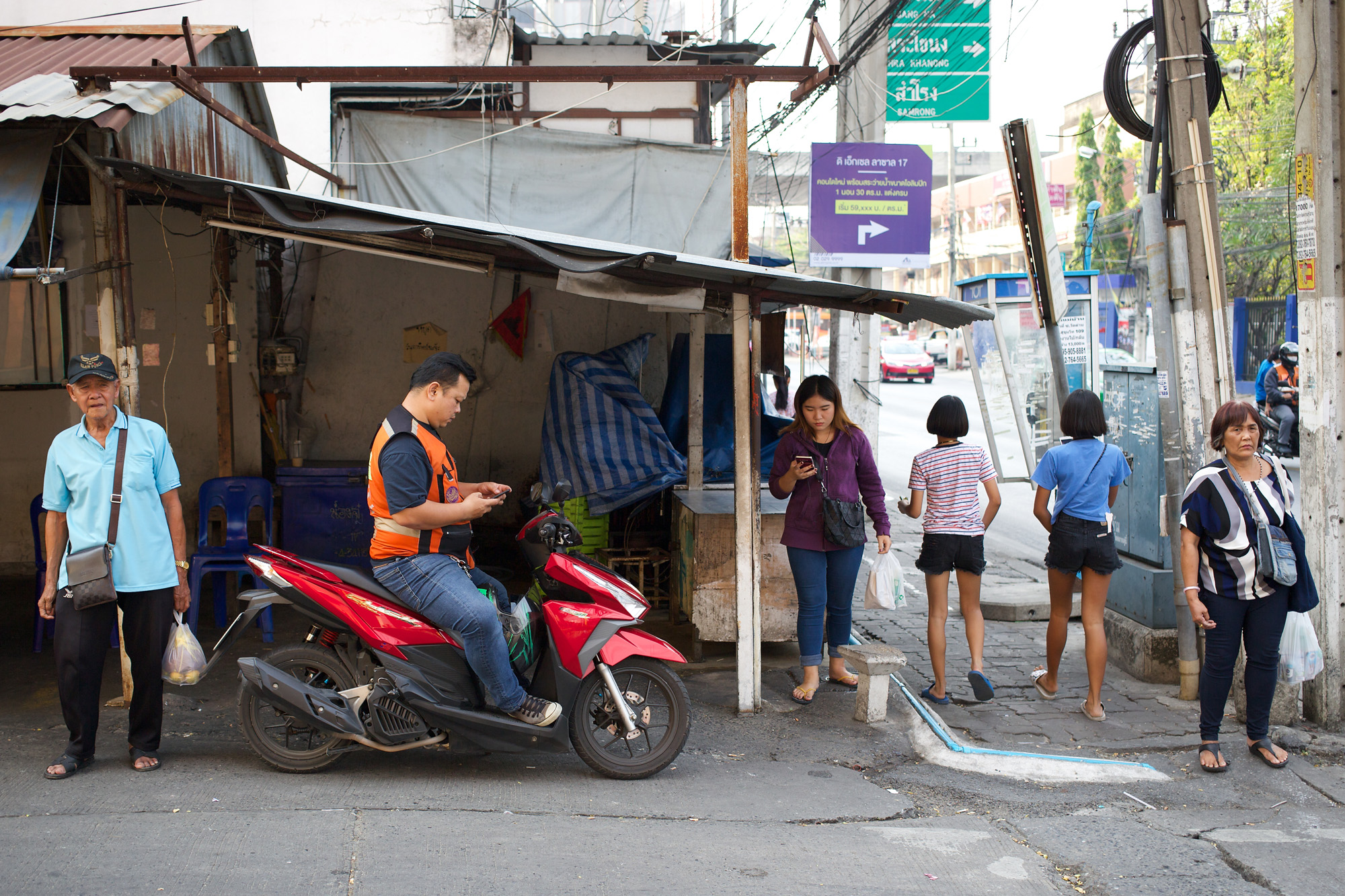
Street scene with six people, one on a motorbike

For example, you may notice that each person is a lone player, except for the two girls walking away from us, side-by-side.

It’s this discovered order, chosen from the chaos of the street, which gives it a distinctive look.

So yes, street photos are always imperfect, but the street photographer is always striving — in vain — for perfection.

How Fast Does the City Change When You Take Street Photos?

Before our great cities were locked down, making their streets deserted, they were places of swirling humanity. In fact, in the busiest areas the scene could change dramatically in a few seconds.

Here are my observations about this phenomenon, written before the world was paralysed by SARS-CoV-2 from Wuhan.

So Many Opportunities
Big cities offer far more opportunities for street photography than you’ll ever find in a small town. Why? Not necessarily because they’re bigger but because they contain huge crowds of people who gravitate towards the most popular areas.

I hasten to add that you can take masterpieces of street photography in small towns. (The work of William Eggleston springs to mind.) But to make your task a little easier you really need the flow of the multitude, the variety of faces and physical types, the quirks and oddities you get when millions of people huddle together in a few square miles.

A Sudden Insight
When I was hunting for a photo to illustrate an article called “Does Street Photography Look Wrong If the Image Isn’t Straight?” (not yet posted) I discovered the image you see above. I looked at it closely and to my astonishment I noticed an extraordinary detail — one which is the inspiration for this article.

As a result, I can now prove that the modern city changes from minute to minute with such amazing rapidity you can take photos that differ radically from each other in both mood and visual content — even when taken just a few seconds apart.

The people in the photo above are waiting for traffic to clear before crossing a road near Piccadilly Circus in London. They seem to be mostly bored or agitated, impatient to resume their relentless flow after being put temporarily “on pause.”

Looking Closer
However, there’s one exception. If you look at the far left, arrowed in the version shown above, you’ll see a Chinese gentleman in a very cheerful mood, laughing and chatting with a woman in red. I’m not sure why he’s laughing. There’s a large bag of rubbish precariously suspended on the pigeon spikes immediately above his head. (London is full of lavish monuments, but it’s a bit untidy in unexpected places.)

I immediately recognised the man in question: he’s the person smoking a cigarette in another picture, one I’ve called (for want of a better title) “Checked Out.” I was intending to use this shot for an article called: “Does Street Photography Look Wrong If the Image Isn’t Straight?” (not yet posted).

couple with red suitcase, sitting on the rim of a fountain

Incidentally, I have no idea whether this couple were checking in, checking out, or just back from shopping. However, I can tell you that they were clearly “on pause” and enjoying it, having a break from the flow of the crowd.

But what crowd? There’s no sign of any crowd in my photo of the couple although they’re clearly in the same location. Can the city have changed so dramatically in such a short period of time?

Checking Out the Data
All these questions prompted me to look up the EXIF (detailed information which accompanies each image as a side file, accessible with a photo editor). What I found was amazing. I had taken the crowd photo at 16:55 and 20 seconds and the photo of the couple at 16:56 and 23 seconds. In other words, I’d taken the two images just 63 seconds apart!

Just think of all the changes that happened in that long minute. The crowd of people crossed the road. I must have walked a little way down Haymarket then doubled back to the Horses of Helios where I photographed the couple. By this time, the woman with the red coat has removed her shoulder bag (it’s on her shoulder in the first photo) and taken out her phone. The man has stopped laughing and has sat down and begun smoking a cigarette.

When I’m in reflective mood, like the man at 16:56 and 23 seconds, I try to figure out a mathmatical theory for estimating the number of street photography opportunities that occur each day in our major cities. I think the number just leapt from billions to trillions.

The mood and visual appearance of a city can change in the blink of an eye. Go with the flow, attune yourself to its rhythms, and try to grab at least one or two of the trillions of opportunities being offered to you.

Alas, all of those things will have to wait until our streets return to life.

When Street Photography Is a Game of Two Halves

There’s a “retro” feel to my featured image today although I took it only two or three years ago. It does, however, illustrate one important point: that street photography — like football — can be a game of two halves.

We are constantly told about the “Rule of Thirds” and how helpful it can be when we want to create a satisfying composition. The rule is even built into superimposed grids in photo editors, as if we’re incapable of dividing an image into three by the eye alone.

Divide by Two
I’m going to make it really easy. Stop dividing by three and divide by two! Have something going on in one half of the image and something else in the other half. It works, given the right subject.

I watched this little train go round and round for a couple of minutes at a Pre-Christmas Fayre (that’s how they spell Fair in this part of the world, no wonder my shot is retro!) The little boy looked good, like Harry Potter on his first day at primary school. I wanted to get a photo with both him and the man who was operating the ride.

Why It Works
The almost-vertical row of lights provided the perfect solution. It divides the image more or less exactly into two halves, while being strong enough to form a central, unifying feature.

Why was it good to make this a game of two halves? Well, look at the image.

Everything points towards the boy. The man is gazing in his direction, although not directly at him. The coloured lights illuminate the boy, as does the bright floodlight at the top of the pole. Another set of lights can be seen behind the boy, whereas the man’s half of the image is dimly lit by natural light.

The boy’s train even “steals” a reflection of the railings! This little guy has it all!

A Study of Contrasts
I could have used this image to illustrate the idea of using contrasts in street photography because it is essentially a study of contrasts: age and infancy; experience and innocence; past and future.

I could even have used it to illustrate the concept of “layers of time.” The background is a medieval castle wall, built on the site of a Roman temple using many Roman bricks. The train appears to be an antique from the early twentieth century (but probably isn’t). The people are two generations apart.

A Balancing Act
However, the image is essentially a balancing act between two worlds. Each of the human figures occupies a world of his own and seems to be very happy with it. The little boy is in the first half of life, the man is in the second. Both halves have their challenges and difficulties, but for a moment the two people are united in time and space, if largely unaware of each other’s presence.

Group of people walking down an urban street past a realistic photo of a park

A Walk in the Park
My second image (above) is entirely different. It’s just a curiosity: almost an optical illusion.

At first glance it looks like two pictures juxtaposed, without any separating gap. But if you look closely you’ll see that it’s a regular street shot of people walking past a hoarding covered with a very realistic photograph. There’s even some graffiti at the bottom.

I like pictures that demand a second (and third and fourth) glance before you can figure them out. This one is slightly understated because its half-and-half composition suggests deliberate juxtaposition rather than optical puzzlement.

Alas, I don’t think many people give it a second glance, a fact that doesn’t upset me.

It just gives me an insight into the way in which an onlooker “reads” an image, jumping to conclusions before scanning the bottom of the page. It makes me careful to avoid doing it myself.

In the meantime I’ll continue, intermittently, to enjoy the “game of two halves.”

Birdwatching on the Street

What? No people in the street? Don’t worry, you can always find a feathered friend, or two.

Somewhile back I wrote a blog post called “Street Photographer Goes Birding.” It was a bit “tongue-in-cheek” because it featured a tiny Goldcrest sitting outside my window, to which I subjected my standard street photography technique: taking a candid shot with a 40mm lens. Being only a few inches away, this — the tiniest bird in the British Isles (barely an inch long) — filled the frame very nicely.

I can understand the allure of bird photography. Because birds flit from one position to another so quickly, photography enables us to study them more closely. We get to see them mid-movement, perhaps when they pause for a split second and seem to be considering their options.

Similarities
In fact, bird photography is very similar to street photography in all but subject matter and the type of equipment you need to do it. Birds go about their daily business such as shopping (catching worms), working (building a nest) and chasing the opposite sex (chasing the opposite sex). There’s really not that much difference between them and us.

They’re also similar to us in the fact that photography can make them feel uncomfortable. For this reason, the bird photographer often builds a hide (a bit like a bird building a nest!) and uses a telephoto lens on a tripod. This is not a good practice for street photography, so taking “ad hoc” photos of birds in the street has to be done with a standard lens — and the subject’s forbearance.

The Chinese Winter Heron
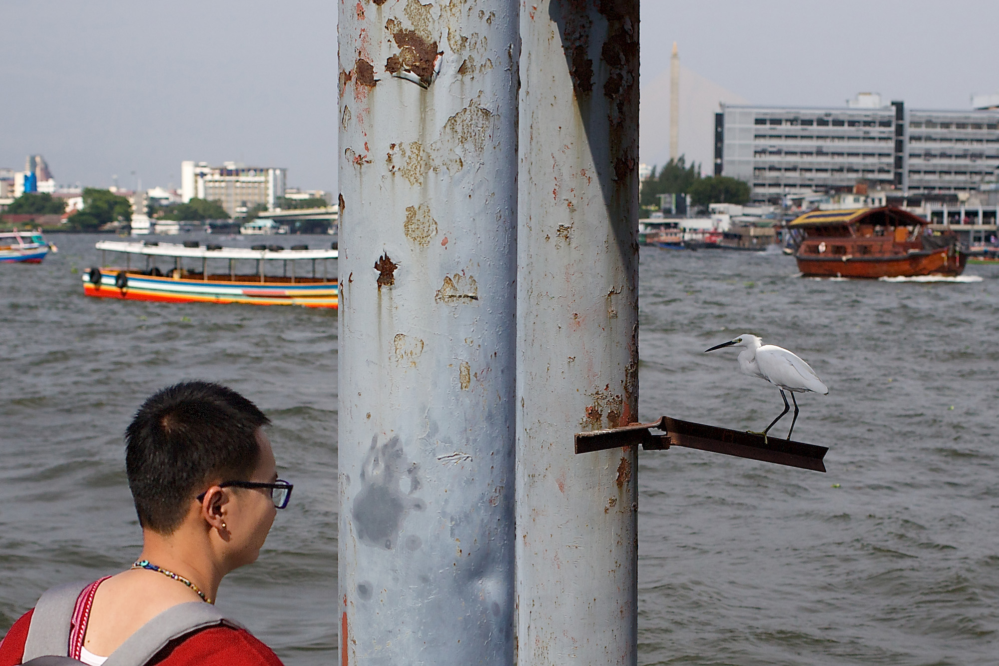
Having made a complicated artwork from this particular subject I’ll not easily forget the obliging bird that posed for me one lunchtime in Ayutthaya. (There’s a single frame from the series at the top of this article).

My objective was simply to take some shots of a passing barge-train, slowly making its way towards Bangkok. In the foreground there was some rusty hauling gear which I thought would add something to the image. Then, as luck would have it, a large heron, disturbed by the barges, flew into the frame and settled on the foreground object.

Over the next minute or two, the bird hopped around, sometimes looking directly at the camera with an old-fashioned Jack Benny stare, before flying off into the distance.

Woman watches an egret against a backdrop of the mighty river

More River Birds
I took these next two shots (above and below) on the east bank of the Chao Phraya near Wat Rakhang Kositaram (Temple of the Bells). In amongst the thousands of pigeons flocking around the waterside, are several scrawny white birds which squabble among themselves, seizing any opportunity to gain a favourable perch.

I’m not a birdwatcher but I guess they must be egrets of some kind. Looking them up online I’m grateful to timsthailand.com for identifying them as Great Egrets (black feet) and Little Egrets (yellow feet), rather than Intermediate, or Cattle Egrets. Please tell me if I’ve got this wrong!

Two large egrets, squabbling

Keeping it “Street”
There are human figures in the first two images but not in the third one. Maybe it’s time to call a halt to discussing birds otherwise they’ll edge out the human species altogether. If you look at this same location on Google Street View you’ll see they already have!

Candid Dogs

“You cannot be serious!” Surely, there are plenty of dog photos on the Internet. Why add to their number?

I confess, although I like most of the dogs I meet I’m not a dog lover, as such. I don’t enough rapport with them, and, big dogs in particular make me wary. I’ve read too many reports in the news about children and sheep being savaged and killed by them.

As a consequence dogs rarely feature in my street photography. The featured image, above, is an exception. It’s a street photo I was pleased to take.

Moriyama Dog
The other shots I’m showing here are not really serious, except for next one, which doesn’t fully live up to my technical expectations. I call this photo “Moriyama Dog,” because the subject reminds me of the famous shot by Daido Moriyama — the one with which he is forever identified.

Moriyama was the most prominent exponent of the photograpic style known as “areh-bureh-bokeh” (“grainy, blurry, out-of-focus”), so I guess I shouldn’t be too upset that my own shot is all of these things, and more.

stray dog, in headlamps

I love Moriyama’s work and regard him as one of the five (or so) greatest street photographers, but I’d never attempt to borrow his ideas. The picture above is just a one-off snap, taken in a traffic jam at night on the outskirts of Bangkok.

Art Dog
I found the Winged Dog (below) in a Bangkok art gallery, in a curious exhibition which resembled a storeroom of discarded works. The image you see is actually the official display, complete with stacked pictures and packing cases. Somehow, the dog ended up as “top dog,” as in “every dog has its day.”

dog with wings, amid other artworks

If you look up “winged dog” on Google Images you’ll find all manner of strange creatures, including many ancient and modern gargoyles such as those mythical beasts which grace gothic cathedrals.

On PicClick (“Search eBay Faster”) I discovered an entire industry devoted to winged dog gargoyles. Well, that was a surprise!

Dog with Hat
Intrigued by the PicClick result, I tried searching for “dog with hat” and was presented with “Dog Hat in dog supplies” (i.e., to be worn by a dog) or “dog hat in men’s accessories” (to be worn by men). I don’t think I’ll be getting either of those!

The best I can do is to lend my own silly hat to a dog, as below. He looks equally stupid in it.

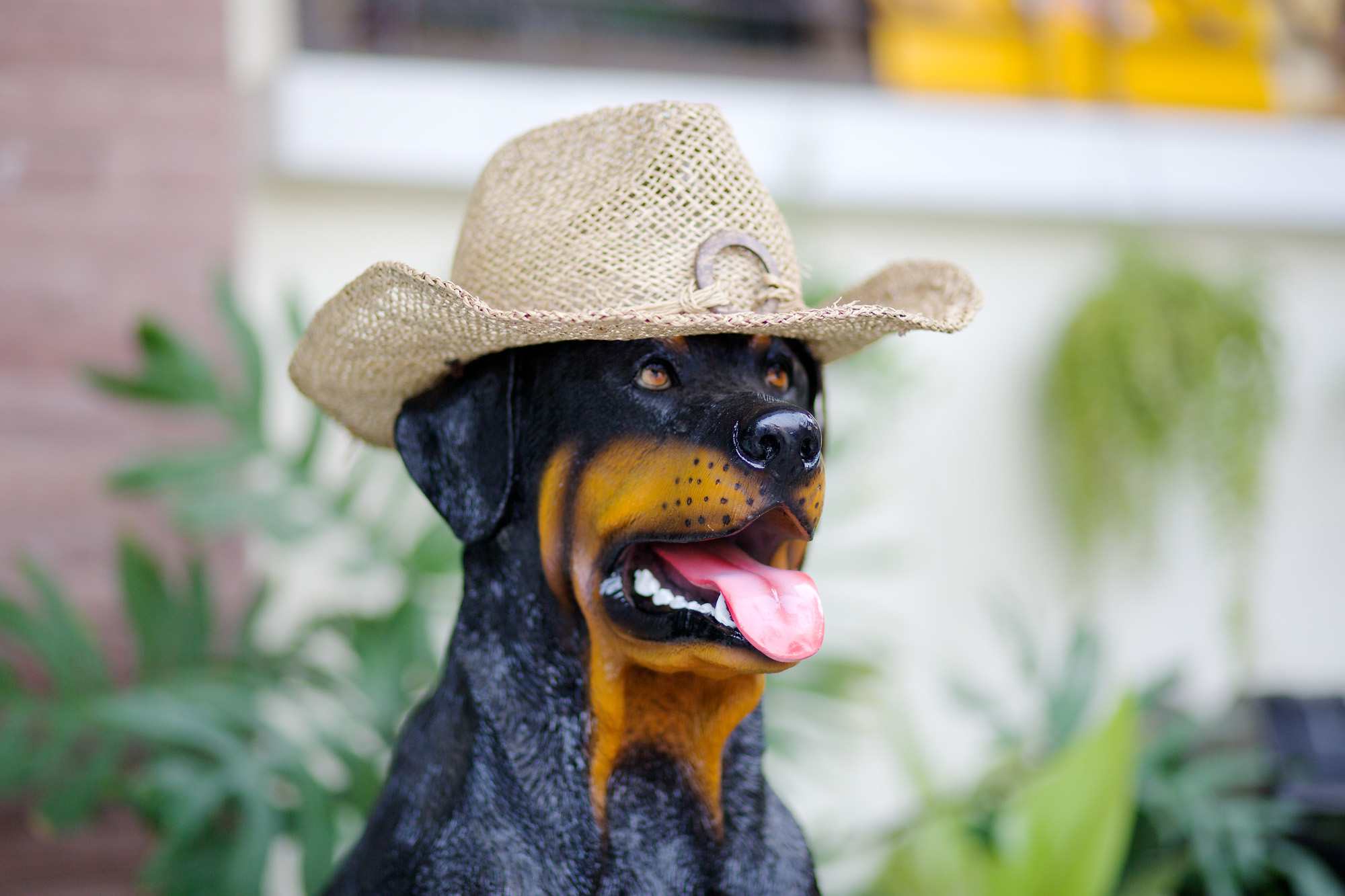
artificial dog sculpture, wearing my hat

Two More Dogs
Sometimes I chance upon a dog that’s dressed outrageously and I ask the owner if I can take a shot. I found the splendid creature below in a trendy restaurant (The Commons, in Thonglor, Bangkok), dressed in a black suit with a red kerchief around its neck.

white dog in restaurant

Naturally, other elements sometimes appear in my infrequent pictures of dogs, such as the next one which I’ve called “Cute, and the Dog’s Nice Too.”

poodle being admired; young female owner in shorts

I still think two legs are better than four, George Orwell notwithstanding. (The sheep, in Orwell’s novel “Animal Farm,” are persuaded to bleat the opposite — “Four legs good, two legs bad” — in order to drown out dissenting opinion during the farm animal revolution.)

Pensive Dog
I’m not sure if the next animal is “owned” or “abandoned,” but it looks in reasonable shape, if not as pampered as the two creatures above. Behind it, someone (the owner?) is donning a motorcycle helmet. Maybe the dog knows it’ll be on its own for a while.

Dog looks forlorn as person behind him puts on a crash helmet

Poodle in a Bag
Finally, here’s the ultimate in man’s determination to remain united with his pet at all times: the doggy bag. Looking closely at the image I can see the poodle is clawing at the man’s back pocket. I hope his wallet wasn’t in there! Dogs can be VERY expensive, can’t they?

poodle carried as if it were a shoulder bag

Showing the Abundance of the Earth

Whenever I see examples of Earth’s abundance I feel mixed emotions. First, I feel joy and I want to celebrate and give thanks, but I also feel a sadness: a sense that we are simply exploiting the Earth, always taking but rarely giving anything back.

Whether it’s agricultural products from renewable resources or fish from the wild, seeing the sheer quantity of them “en masse” can be truly shocking.

Pile ’em High
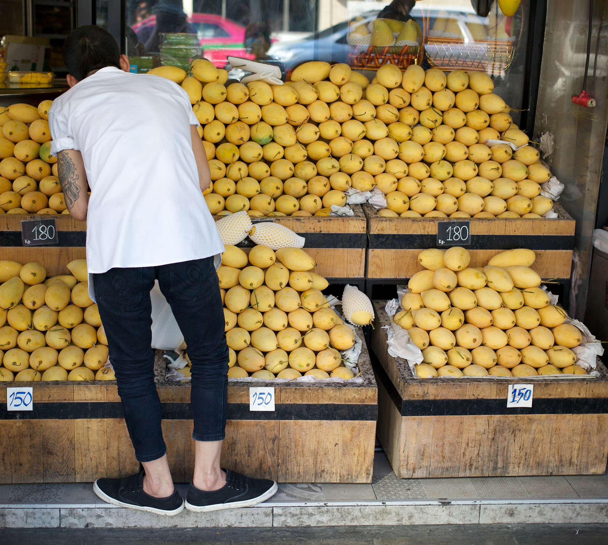
Retailers love to “pile ’em high” to attract attention and sell more items. The sales technique works every time, whether you’re selling books, beans, or, as above in the featured image, mangoes. And again, below:

The mango shop in Bangkok’s Thonglor district is one of those delightful stores that specialises in a particular type of fruit of the very highest quality. They’re doing it right. They care greatly for each mango, handle it gently and reverently, and source it responsibly. I think we can celebrate such a business and feel positive emotion, as long as they don’t use too many plastic foam sleeves.

More Worrying
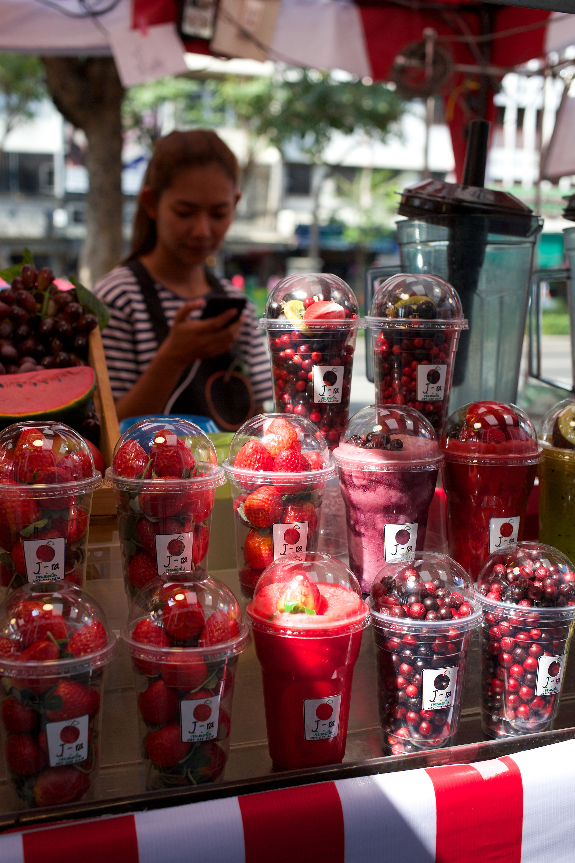
I’m more worried about the packaging of strawberries and cherries, as seen in the image below. Of course, these products look even more magnificent. They’re beautifully presented and appear utterly beguiling when a shaft of sunlight illuminates them, bringing out their brilliant colour.

But if all the strawberries (and other fruits) in the world start being packaged like this, I think it would terminate our planet very quickly. We’d become buried in a mountain of plastic.

Is there anything particularly poignant contained within the image? I’m not sure. I guess it depends on your attitude towards elaborately packaged products. The stallholder is checking her phone and doesn’t seem too concerned. I think she completes the image and the message it contains.

Yes, We Have Bananas
On Bangkok’s abundant food stalls you can find up to 27 different types of banana, often in two different shades: green and yellow. I think they’re wonderful to see when there’s no sign of packaging. Maybe no one’s invented individual sleeves for bananas.

I wish I could say the same for cantaloupes. At New Year’s, my partner’s father was given three cantaloupes by three different people and each one came in its own elaborate gift box. It’s becoming impossible to give fruit as a present without ensuring that it meets prevailing standards of gift-wrapping. You get plenty of gratitude, but it comes with more fill for the dumpster.

Pomelo Mania
One of my favourite fruits is the pomelo (above), the ancestor of the grapefruit. Driving through the salt flats near Bangkok, motorists come eventually to dozens of stalls selling pomelos and young coconuts at wholesale prices.

Again, in these places there’s the expression of abundance which I find so poignant, obliging me to ask the driver to stop so I can take some pictures. Here’s one with a scrawny cat passing a red bin. I don’t think the animal is greatly impressed with all the fruit. You can starve amid plenty.

Funeral Wreath
If you do happen to starve you’ll be needing a funeral wreath, the bigger the better. Here’s one, about to cross the road on its way to the temple. I wonder what sort of wreath we can give the Earth when we’ve finally killed it?

Why Words Shout Out Loud In Street Photos

If words appear in a photo it’s impossible to ignore them. They shout at us loud and clear. Even when they’re in a foreign language we feel their power. We know they will speak immediately and directly to anyone who understands their language.

In a street photo, words can eclipse the rest of the content. Writ large or small they are the first objects to catch the eye. What’s more: they’re everywhere: on posters, on street furniture, on tee-shirts and newsstands. You can’t easily avoid words when you’re out on the street, so maybe it’s best to make good use of them.

Sometimes I try to combine words on a sign or poster with other parts of the image, making them seem to comment on the action. Words are static within a photo so it’s important to contrast them by showing activity as well, otherwise you’ll end up with nothing but a still life. The result may not be a bad picture, but in street photography we’re mostly trying to capture the actual life of the street.

In my featured image (from Singapore, above) there can be no doubt about the subject, which is labelled in letters writ large. Once you’ve been lured inside the restaurant you’ll be able to read the “small print,” including a warning sign (at the top of the picture) and the apologies for “inconvenience.”

Colours and Contrasts
I often talk in this blog about the deliberate use of colours and contrasting content to create a meaningful composition. Sometimes the meaning can be discovered later, once you’ve processed the image and examined it more closely.

When I took the following picture I was struck by a combination of blues and blacks, with only a hint of any other colour in the frame. The lady’s face reminded me of an elderly aunt from my childhood, while the dog offered a wonderful contrast in both age and colour. Likewise, the coffee in the advert looks warm and inviting, whereas the lady and the dog are well wrapped up against the cold.

Only when I looked at the image more objectively did I realise that the old lady was clearly not a customer of CaffĂ© Nero and was unlikely to have been waiting for a skinny latte or cappuccino. I have to say I’m not happy with the dead space at the lower right, but I like the contrast between subject and setting.

Photographers tend to be more attuned to visual appearances than to the written or spoken word, making them less likely to pay attention to the effect of words on the viewer.

Anglo Saxon four-letter words are the most violent in the English language, but you often see them on tee-shirts or scrawled on walls as graffiti. For years, a disused cinema in my neighbourhood had the “C-word” etched back-to-front in dust on an inside, upper window. It gave a “too strong” flavouring to any street photo which included it in the background, rather as if a bitter spice were being added to the dish of the day.

Word On The Street
One photographer who notices words is Richard Nagler. He published a book called “Word On The Street” (Heyday, 2010) in which each photograph contains just a single word surrounded by other content. He describes how he was working on a different project in Oakland, California, when he saw an elderly woman looking of a window above a large (and unlit) neon sign saying TIME. On that occasion he failed to get the shot because the woman drew the curtains, but he went back (time and again!) until he saw her at the window once more and captured something similar.

You can find the image, among others in the series, on Richard Nagler’s website.

Gratuitous Language
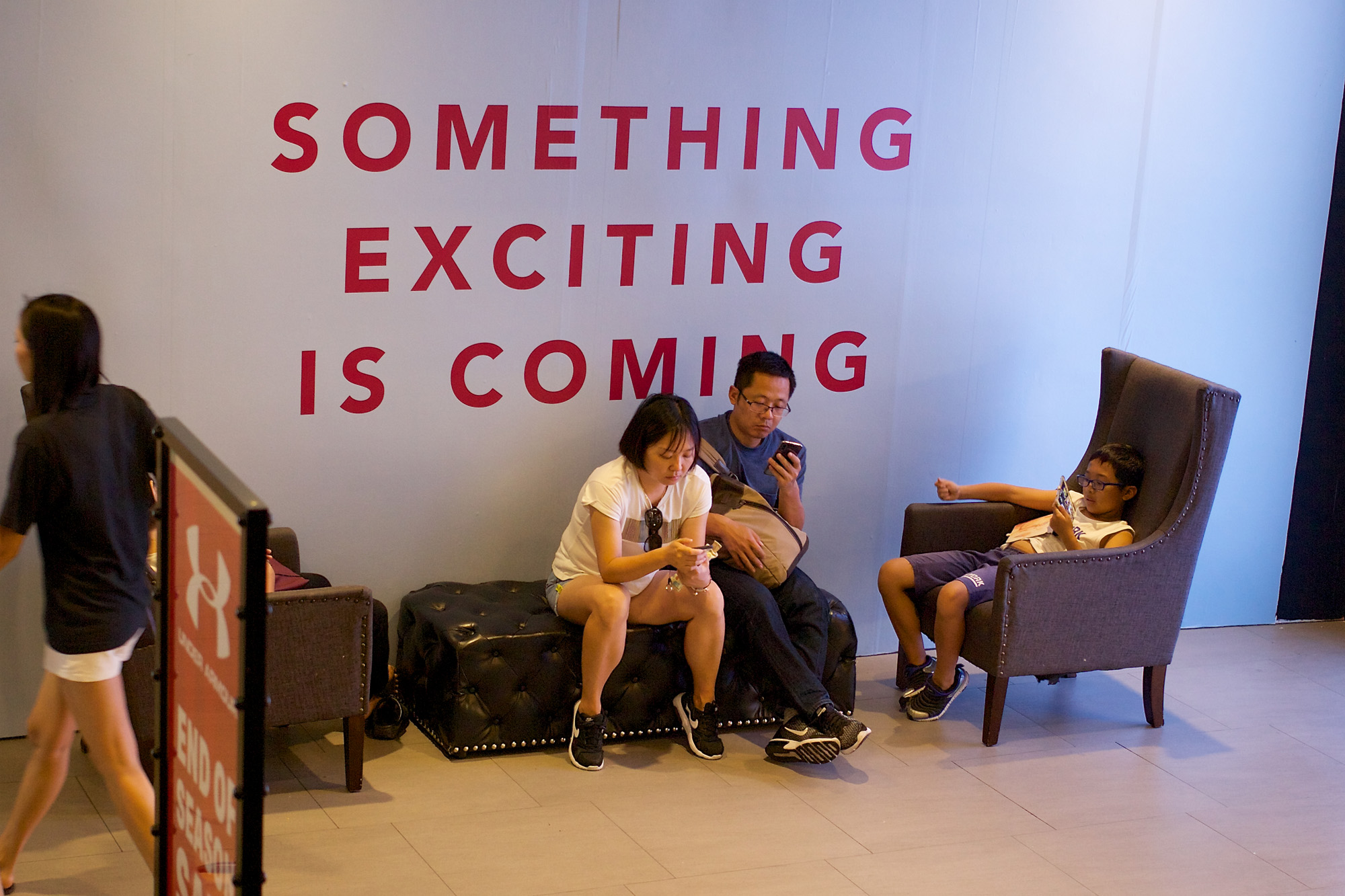
In stores and malls you often see words that seem purely gratuitous and meaningless, although they later take on meaning when the rest of the advertising campaign comes along.

Here’s a family in Bangkok who are time-wasting, maybe hoping that “something exciting” is on its way. It probably isn’t.

For excitement you have to go out on the street. There, girls parade with highly provocative, and, it has to be said, very amusing words on their tee-shirts. I particularly liked the one below.

Today, words and photography are inextricably bound together. You can no longer prise them apart.

The Art of Colour Matching

If your street photography is entirely black and white, look away now. Little of what I’m going to say in this article has anything to do with taking pictures without colour. It’s all about the art of colour matching.

The idea of matching various components of the image is not, of course, limited to colour photography. For example, in the absence of colour you can match shapes — and this has long been a favourite ploy of street photographers shooting in black and white. A bent elbow here, another bent elbow there. Voila! You’ve found two matching shapes in otherwise unrelated subjects — and the picture looks more satisfying as a result.

Exactly why images look more satisfying when there are correspondences within them is not at all obvious. Is it because we like to be reminded of coincidence? When coincidence is evident — as when two people assume the same unusual stance, or when two matching colours establish a bizarre commonality between otherwise unrelated parts of the image — there’s a satisfying sense of connectedness. Maybe it’s just wishful thinking on our part.

When we’re cut loose from the world — when the doctor snips the umbilical cord and says: “That’s it, kid, you’re on your own now” — we start to grow as individuals. Some people lose any sense of connectedness to nature, to the world around them, and even to other people. Yet even they may respond to the “irony of correspondences” when a photo shows unlikely (and possibly misleading or even non-existent) “connections” between unrelated parts of the image.

Man on a Bicycle
Take my featured image (above), which shows a man on a bicycle, waiting for the traffic lights to change. His purple jacket matches the purple chairs and the purple lettering on the window. Purple is the dominant colour in the picture. There’s plenty of red (the bike, the backpack); there’s a solid rectangle of yellow — which fortunately is somewhere near the centre; and finally a touch of blue and a barely noticeable squiggle of green.

The picture “works” because of the colour matching and it would certainly look less interesting in black and white. Does the colour matching make it more meaningful? That depends on how you look at it. The cyclist is completely unaware that he shares the same colour as the table and chairs — and, in a further extension of the coincidence, his blue jeans match the half-concealed blue table as well. He has a double connection to the establishment where the managers are so proud of the price of their beer.

I think colour does add meaning to the picture. The subject looks like he knows his way around town. He’s dressed for the part: a real street warrior. That his surroundings should echo his personal colour preference seems perfectly natural. You could almost imagine the whole of London turning purple as he races through the streets ahead of him.

Man on a Tricycle
Here’s a completely different example of colour matching (below). In this image there’s no single outstanding colour which connects the man on the tricycle to his surroundings. They all do. All, that is, except for the garish advertising sign on the back of the man’s vehicle. It’s the one jarring note of modernity in a photo that otherwise makes you think nostalgically of a changing world.

man on rickshaw

First there were hand-pulled rickshaws, then there were tricycle rickshaws — like the one shown — to be followed by motorised vehicles like tuk-tuks and taxis. As a means of transport the tricycle rickshaw is a vehicle in transition, neither fully mechanised nor entirely unmechanical in the help it gives to the operator via gearing and braking. It spans two eras, belonging to both at the same time.

The pastel browns, blues and reds of the rickshaw tricyclist are echoed in the crates and awnings of the background. In fact, the background is so close to the street it’s almost foreground, with the passing vehicle just a metre or so in front of it.

Again, I ask whether the colour matching makes the image more meaningful? I think it does. Apart from the fact that the tricycle and background both have the “feel of the street” (perhaps from a patina of dust, or from the muted shades of old materials) they both make a perfect foil for the new, glossy advert which undoubtedly provides a bit of extra income for the rider.

The rickshaw rider is moving out of the frame rather than into it. I timed the shot so the vehicle and rider would be seen against the striped awning rather than the crates. I’m glad I did. This man is not cycling into the future so much as leaving the past behind. I hope he finds a passenger soon.

The Pilot
To complete my trio of colour-matched street warriors, here’s another image (below) which I’ve called “The Pilot.” He’s not, of course, the pilot of the aircraft behind him. He’s just a guy who happened to be standing in front of it at the time. Nonetheless, his blue shirt and (look carefully!) red belt match the colours of the airplane perfectly.

man in fron of possibly fake aircraft

I have no idea whether this plane (or glider?) is “for real” or whether it was once a funfair attraction. At any rate, it’s found a permanent — or at least immobile — home on the forecourt of a filling station to the north of Bangkok. The dude with sunglasses saw me taking his picture and gave me a Lewis Hamilton smile. He seems so connected to the plane in every possible way I could scarcely pass up the opportunity.

Whatever else it does, colour matching links together the various components of the image to create satisfying harmonies and correspondences. Like the Chancellor’s annual Budget it all adds up and I “commend it to the House.”

A Moment of Concentration

Whenever I see people concentrating on an activity — any activity — I start to think of the photographic possibilities. It’s the very act of concentration that interests me.

Why? Because it’s inherently photographic. Concentration is focus — and focus is one of the main components of photography.

In optics, focus is all about bringing light rays as close together as possible. The pinhole in a pinhole camera does it — and so does the lens in a normal camera. A lens concentrates light rays into a tiny “circle of confusion” which always has a diameter, just as a pinhole does, so the focus is never perfect mathmatically. However, with a quality lens the focus is good enough to fool the eye, even when you enlarge the image.

Focus as Metaphor
We use the metaphor of “focus” all the time in daily life. The present moment is usually the focal point of human consciousness, even though memory can take us back a few moments, hours or even years, while our expectations can project us forward into the future. Most of the time, however, we’re aware of the “here and now,” even when “here” is somewhere in cyberspace and “now” has disappeared before we’ve had time to appreciate it.

By deliberately concentrating, we’re trying to reduce the circle of confusion, thereby bringing something into sharper focus in order to better understand or manipulate it. Think of the seamstress, concentrating on some intricate stitching; or think of the surgeon, reconnecting a nerve.

Every art, science, trade and profession requires concentration and focus. Without this deliberate narrowing of attention, nothing of value can be created.

Two women arranging flowers with great concentration.

Why Does It Work in Street Photography?
Images of people concentrating on a task in front of them can be as compelling as those which portray strong emotions. In fact, I’d go further and say they’re often better. By showing the act of concentration they also help onlooker to concentrate on the image. In photography — where sharpness directs the onlooker’s attention — concentration is contagious.

The principle at work here is the well-known one of “ideated sensations,” described succinctly by Bernard Berenson in his works on the visual arts. For Berenson, a person looking at a great Italian painting would be able to imagine the physical sensations felt by the subjects — particularly the stretching of muscles, an action which communicates a sense of energy and vitality. Not only that, in our minds we “feel” the weight of objects in the image and feel the textures of different materials, almost as if we were there in reality.

These ideated sensations of tactile values and movement are so powerful, Berenson believed, that they had the effect of being “life enhancing.” It’s a process by which onlookers recreate the image in their own living consciousness, aided by the skill of the artist (deceased long ago) who made this apparently magical transference possible.

Where Can You Place the Point of Concentration?
Conventionally, most photographers tend to place the focal point of concentration somethere fairly close to the centre of the image. For example, a photograph of a watchmaker works best if the subject’s face and the watch he’s working on are close together. This is because the idea of concentration is shown by the face as well as by the intricate task being performed.

The Featured Image
I’ve tried to be more adventurious in my featured image (above). Here’s a man who’s battling to concentrate on his mobile phone, despite all the distractions of real life.

I think it works very well as a whole frame, with the blurred background and the sharp point of focus at the top left. You may think otherwise, so here, for comparison, is a crop which places the point of concentration closer to the centre of the image.

detail of the featured image

Well, that’s not bad either, but it changes the meaning of the photo. While it increases our “ideated sensation” — because the man’s concentration now fills the image and we’re inclined to feel it more intensely — we’re missing the surrounding context. It’s this huge out-of-focus area that is every bit as important.

In my photo, the man’s view of reality has narrowed to a point which is far outside the picture frame. Perhaps he is taking a photo of a tall building, or else he may be trying to read the football scores or take a selfie. We don’t know exactly what he’s doing, but this doesn’t matter. He’s mentally focusing. In turn, I’ve focused my camera on him and thrown the rest of the scene out-of-focus, echoing the subject’s experience of the same moment.