As I’ve said approximately twenty times in these blog posts, “contrast” — in the broadest sense — lies at the heart of street photography. So here’s a potential theme with built-in contrast: domestic disputes set against a background of cheerful colours. Ironic, huh?
Psychologists often talk about the influence of colour on our daily lives. It plays an active role; it’s not just a passive backdrop to be enjoyed or reviled. Colour affects our moods and behaviour for reasons that are still unknown but which probably date back to humanity’s distant past.
Because colour seems to affect us emotionally, people develop preferences for one colour over another. There may even be a gender-based bias, with women preferring warm colours while men — most men, not all men — have a preference for cool colours. There’s even some academic research to support this generalisation (Whitfield, T. W. A., & Wiltshire, T. J. 1990).
Domestic Dispute
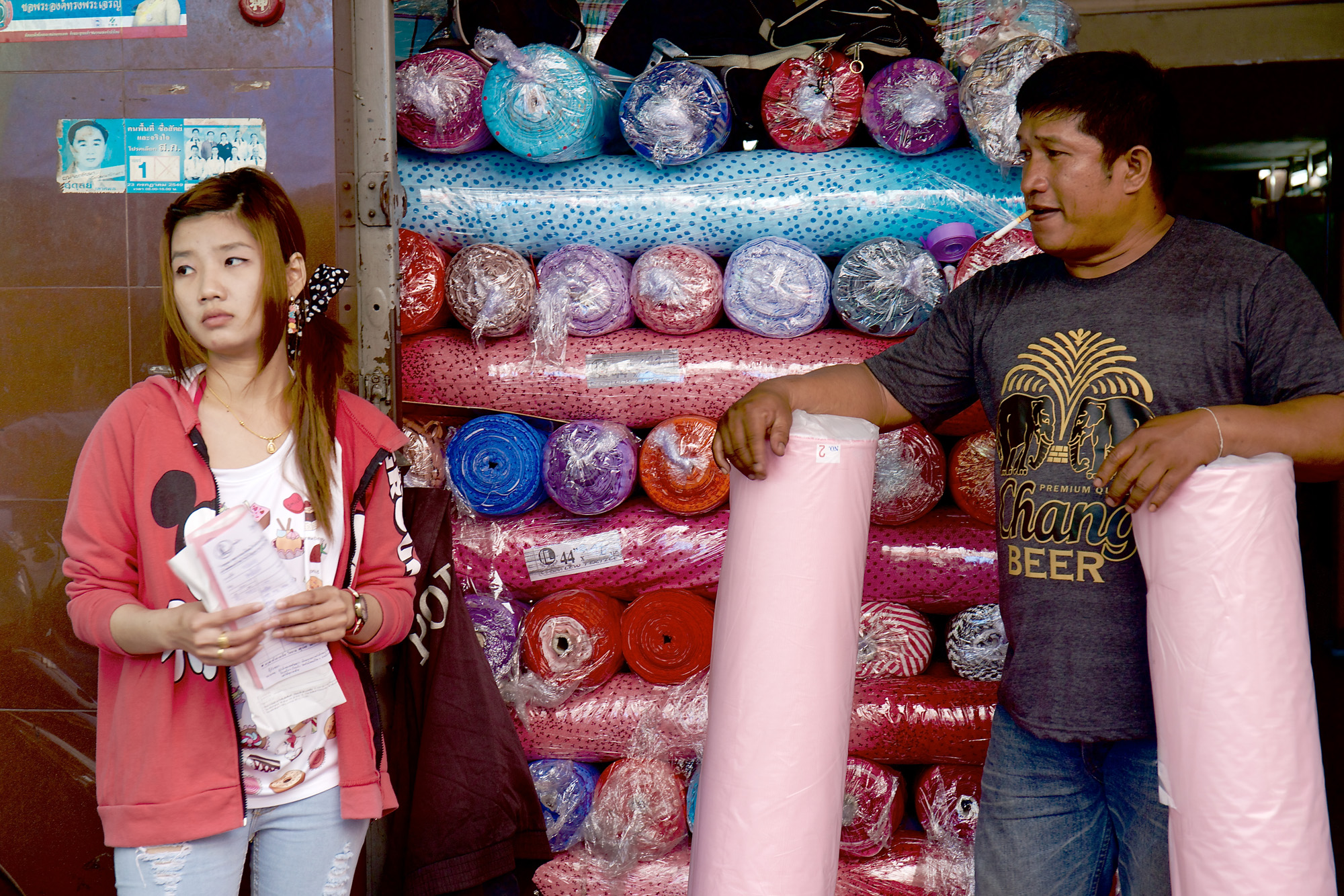
Is it possible that both men and women find a clashing mixture of colours to be sufficiently irritating to provoke a domestic argument? In my featured image (above) it looks like these two people have a strong difference of opinion. In fact, a dispute with recriminations seems to have broken out while standing in front of a colourful array of chiffon scarves.
I’m not suggesting that the scarves are in any way responsible, but I’m struck by the difference in appearance between the man and the woman. She’s dressed in neutral colours: black skirt, white shirt, and carries a white shoulder bag. She’s also clearly cross about something and has put the man on the defensive. He in turn wears a turquoise tee-shirt, a jacket with bright orange flashes, and rides a bright red scooter with a red, but not-quite-matching helmet.
No wonder she’s upset! Happy couples tend to wear colours that complement each other. These two — if they are indeed a couple — don’t dress harmoniously, although the woman may have restricted herself deliberately to neutral shades because her man has no colour sense whatsoever. In these circumstances, the only way a woman can express herself is to raise objections.
Chromotherapy
The science (or pseudo-science) of curing people of ailments by using colour to correct the imbalance which is supposedly the cause of the problem is called “chromotherapy.”
Chromotherapy seems to me to be a colourful version of homeopathy. It has a huge following. It’s used successfully in many instances — and it has a large supporting literature which explains it in scientific language without necessarily winning the support of the scientific community at large.
Modern chromotherapy dates back to the work of Edwin Dwight Babbitt (1828-1905), an American spiritualist and physician who established his own college — the New York College of Magnetics — which issued degrees to students qualifying them to administer colour-based treatments. He even invented a device called a “thermolume” which was able to concentrate light in various colours on to different parts of the body. In another approach, he irradiated water with colour-filtered sunlight, claiming that water retained the unique energy of each particular colour.
Is there any truth in chromotherapy? I’d be surprised if it were completely devoid of truth, but reading about it is like wading through treacle. Its exponents elaborate on it with smatterings of quantum theory, possibly in an attempt to bring it up-to-date and make it seem respectably scientific. But I can’t bring myself to believe a word of it. Frankly, it’s only a matter of time before someone invents a comprehensive, colour-based religion in which every colour represents a pathway to God.
Colours in a Lower Key
Coming back down to Earth — and to street photography — here’s a more harmonious image (below).
In a sense, this photo is the reverse of the other one. This time the man wears neutral colours whereas the woman is dressed in tasteful pink. The goods on display show a marked preference for warm colours, with pinks and reds predominating.
As you can see, the woman is looking off to the left, away from the man. For whatever reason, her expression is a bit grumpy, as though she’s either bored — for lack of customers — or waiting impatiently to be served.
There’s another possible scenario in which the woman is the customer, waiting for her husband to show up with some cash, while the man in the picture waits patiently with the two rolls of material she’s trying to purchase.
There can be no wholly accurate interpretation of the photo. Viewers will have to create their own narrative to explain it. To me, it looks like the man with the cigarette dangling from his lips is trying to woo the girl by showing off two massive rolls of material in her favourite colour — but she’s refusing to be impressed.
In Pursuit of Ambiguity
The photo is impenetrable and therefore ambiguous, once we’ve imposed our own narrative on it. In street photography, ambiguity is a virtue, but science can’t tolerate conflicting explanations.
I doubt if any science is more complex than the theory of colour — so inextricably linked to human perception. Perhaps, in our observations of colour, we should think more about relationships than about the specifics of red, white or blue. Here’s what the master of abstraction Piet Mondrian had to say about it:
“Everything is expressed through relationship. Colour can exist only through other colours, dimension through other dimensions, position through other positions that oppose them. That is why I regard relationship as the principal thing.”
He was right. Spread the word.