If You Borrow a Poster, Put It To Good Use

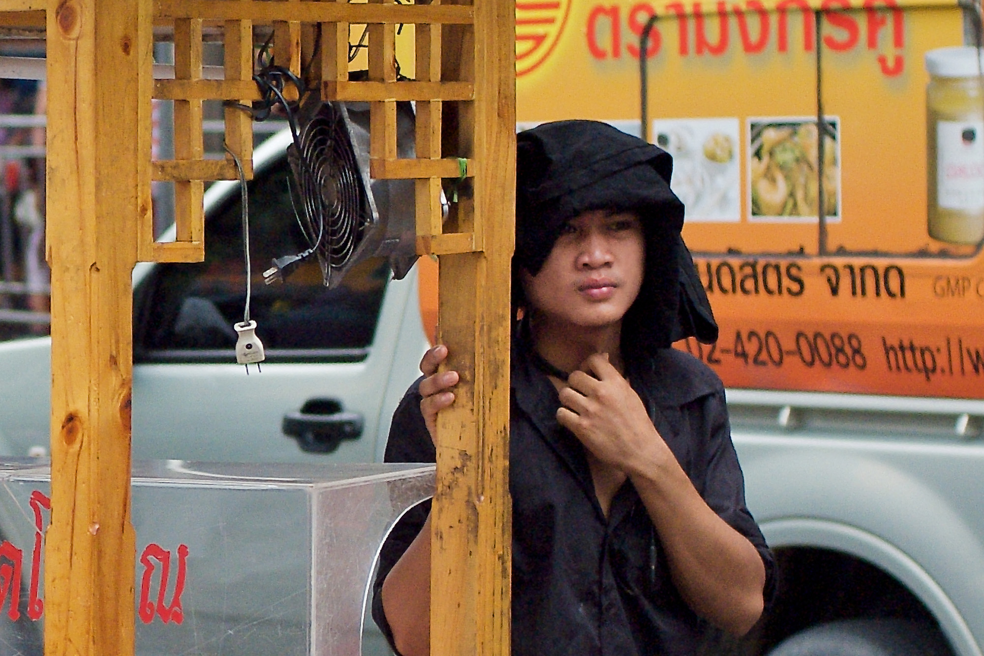
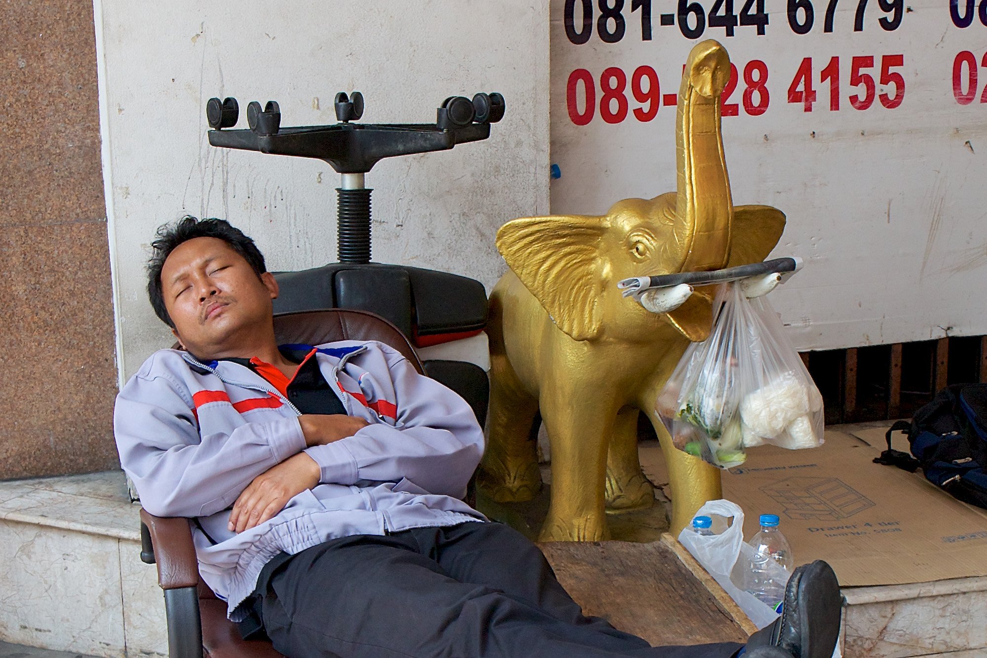
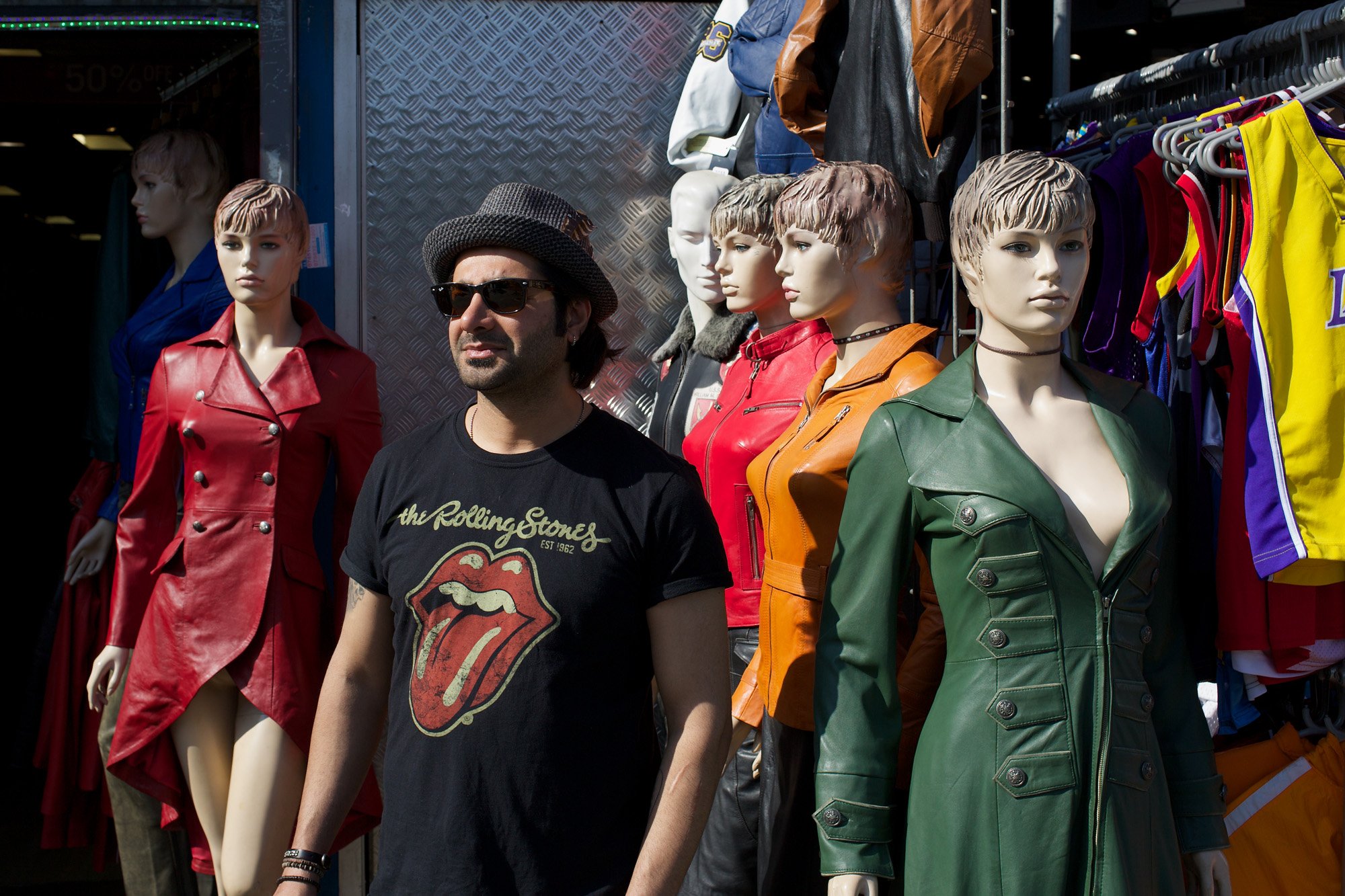
Do advertisers mind if you include their posters in your street shots? No, they encourage it. They like to see their adverts reproduced in as many places as possible. It’s one reason why so many posters are amusing and “high impact” — and why they positively invite selfies and photo ops of people standing next to them.

This is especially true of posters located close to the ground, at bus stops and waiting areas. There’s much to be gained by having everyman and everywoman displayed in close proximity to the image in a poster. It connects the public to the product. In this way, the product insinuates itself into our collective consciousness and becomes part of the fabric of daily life.

In my street photography I take it for granted that this devious process is taking place, but I don’t attempt to fight it by ignoring the posters. What’s the point? In a hundred years time the product being advertised may have long gone out of fashion, its manufacturer bankrupted by changing tastes. The world moves on, but street photography is forever.

The Eternal Triangle
In my featured image (above) there are several elements playing their separate roles and the Kurt Geiger poster is just one of them. The shape of the poster is repeated in the white rectangles at the top of the frame. Huge columns separate the two real-life figures, a workman in overalls who’s just bought a sandwich and a pregant woman who’s taking a distant photo into the bright sun.

Please don’t ask me for the “meaning” of this picture. While I certainly don’t think its meaningless, I can’t quite put into words any precise explanation of it, other than to analyse the composition. At the time of taking the shot, I saw the image as a whole and composed it deliberately to achieve the effect you see.

When I saw that the model in the poster was wearing sunglasses and appeared to be looking directly at me (and my camera) I was naturally interested. I had to wait for the two figures to move into position and they duly obliged. I had in mind the idea of contrasting real-life people with the image of the glamourous model, but I think the picture has turned out differently. It’s really about photography.

The glamourous model, the pregnant photographer in pink, and me (or you the onlooker) form a triangle that almost encloses the worker and the two huge columns. The whole composition hinges on the man who is closest to the centre of the image. In particular, the whitest and brightest feature is the man’s overalls which identify him with the workers who built and now maintain the magnificent setting.

In other words, the workman is actually part of the background, despite his visual prominence. The real subject is the photographic triangle: us, the model and the woman in pink.

At least, that’s one way of looking at it.

Big Yawn

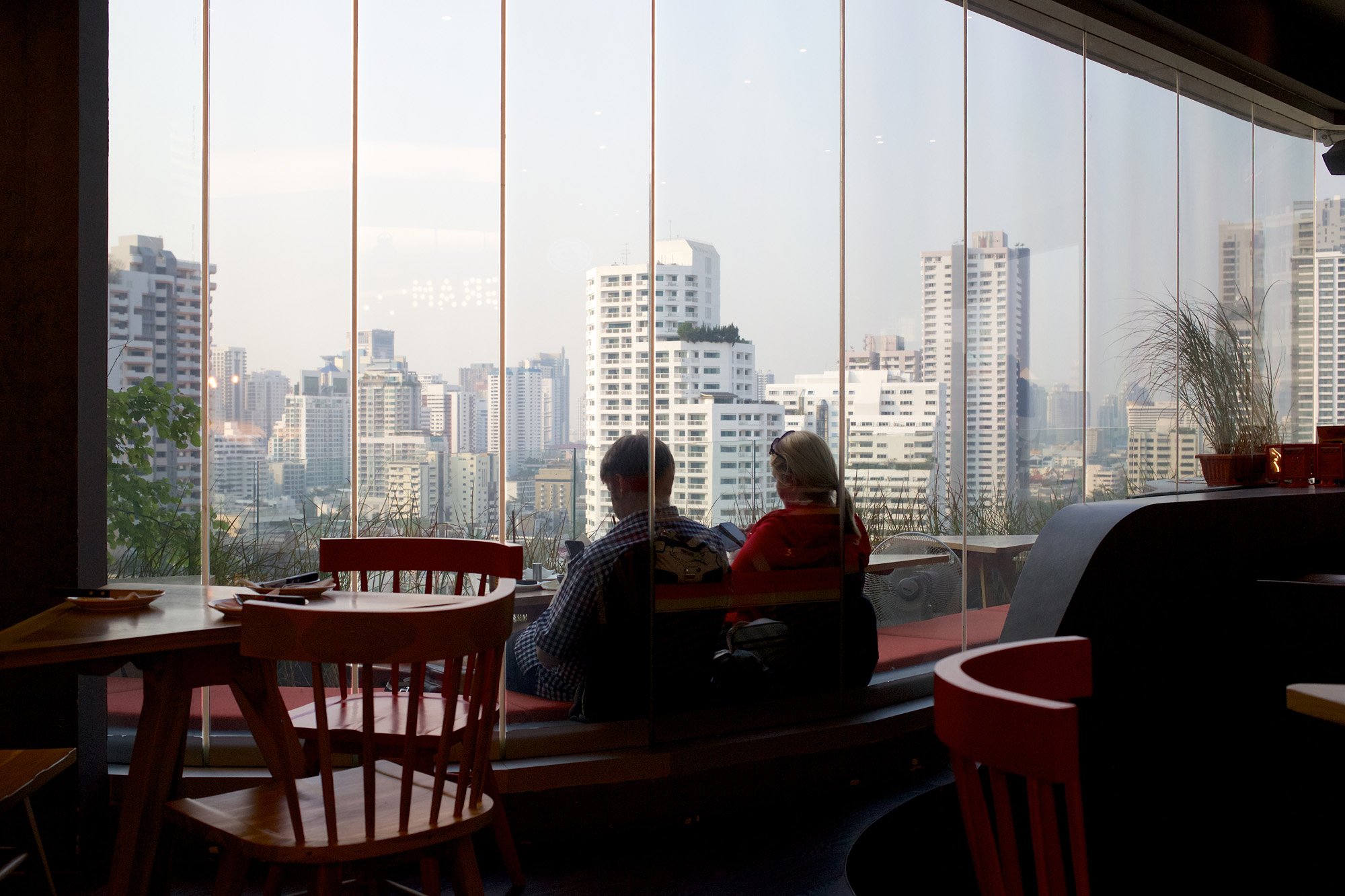
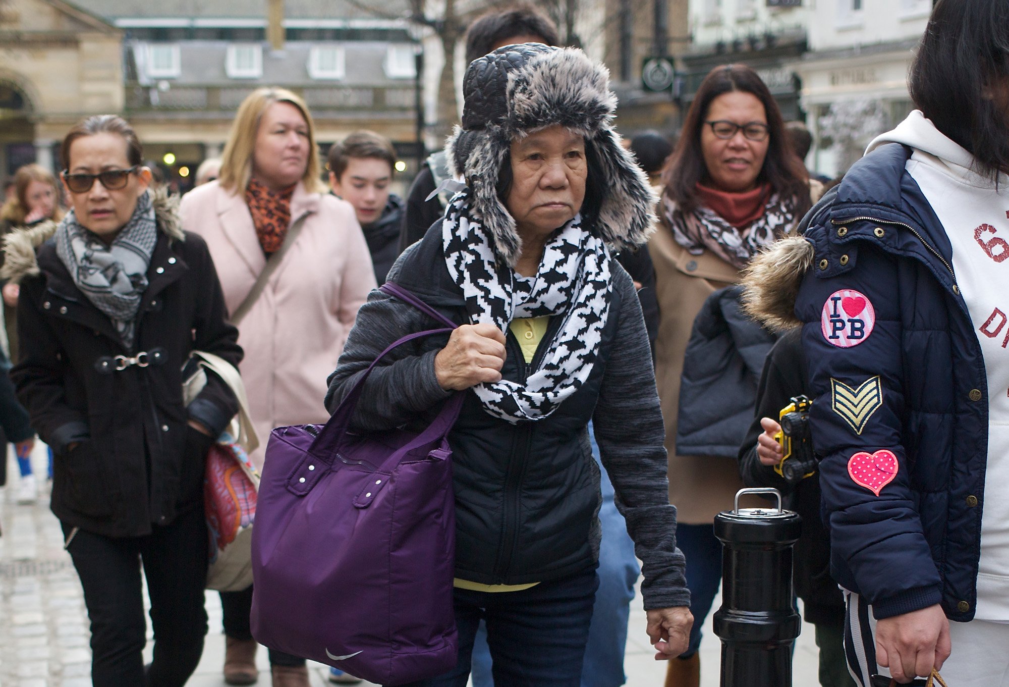
The next picture (above) is not nearly as complicated. It’s just two woman texting while the little girl in the poster gives a big, exaggerated yawn. It’s my simple way of stating that I’m getting a little bored with seeing — and photographing — so many people staring at their phones. Henri Cartier-Bresson never had this problem!

Too Good to Ignore
Images in posters are far too good to ignore. The photographers who take the original shots are highly paid professionals and have gone to a lot of trouble to create the most stunning images possible. If you include their images within your street photo, you owe it to the fraternity of photographers to make a significant contribution of your own. That’s why I say: “If you borrow a poster, put it to good use.”

The Peril of Parallel Lines

I was standing on the station platform, looking at the railway tracks then glancing at my newspaper. The top story jumped out at me and said: “Revealed: How Parallel Lines Can Give You a Splitting Headache.”

They can? This was certainly news to me — and the sub-editors must have thought it would be news to other readers, seeing as they’d placed it on the front page.

To mark the moment I took a shot of the rails in front of me (below). It’s not a “street shot,” but it’s kinda pretty, especially with the red weeds (Herb-Robert?) and sycamore shoots growing between the tracks. Could such an innocent scene really give me a headache if I looked at it too long?

rails

Apparently, the answer is “yes” for many people. Scientists at the University Medical Centre Utrecht have discovered that regular parallel lines can exaggerate a natural pattern of activity in the brain called “gamma oscillations.” They do so in a way that’s been detected just before epileptic patients have a seizure.

The researchers have even suggested a plausible theory as to why this happens. Because there are no straight lines in nature, the human brain has not yet evolved complete protection against the man-made environment — which teems with straight lines, many of them parallel to each other.

Striped Patterns Can Be Irritating
As a street photographer I’m trying to recall whether looking at vistas with lots of buildings has ever triggered a violent headache. I can’t say it has, although I certainly get debilitating migraines from time to time. I’m not alone in this. Ten million people suffer from migraine in the U.K., twenty times the number of those who are epileptic. The researchers believe there may be a link.

Do you find stripes irritating? Quoted in “The Times,” Utrecht researcher Dr Dora Hermes said: “Even perfectly healthy people may feel modest discomfort from the images that are most likely to trigger seizures in photosensitive epilepsy.” She went on to say that making sharply-defined stripes just a little bit blurred or fuzzy can greatly reduce their negative effect.

As regards interior decor, I’ve never been very keen on striped wallpaper, the sort which often decorates a doctor’s waiting room. My tutor at university, the late Maurice Cowling, had vertically striped wallpaper throughout his rooms at Peterhouse — and he wore vertically striped shirts that almost matched. It was quite hard to spot him on first entering his apartment.

Cameras Have Fits, Too
Believe me, it’s not just people who freak out when they see parallel lines. Cameras do it, too.

I found an interesting weed-covered building site in Bangkok and attempted to focus on a flat, distant wall. The camera just refused to focus, no matter how many times I half-pressed the button. Worse, it wouldn’t focus thereafter, causing me to take the nuclear option: switch off, remove the battery, replace, fire up, and — presto! — it worked for other, “normal” subjects.

Later, I looked up the problem in the 5DIII manual and found an interesting page called “When Autofocus Fails” (p.110). There it was in black and white. “Subjects Difficult to Focus” — including “repetitive patterns,” such as “skyscraper windows.” It didn’t mention anything about the camera having an epileptic fit, but mine certainly did.

Parallel Lines in Street Photography
I’ve been looking through my pictures to see if I have many shots in which parallel lines are the dominating factor. I don’t. There’s always some ameliorating feature, a curve, a twist, a diagonal, or something else to soften the rigorous man-made lines of modern architecture.

I think architects and designers have already woken up to the parallel line problem (except possibly in China and Hong Kong). They’ve made skyscrapers less regular in shape and they use sculptures and plants to break up the rigidity of form. I doubt if the couple in my featured photo (at the top), taken at Em Quartier in Bangkok, are suffering from a headache, unless it’s from looking at their mobile phones.

Here’s another example (below), also from Em — which represents some of the latest ideas in city architecture — a brilliant contrast of curvy sculpture placed against a vista of straight lines.

sculpture

Just looking at it gives me alpha waves — surely the opposite of gamma oscillations?

When the Picture Makes No Sense At All

I have a feeling that most people only glance at a photo, then move on to the next one unless something in it catches their eye.

So what happens when the picture makes no sense? Will the onlooker be obliged to linger for a few seconds or turn away with a sigh of impatience? Either way, it’s an improvement. Confusing the onlooker is the artist’s revenge on those who don’t pay attention.

Forgive me if I sound a bit cross, but I’ve just read my Facebook comments, from which it’s clear that some people can be so impatient they’re prepared to condemn an article without actually clicking through to read it. You, dear reader, are not among them. Thank you for your indulgence.

The Crazy Café
In certain places it’s possible to take a representational picture and still leave the onlooker in total confusion. But first you have to find somewhere that’s visually disturbing on a grand scale.

My featured image (above) is an interior shot of a café in Bangkok, somewhat off the tourist trail. It will be familiar to the residents of the adjoining condo building and their guests, but I doubt if very many tourists will have seen it.

Dimly lit, the Bookshop Bar (at the Ashton Building, Sukhumvit Soi 38) is the sort of place where booklovers will be either delighted or appalled. Here, the designer Ashley Sutton — who’s well-known in Bangkok for restaurant interiors such as Mr Jones Orphanage at Siam Square, Maggie Choo’s, Iron Fairies and Fat Gut’z — has created the ultimate anti-book environment.

This is not a place where you’d actually want to read, unlike true bookshop cafés like the Elliott Bay Café in Seattle. Sutton’s Bookshop Bar is a surreal flight of fancy, a nightmarish vision of old, dusty volumes, twisted shelves, stairs that lead nowhere, feather quills on tables, and the pièce de résistance: books suspended from the ceiling on wires so they can be pulled up and down disconcertingly above the customers’ heads.

You can read long quotations from the books on the walls of the bar, but taken out of context they don’t make any sense. They seem to have been extracted from “penny dreadfuls” or old westerns, whereas the leather-bound (or faux leather-bound) volumes look as though they might be classics. The whole place makes you feel like Harry Potter having a nightmare before examination day.

Like the cakes in Mr Jones Orphanage, the Bookshop Bar is a visual feast — and where better to take a confusing photo? Any photo taken in this café would be puzzling. There are one or two on the Internet which do not include a blurred waiter, as mine does, but they’re still a jumble of nonsensical shapes.

In a still image, there’s no way to show the books going up and down on their wires, but by blurring the waiter I thought I could introduce a little movement into the shot. Frankly, I didn’t have much choice. I needed a long exposure in the dim light. Resting my elbows on a table I hand-held the camera, set it to ISO 1000 and took the shot at 1/20th second.

I think people will give this shot of the Bookshop Bar a second glance, if only to try and make sense of it. They will still continue to flick through other, more meaningful images without pausing, but at least I’ve stemmed the flow for now.

The Crazy Shop Window
Again, in the image below, a strong element of craziness intrudes, setting the onlooker an indecipherable puzzle. This time the designer is Issey Miyake, whose surrealistic clothes are visually striking even without the dramatic treatment they were given in the Selfridges window on London’s Oxford Street.

Selfridges window

I tried photographing the window directly, but as I was standing in sunlight (it was a July afternoon) my reflection was unavoidable. So I decided to take the window at an angle and capture someone else’s reflection instead.

I quite like the result. It looks as though the two female pedestrians are holding sunshades, but no, it’s the work of Issey Miyake again. There are some ghost images, too, which even I can’t quite fathom.

Never mind. It’s Oxford Street on a typical summer’s day. I’d just attended my son’s graduation and I was still tipsy from a few glasses of wine. The subject seemed perfectly natural at the time.

Colour Matching Really Works

If you can find different people — or even a selection of objects — bearing the same colour within a street scene, you have a good chance of getting a satisfying photo. Better still is the occasion when people and unrelated objects share the same colour. That almost guarantees success.

For want of a more definitive phrase I’ll call this phenomenon “colour matching.” It’s what we do when we decorate and furnish a room, or get dressed in the morning.

Not all street photographers bother with colour matching, many of them opting out of colour altogether to concentrate on black and white. Maybe they are the sensible ones. Black and white photos always look good when you frame them and hang them on a wall at home. They don’t interfere with your existing colour scheme; instead, they enhance it by providing neutral contrast.

The Impossible Problem
As I’ve said elsewhere (my blog is full of colour musings), the battle with colour in street photography is constant and ongoing. It’s presence raises a fundamental problem which is almost impossible to solve.

It’s this: the streets contain a riot of colour. There are bright yellow markings on the road, bright orange cones, red warning signs, along with multicoloured cars, handbags and hairstyles. Shop windows have touches of colour coordination — and passers-by are as varied as a box of Smarties.

If you take a standard, wide-angle shot of this polychromatic world you’ll have a truthful image, but it may not look very pleasing to the eye.

So what do you do? (And this is where we get to the crux of the fundamental problem). You have a choice. You can continue to take the standard, truthful shots, making sure your system reproduces the colours accurately. Or you can be very selective, photographing only those subjects that show colour matching and coordination.

Expressed in the terms I’ve suggested, the choice would seem to lie between truth and falsehood; between true but ugly photos and those which are false but pleasing.

The Difficult Solution
There’s only one way to find a solution to the impossible problem. You have to prioritise your choice of subjects. It’s no less truthful if you take a typical scene when the colour combinations are pleasing, as long as you’re not consistently leaving out vital elements of our contemporary culture merely for the sake of art.

Unfortunately, you may have to overlook promising subjects that would make ideal content if found in an alternative location, or adjacent to differently coloured objects. You have to become very selective in what you photograph. At the end of the day (literally) you may still have plenty of images, but they’re likely to be in various styles: uncoordinated among themselves, although each one may individually demonstrate a mastery of colour matching.

I don’t think you need to worry too much about the variety of styles. When you have enough images you can sort them into harmonious sets. Personally, I think this is more enterprising than the blanket imposition of a black and white colour scheme to all your work.

Loosely Matched Colour
I’m not suggesting you attempt to control the colours too tightly. You can have fun with them, as my featured image (above) shows. I liked the “in-your-face” portraits of the ColorFun banners and waited until I found some matching colours in the passers-by.

In the photo, the prominent red bra in the centre anchors the composition. The strap of the bra below points to it, emphasising its role. Three passing shoppers wear a shade of pink which actually clashes with the red bra, but it doesn’t seem to matter. As long as there’s some colour matching you can still have fun. Luckily, there’s enough red in the banners — and in the bag at bottom right — for the fight between the colours to be evenly matched. (Note: the word “fight” appears on one girl’s tee-shirt).

Closely Matched Colour
It’s relatively easy to obtain an image with closely matched colours, but the result is often less exciting than when matching colours fight among themselves.

Stacked heels

In the image immediately above (taken in Hong Kong) the artist has already created a backdrop using harmonious colours. All you need is two passers-by to complement the effect. The two I’ve chosen are ideal, partly because their colours are neutral but also because the stripes of the woman’s leggings echo the many stripes in the mural. Similar stripes are made by the zips in the man’s backpack.

Everything in the image is harmonious, except for the woman’s trailing foot with its huge stacked heel. She negotiates the perilous descent with skill — and the next step looks like it may be even higher, although we can’t see it. Her balancing hand, the man’s wristwatch, and the stacked heel form an inverted pyramid, suggestive of instability. Without this hint of danger the excessive colour matching would make the image uninteresting. That’s always the danger when you match colours.

Wooden stall

A Study in Yellow
In the next shot (above) I’m relying largely on the subject’s pensive expression to lend interest to the image. With his friend this man was moving a portable stall through the market in Bangkok’s Chinatown. The yellow of the wood matches the colour of the advert on the side of the passing truck. The man’s black clothes and headgear match the electrical hob hanging from the roof of the stall.

Again, I’ve made the image work on its own terms. But if I were to set it beside another internally harmonious image the two would not necessarily hang comfortably side-by-side. Nonetheless, because black is one of its most prominent dominant shades, it looks at ease with my final picture (below) of two repairmen at work on a motorbike.

The contrast between the two images is not one of colour — because they share a similar shade of red highlights — but in the actions of the subjects. The man in Chinatown is pausing, calmly, whereas the mechanics are caught mid-action in dynamic poses. You can’t see their faces clearly, so the picture relies on their activity for its visual interest.

Souped up

Truth Will Out
I don’t think the compositions I’ve shown here are any less truthful for having been plucked from the riot of colour on the street. I like to bring order to the reality I see, but I’m not always willing to accept the order which others — architects, designers, and town planners — have tried to impose upon it.

What matters? The end result. The finished image. A truthful statement that pleases the eye.

The Anxiety of the Street Photographer

I sometimes get the impression that photographers — even a few street photographers — never feel anxiety when they’re shooting. They look so comfortable, strolling around, casually glancing to the left or the right. They seem to be waiting for the perfect photo opportunity, perhaps a two-headed cow ridden bareback down the High Street by a naked dancer.

The other day I saw a man, camera in hand, looking for pictures on the right side of the street while a delightful two-second scene was being played out on the left. The light was perfect, the gestures demonstrative, the woman captivating. But the photographer was still checking out a minor architectural feature and wondering whether to record it.

Going Offline
Personally, I was not in shooting mode at the time. As I’ve explained elsewhere, I don’t carry a camera “at the ready” at all times; only when I’m seriously hunting for pictures. It’s the only way to do it. You need to have total alertness or just be content living a normal life without constantly taking pictures.

Along with “total alertness” — the state of readiness needed on the street when you’re shooting — comes anxiety. It’s part of the Faustian bargain you make with the devil (so to speak) when you take up this occupation of street photography. You sell part of your soul, or at least your peace of mind, in order to get decent pictures.

It’s not just me who feels anxiety on the street.

Henri Cartier-Bresson said in an interview (you can find it on YouTube): “It develops a great anxiety, this profession, because you’re always waiting: what’s going to happen? What, what, what?”

That’s it precisely! You become worried about what’s going to happen next. Or rather, you start to worry that nothing whatsoever is going to happen for the rest of day. You’ll just be stuck in limbo, wandering aimlessly around the streets, feeling — knowing — that all the action is going on elsewhere.

You start to wonder: “Why am I doing this? Couldn’t I be sitting at home reading a novel, or having a drink with a friend? Why do I feel compelled to tramp the streets of this goddam city when it would be so easy to get a flight to Peru and take some great photos of people wearing peculiar hats. A trip like that would yield sure-fire results.”

Only the voice of experience can calm your fears.

Good Days, Bad Days
The fact is: there are good days and bad days on the street. Some days I’ve gone out in my home town when the light has been great, only to find nothing to inspire me whatsoever. I return with a few desultory images that are barely worth loading on to my computer.

By contrast, I popped into London a few weeks ago — with the lowest possible expectations — and returned with around thirty shots that I wouldn’t mind showing.

Perhaps I respond more readily to life in the big city. I lived in London for many years and I know the feel of most of the streets in the West End and all of its surrounding areas. It’s possible to be both anonymous and invisible in London whereas neither is possible in a small town. It’s harder to photograph strangers in the street when you’ve seen most of them before.

Now you’re wondering: can you turn a bad day into a good day by using a different strategy or by trying to change your mood? Maybe it’s your anxiety that’s actually causing the lack of photo opportunities. Perhaps there are opportunities happening all around you, but your negative mood is preventing you from seeing them.

The Best Tip of All
I don’t subscribe to the view that anxiety is negative. It’s quite the opposite. It’s what induces the state of “total alertness,” when you’re able to take in everything that’s going on around you and respond to it quickly. Getting some potentially good pictures reduces your anxiety; failing to get them increases it. Fortunately, I do have a tip that may help you keep your anxiety level down to manageable proportions.

It’s simple: just move to a busier area where there are more opportunities.

While it’s true that you may get some of your best images in the quieter streets, especially when the light is good, you’ll find it frustrating to work in these areas for long periods. As Cartier-Bresson says, “you’re always waiting” — and it’s the waiting that causes frustration and anxiety to build.

So when that happens, give yourself a break (and if necessary change your style) and move to where there’s more action.

This is what I did after taking shots in the Seven Dials area of Covent Garden. It’s a great spot: a confluence of streets with attractive buildings such as pubs, restaurants and vendors of theatre tickets. However, there’s only a trickle of passers-by, making it difficult to compose meaningful shots in which people play the major role.

Time was marching past quicker than the pedestrians and I was becoming increasing aware of my lack of success. The solution was to walk the short distance to Tottenham Court Road, a major artery heading north, where I found some building works causing chaos on the pavement. Pedestrians were having to walk around the trucks that were pulling out on to the main road into the path of oncoming buses. You can see one of the shots I took just above this section.

Breathing a sigh of relief, I was able to head back towards the quieter areas and continue the day’s shooting (such as the featured image, at the top). I found that alternating between backstreets and main thoroughfares was a good way to engineer a positive outcome. The build-up of anxiety in the quiet areas made me bolder in the busy areas, resulting in better pictures.

My message is this: don’t worry about anxiety. Just use it to your advantage.

Sculpting Buddhas

For every Saint sculpted by European artists I reckon there must be a thousand Buddhas sculpted in the Orient. It’s almost impossible to perform street photography without including them. Alternatively, you may decide to make them your primary subject. After all, the image of the Buddha is not a stage prop and shouldn’t be treated as such, despite being as much a part of the eastern environment as the ground itself.

Images of the Buddha are not representational in the same way that images of Christ, or the Saints, represent an individual human being who is nonetheless divine. A sculpture of the Buddha has an abstract, symbolic quality. It represents both an idea and an ideal. The idea is eternity and the ideal is the possibility of achieving oneness with eternity and liberation from the otherwise endless cycle of death and rebirth.

Eternity and Ephemerality
Street photography is all about capturing the ephemeral moment and preserving it for eternity — or at least for as long as people wish to view it. Unlike the sculptor, the photographer can’t separate these concepts of eternity and ephemerality. The conflict — or contrast, if you prefer — is built into the medium.

Move, point, click, eternity. That’s the photographer at work. Is it entirely coincidental that more cameras are manufactured in Buddhist countries (Japan, Thailand) than elsewhere? It’s interesting to reflect on this thought. We could be forgiven for thinking that the camera is a tool of Buddhist teaching.

All Buddhist sculptures are highly finished and smoothly polished, whether made of bronze or stone. They seem to be so self-contained and other-worldly you could almost believe they arrive in the world fully formed, without human assistance.

I love to see ancient Buddhist sculptures, standing or sitting in rows — especially in the rain. Repeatedly, they weather the storms yet succeed in maintaining their posture, even when the substance of which they’re made begins to erode.

Buddhas in the Making
Only during the sculpting or painting of a Buddhist figure do you get a sense of “process” rather than fixed, eternal serenity. I think my photo (above) of the craftsman in the purple shirt, who is smoothing the surface of the figure with some kind of resin, shows the process — but the moulded statue is already fully formed. Even here, the Buddha seems to be perfect, despite any ongoing activity to finish the work.

I took the shot from across a major road in a particularly busy part of Bangkok, near the Giant Swing — the huge wooden structure on which young men would perform the dangerous religious ceremony of “Lo Jin Ja.” Rooted in Hindu traditions, Buddhism is not all contemplation and quiet reflection!

To the Western mind, Buddhism appears to have been born out of a human desire for permanence in an impermanent world. Buddhists counter this view by eliminating desire itself. They set themselves on a path which, they believe, leads to freedom (from reincarnation), oneness (with the rest of existence), and eternity. You won’t get there, they say, if you desire it.

As a result, Buddhist societies have an easy acceptance of life in all its forms. I can’t be uncritical of the religion as a whole, because — as in all religions — cults and breakaway groups have a habit of making sudden appearances, enriching their founders and enslaving their adherents. Yet there are so many positive aspects, especially respect for life, tolerance shown to others, and reverence for the enormity of existence — that I can’t ignore it either.

In Thailand, what I value most about Buddhism is the way in which it interweaves with the everyday lives of the people. As I write, my 96-year-old father-in-law is celebrating his birthday by inviting a number of monks into his home for prayers and a meal. Younger people rarely have special birthday celebrations, but older people like to mark the big occasions: those that correspond with the 12-year-cycles.

Hence, 60, 72, 84, 96 are all occasions on which monks are needed, especially when you’re 72 and have completed your “six cycles” according to Eastern tradition — a tad longer than our “three score years and ten.”

The Forest, the City, and the Monastery
As I understand it, there are three environments in which the Buddhist adept — the Bodhisattva — can reside. They are the forest, the city, and the monastery.

Bodhisattvas have placed themselves on the path to enlightenment — and could achieve it with ease but stay to help others along the way. To me, those in the city seem to have the most noble calling, while those in the monastery have the advantage of peace and tranquility for reflection. Yet it’s the forest dwelling monks who are the most highly regarded, with their tradition consistently promoted as superior to the others.

sculpting Buddha

Back to Nature
Away from the normal city, I like to take pictures in Thailand’s Ancient City, the 200-acre park just to the south of Bangkok. Its construction began in the early 1960s but it’s filled with accurate reproductions of many ancient temples as well as with several original buildings, moved here to enhance the sense of authenticity.

“Ancient Siam” (as it’s now called) is not in the forest, as such, but set in splendid gardens with hundreds of trees and pathways. It gives you a real insight into the variety of Buddhist tradition and all the mythological events and narratives that support it.

Just above is my shot of people working cheerfully on their very latest sculpture. The woman has discarded her gloves to get a better grip of her spatula for carefully smoothing the torso. The Buddhist figure smiles back at her.

Don’t Be Afraid of Colour

Colour is both joyful and exhausting. It’s the signature of life: a signal to living creatures that we’re here on Earth instead of far away on a remote, monochrome moon.

Think of how the world would look if everything were in black and white, the two neutral colours of a legal document. It would look dead and lifeless.

Most animals, together with birds and insects, have colour vision. Dogs tend to confuse red and green, but they can certainly distinguish red from blue. Even cats — once thought to see only in black and white — can detect more colours than was once thought.

Our Colourful Vision
Human beings have sophisticated colour vision because of the number of cones in the eye. As a result, we can see that trees have a hundred shades of green in the spring and a thousand shades of red, yellow and brown in the fall. If we wait until winter, when life is hibernating, we see the countryside drained of brilliant colour, leaving brown branches, blue smoke, white snow and little else apart from evergreen trees, colourful man-made objects, and, of course, the birds.

Birds have better colour vision than we do. They see more colours and they have additional color cones in their retina, making them more sensitive to ultraviolet. Even to our eyes, birds appear to have colourful plumage, but to them the feathers of another bird are quite remarkable — and well worth a compliment in birdsong.

We’re Outclassed by the Birds
Don’t just take my word for it. Scientists have studied the colour vision of birds, comparing it to our own. Richard Prum, professor of ornithology, ecology, and evolutionary biology at Yale University, noted: “The startling thing to realise is that although the colors of birds look so incredibly diverse and beautiful to us, we are colorblind compared to birds.”

It appears that birds can see far more colours than they make in their plumage. However, over millions of years of evolution they’re gradually catching up, becoming more and more colourful. The same phenomenon is happening, not in human evolution (as far as we know) but in human culture — and far more quickly.

Professor Prum, with Mary Caswell Stoddard of the University of Cambridge, authored the 2011 paper: “How colorful are birds? Evolution of the avian plumage color gamut.

It’s a fascinating read and raises all kinds of questions that are relevant to photography. For example, at the time of its publication, Professor Prum said: “Our clothes were pretty drab before the invention of aniline dyes, but then color became cheap and there was an explosion in the colorful clothes we wear today.” He added: “The same type of thing seemed to have happened with birds.”

Birds use colour for different purposes: not only as camouflage but also for social signalling and choosing a mate. But what came first: the avian visual system or the complex communication signals which led, via evolution, to increasingly colourful plumage? It’s not a “chicken and egg” situation! Scientists are reasonably sure the visual system evolved first and all the rest followed.

Likewise, we are filling our world with increasingly colourful objects: murals, paintings, bright plastic chairs, anoraks, tee-shirts, mailboxs, and brightly coloured vehicles. When Henry Ford said the customer could have a car painted any colour as long as it was black, he must have realised the policy would eventually have to change. We see colour and we yearn for colour, even when it’s garish and in questionable taste.

The Yellow Car
A while back there was an illustration of our modern attitude towards colour when hundreds of motorists driving bright yellow cars descended on the Cotswold village of Bilbury, in Gloucestershire. They were there in support of Peter Maddox, 84, a resident whose own yellow car had been vandalised by people who thought it looked out of place in the picture-postcard village.

Mr Maddox had no wish to offend and replaced the car with a grey one, but not before news of the dispute spread on the Internet. Hearing that tourists had deprived a pensioner of his car simply because it ruined their photos was more than other yellow car owners could bear. Like a swarm of angry bumble bees they arrived at Bilbury to make “a celebration of anything yellow“.

The story ends happily for some, but not for all. Today in England, you can have your car sprayed in “Maddox Yellow.” Thank you, Mr. Ford.

And the Conclusion Is?
For the street photographer, the only possible conclusion is that the world is getting ever more colourful — often in ways we find hard to accept. We can exclude colour and stick to black and white photography. Or we can embrace it joyfully, like the motorists who went to Bilbury in support of Mr. Maddox.

In my own experience I find a similar conflict between the subtle grey tones of traditional architecture and the garish additions of street signs, posters, graffiti, and brightly coloured hairstyles, clothes and accessories. This is especially true in the northern cities of Europe and North America, where the best policy for the street photographer is to be selective with colour, using it for contrast and emphasis.

In tropical countries, colour becomes more prevalent in human culture — as it does among birds. I still try to make sense of it when taking pictures in South-East Asia where I’m obliged to see the world primarily in terms of colour. I sometimes limit the range of colour within a single image, as in the featured photo (at the top). At other times I “let it all hang out” and include every colour in front of me (as below).

I don’t expect everyone to approve.

Why Does Everything Have to Be Awesome?

I’ve seen the Grand Canyon, the redwoods of California, the skyscrapers of NYC and the mighty Mississippi — and yes, America is awesome. But why, oh why, oh why do Americans (and increasingly Europeans, Brits, Aussies, and even the Chinese) want absolutely everything to be awesome?

I’ve just had another email from Awesome Books, but the books are exactly the same as the ones you can buy on Amazon, except there appear to be fewer of them. How awesome is that?

Far From It
As an activity, street photography is a far from awesome, which is one of the things I like about it. It’s all about photographing ordinary people in their everyday clothes, going about their normal business, on regular city streets. I don’t think I’d want to turn this activity into anything more spectacular, although I’m sure others will make the attempt.

For example, you could abseil down a city storefront with powerful flash gear and photograph passers-by as they gaze at you from below. You could “play dead” by lying on the ground clutching your Leica and photograph anyone who tries to steal it from you. Covered in silver paint, you could become a “living sculpture” of a 19th century photographer who springs into life and takes a picture whenever someone gives you a coin.

If you stage any of these stunts, I’m sure you’ll be written about in the media as a street photographer whose work is “awesome.” You’ll be pushing the boundaries of the medium as far as they will go. That’s what “awesome” is all about, isn’t it?

What It Really Means
Awesome means “provoking feelings of awe” but used as a slang word it just means “very good” or “amazing.” The Urban Dictionary describes it one of the three words which make up most American sentences, the others being “omygod” and “shit.”

Awesome things (taken from Internet discussions) include the singer Bono, pizza, a tea party held by someone called Edward, the fans of Veronica Mars, “that Calvo chick,” and “riding a rocket lawn chair through a strange portal while dressed in a disguise with a cat that happens to be a chef on your back.”

OK, the last one is definitely awesome. It would make a great street photo if it were not pure fantasy. In the meantime I’ll have to take what’s possible, namely the pizza (below). At least it’s wood-fired and stone baked!

Awesomeness in Art
Provoking awe has long been the purpose of religious art. The great medieval cathedrals still have the power to leave us open-mouthed as we wonder at the mysteries they evoke.

A new and more down-to-earth human element emerged in the Italian Renaissance beginning with the murals of Giotto, but it quickly became smothered by the awesomeness of Michelangelo and the Sistine Chapel ceiling. Now, in the present era, our most highly acclaimed artists are people who work on a colossal, awe-inspiring scale — like Damien Hirst with his “Treasures from the Wreck of the Unbelievable.”

Even Bansky, who for several years painted wryly amusing urban graffiti, eventually had to “go awesome” with Dismaland, a full-scale funless entertainment park, a nightmare version of Disneyland.

By contrast, to take up street photography is to take a step back from awesomeness. The street photographer has seen the alternatives: the landscapes covered with plastic (Christo), the 100 million handmade porcelain sunflower seeds (Ai Weiwei), the gigantic colour pencils of “Reverse City” (Pascale Marthine Tayou), and has made a conscious decision to go back to basics — to look closely at the reality of urban life.

Looking Closer
To be frank: most street photos don’t seem at all awesome if you print them large for the exhibition wall. They work best as small scale images — fragments of life rescued from the muddle and chaos of the street.

Yet if you look closely at the finest examples of street photography, you can’t help but be amazed at their qualities. After all, it’s possible to be humble and awesome at the same time.

In music, Franz Schubert inspires awe with his small scale works — his songs, chamber music, piano sonatas and impromptus — as well as with his late symphonies. The same is true of the other great classical composers. It’s not the scale of their work that matters so much as its profundity: the degree to which it puts you in touch with the wider workings of the universe.

Does street photography have the potential to bring us closer to the truth? I don’t see why not. If we stop searching for awesomeness by making big statements with Big Art, I think we can find it on the street, in small scale works that enable us to see more clearly what is actually there.

Getting Good Colour in Street Photography

Colour is both the joy and bane of street photography. If you get it right you can make a great photo; get it wrong — which is all too easy — and your photo will be ruined. In that case your only option is to convert it to black and white.

Digital photographers are burdened with colour complexity. Instead of shooting, as film photographers once did, with a particular stock such as Velvia or Kodachrome which imparted a characteristic “colour look,” photographers now have limitless options. Yes, the camera’s sensor has a colour profile, but subsequent processing enables us change colours globally or individually. We’re spoiled for choice.

Problems are compounded by the way in which colours are displayed on various monitors, which may or may not have been optimised. Add to this the capacity of the human visual system to make its own counterbalancing corrections based on knowledge and memory — such as its determination to see white paper as pure white — and you have a cocktail of challenges hard to swallow.

So what’s the best method of tackling these challenges? I think most photographers attempt it by instinct, selecting colours that look right to their own eyes, working with well adjusted monitors — and sometimes by simply forgetting about colour altogether and letting it take care of itself. To use a slang expression with no visual connotations: they “play it by ear.”

The Non-Colour Option
Playing it by ear leads eventually to shooting in black and white. I don’t blame street photographers for taking this option because today’s streets are full of riotous colours that are hard to control.

Ironically, it was never this way in the days of black and white film. Cars were black, people were dressed in black or grey. No one had coloured hair except for redheads who probably wore hats. Even brown “raised a frown in town.” Essentially, the photographer was looking at a black and white scene, brightened only by the peach-coloured complexions of pretty women.

My point is: in the early twentieth century, a black and white photo was a reasonably accurate interpretation of a street scene. Today it isn’t. We have to come to terms with colour and master its complexities.

What Is “Good” Colour?
I’ve called this blog post “Getting Good Colour in Street Photography,” so I need to define what I mean by “good.” This is where my comments become subjective.

I appreciate a wide range of colour styles and combinations when I see them in other people’s photography. On the other hand, I have personal preferences as to what “looks right” in my own pictures. As far as these are concerned, I like colour palettes that are harmonious, perhaps with contrasting notes such as a patch of red in a sea of green.

In fact, green is the one colour that never looks right to me in a photograph. I grew up on a farm surrounded by trees, fields and such like, so I’m aware of the hundreds of shades of green which make up the English countryside. But whenever I see a photo of a closely-mown lawn I simply don’t believe the colour. Go to Google Images and search for “closely-mown lawn” and you’ll see what I mean.

Fortunately, lawns are rare in street photography. Brightly coloured clothes are not. Yesterday I saw a woman wearing a shade of pink I’d never seen before. Its intensity was unbelievable: well outside the gamut of Adobe RGB (along with sRGB, one of the two main colour “spaces” used in digital photography).

I like the colour in my featured image (above), where the storekeeper in Camden Market, London, has cleverly selected an harmonious range of leather coats and displays them proudly on the sidewalk. You could argue that the brilliant yellow of the sports vests on the right tends to upset the colour scheme, but I think they enliven it and make the photo less “tasteful.” After all, the Rolling Stones’ “distressed tongue” tee-shirt indicates taste in a big way, although it may not be to everyone’s taste.

Here’s another shot from Camden, taken shortly afterwards. I like the way the storeman handles the dresses with thick gloves (which would have stood out better in a contrasting colour).

Factors Affecting Colour
In no specific order, the chief factors affecting digital colour are: light, exposure, distance, sensor, and processing.

1. Light is by far the most important factor because it’s the source of all colour. Pigmented objects merely hold back certain wavelengths of light and reflect the rest.

I was tempted to add “time of day” to the five factors, but the change in light’s colour temperature from cool to warm as the evening progresses is (in a sense) a function of sunlight itself: the angle at which it passes through the atmosphere.

2. Exposure makes a huge difference to colour shades, lightening them or making them darker depending on whether you increase or decrease the exposure.

3. Distance reduces colour saturation, the atmosphere eventually adding a blue cast to the image, even on a clear day.

4. Sensor types, as I’ve mentioned, have unique colour responses, some of them favouring green at the expense of red and blue. A photographer’s choice of camera is often strongly influenced by the appeal of certain colour sensors when compared to others.

5. Processing introduces the Joker in the pack: the one factor which can change all the others. If someone’s cyan-coloured bag is ruining the shot you can easily tone it down in your photo editor. In fact, you can alter the hue, saturation and brilliance of any colour individually, or apply either global routines or customised presets to the whole image.

To the above list you need to add all the subjective factors affecting colour vision, such as age, colour memory, retinal fatigue and the way in which background colours strongly influence the perception of colours in front of them.

Subjective factors play a huge role in colour photography. On the xRite Colour Challenge I scored 4 points — pretty good, considering the worst score for my gender is 16,021,602 (low scores are better, zero is perfect).

Colour Affects the Choice of Subject
Inevitably, when I see a colour combination that looks right, I’m always tempted to take a shot, even if the subject doesn’t meet all the other criteria of a street photo: contrast, form, decisive moment, and so on. My solution is often to find the right colours in a scene then wait for a neutral-coloured subject to join them.

Sometimes a scene is readymade. Here, for example, is a woman in a multi-coloured dress, sitting in a huge window on a sunny day in central London above a costume jewellery store.

There’s hardly any colour in the picture except for her dress, so I can get away with placing her at the top of the image. The eye is drawn naturally towards her, while first reading the name of the store below.

Behind tinted glass the woman’s dress cannot be depicted with accuracy. Does its colour have the freshness of Spring? Not quite, but I’m prepared to compromise — unlike the designer of those viciously uncomfortable chairs.

Those Impromptu Street Portraits: Valid or Not?

Like most street photographers I occasionally take impromptu street portraits. They’re hard to resist.

For example, one day I was walking along a street in London when I spotted a man smoking a cigarette. I managed to get a shot of him before there was any conversation between us, but because he was looking directly at the camera I felt I had to say something afterwards.

We had a brief chat and he kindly let me take another photo. I asked him to look away from the camera. The resulting image (shown above) is very close, super-sharp, and technically more accurate than most street photos. I like it, but it’s not at all the kind of image I normally seek. Let me explain why not.

Why Candid Is Better
As soon as the subject becomes aware of the camera the spell is broken and something is lost. I’m sorry if this sounds a bit obscure, but if you feel the same way you’ll know exactly what I’m talking about.

I want to show the world as it really is, not as it wants to be seen. Most people begin to act as soon as they know they’re “on camera,” smiling, posing, putting on their “best face,” raising a rabbit-ears salute or making some other gesture. There’s no end to the contortions performed by the public when they think they’ll end up on Facebook or Flickr.

Of course, you may be lucky (as I was with the shot above) in finding someone who “gets it,” who sees you taking candid pictures and knows the kind of shot you want. But it’s better to maintain the convention of “the invisible camera,” taking candid, unposed shots whenever possible.

When a subject looks directly at the camera lens a peculiar process is set in motion. After the image has been processed and displayed, the subject appears to be looking at the viewer. But in no sense can the helpless subject make true eye contact with those who view the image. When it comes to scrutiny, it’s a one-way street: the gaze is from viewer to subject, not vice versa. For this reason I find that the people depicted in most street photos often project a kind of defensive, accusatory stare which they seldom use in other circumstances.

The Specialists
Many photographers specialise in street portraits, often gaining considerable critical and commercial success. Brandon Stanton’s series “Humans of New York” is a notable example, a remarkable collection of faces that leaves you marvelling at the variety and beauty of the human race.

Stanton has now divided his collection into various series: “Intimate Stories,” “Refugee Stories,” “Invisible Wounds,” and so on, his project morphing into literary territory, beyond the purely photographic. He writes: “Somewhere along the way, I began to interview my subjects in addition to photographing them. And alongside their portraits, I’d include quotes and short stories from their lives.”

I like Stanton’s approach. It works, especially with the addition of text. I wouldn’t call it “street photography” in the classic sense, but it’s perfectly valid, if not entirely original.

Many photographers have attempted to meld biography and portraits into a new artform. For example, British photographer Adrian Clarke, a former civil liberties lawyer, took the same road, moving from visual images to a combination of words and image. He made an initial impact with his series “Framed” — depicting subjects who had served long prison sentences for crimes they didn’t commit. In later series such as “South Bank is Shrinking” (2008) and “The Road to Low Newton” (2009) he accompanied his images with biographical stories told in the subjects’ own words.

I’m not wholly convinced by these brave attempts to create a new artform. They seem to involve too many compromises. We never learn the real story of the subject’s life, just a personal, one-sided version of it. Only a well researched biography or novel can present a full account of an individual living in a particular place through a particular period of time. By contrast, a street portrait without accompanying words leaves you guessing and prompts your imagination to provide the backstory.

Beyond Travel Photography
When you travel to a foreign city there’s an added impetutus to take street portraits because you can include both the person and the place in which they live: two for the price of one! Even better, you may be able to photograph them in the actual performance of some unusual occupation that’s unique to the area. Three for the price of one!

Their performance may even involve birds or animals. That’s four for the same price — and by now you’re probably in China, photographing an elderly gentleman engaging in cormorant fishing on the Li River in Yangshuo. It’s OK. I’ve seen it before. Yes, he’s very photogenic and the fishing is genuine, but his main activity is not cormorant fishing at all — it’s having his photograph taken.

I think it’s best to avoid the ersatz image: the synthetic, fake, false, faux, mock, simulated photo which takes you away from the nucleus of street photography towards its outer reaches. Keep it candid. Keep it real — even if the resulting photo is less technically correct.

The Revealing Moment
For example, sometimes you can catch people momentarily lost in thought. Maybe they’re actually lost, which is even better. Either way, they’re likely to be unaware of your presence, at least until you’ve taken the shot.

In Bangkok I took this photo (above) of a gentleman with a wise face, not unlike the Chinese figures you see guarding the Royal Palace. There was no time to worry about the background, which is cluttered almost beyond acceptability, but I like the shot. Why? Because it preserves the integrity of street photography.

The camera remains invisible. The onlooker can enjoy the same privileged viewpoint as that enjoyed by the reader of a novel. The photo lets you enter the world imaginatively and without confrontation. You can put yourself in the man’s place rather than confront him with impersonal scrutiny. In other words, this really is a street photo, not just an impromptu street portrait.