Red is a wonderful colour. For the Chinese it’s the colour of good luck and for others it’s the colour of passion. Too much of it is said to cause people to become agitated and lose their temper; too little leads to lethargy, caution and lack of vitality.
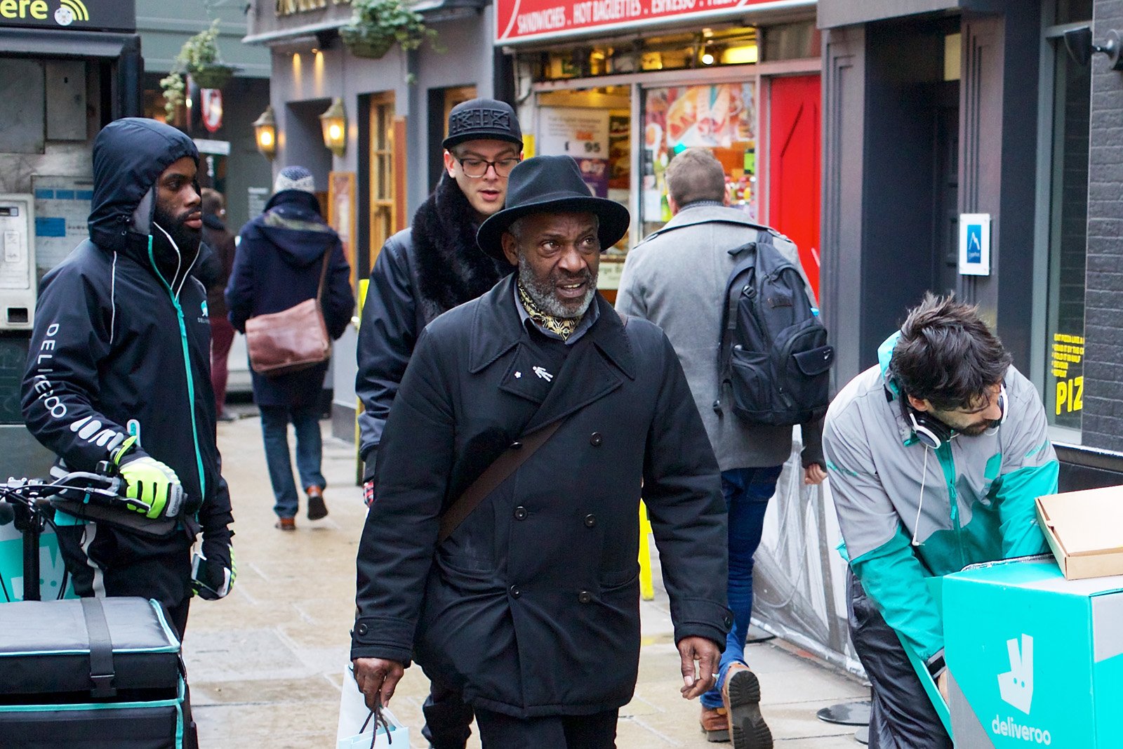
Street photographers in search of red usually have to rely on finding someone wearing a red dress or standing against a red background. It’s rare to find an entire collection of subjects and settings composed primarily of red or even vaguely reddish colours. In fact, at the risk of being overly cautious the street photographer may choose to avoid red altogether. It’s not the easiest colour to incorporate into a picture.
Personally, I love red — and orange and yellow — and I find them uplifting in comparison to the pervasive greys and browns of the typical city street. Any image composed primarily in red will be eye-catching. If you can offset this intense colour with some deep black, so much the better. You may have to wait for Chinese New Year before this combination comes along, but the wait will be worthwhile.
My featured image (above) was taken during Chinese New Year when workers were bringing extra lanterns for a street festival in Phuket Town. It was the Year of the Snake — or “little dragon” — so the twisting cables of the crane on the truck are significant. It’s best to represent the snake symbolically as it doesn’t like people seeing its body — or so the Chinese believe.
As you can see, the photo is not exclusively a composition in red. It contains orange (the side of the truck) and yellow (the worker’s tee-shirt and the lanterns’ tassles and inscriptions). There’s hardly any green or blue in the image. Do we miss them? Not really, although the picture may seem unusual because of its restricted palette.
Fortunately, anything unusual tends to go down well in street photography. Street scenes are all too familiar to most people, so you have to find ways of showing them in a new light. Hence, “unusual” equates to “good” in the street photographer’s lexicon.
When a Red Scene is Ready Made
The best source of red is undoubtedly red paint. It’s not always welcome, especially in the more conservative parts of London. There was, for example, the notorious case of the woman who painted her house in vertical, candy-coloured red and white stripes, taking revenge on her neighbours who’d prevented her from demolishing the house and adding an underground swimming pool to its replacement.
Red is often seen to be too “forward,” too provocative — as though it were being worn by a particularly aggressive Parisienne prostitute. That seemed to be the case in Kensington, where the adjoining houses now look unusually drab in the dull light of a typical London day. Nobody of class wants to look like a prostitute (or live next to one) but neither does anyone wish to seem dull and uninteresting. Neighbours! Don’t you just love them?
Red is not inappropriate on the facade of a public house (a London “pub”). Here it is (below) on The Coach and Horses in Soho. The paintwork is imaginative and bold, with white highlights and black window frames to alleviate the pervasive red — which seems to step forward towards us.

For the photo, all I needed was a man using a red phone (he was already in position when I walked past). This time there’s no yellow or orange, although the red itself has an orange tendency. The only jarring note is the blue bin on the right, but even that is counterbalanced by the vertical blue strip on the left.
Incidentally, this is the pub made famous by the patronage of the late Jeffrey Bernard — immortalised in the play “Jeffrey Bernard is Unwell” in which Peter O’Toole returned to the London stage to take the part of the hard drinking journalist beset by various ailments.
The lone, male figure in my photo may trigger some people’s memories of the journalist, the play, the actor, and the legendary performances that followed.
When Red is Over the Top
The residents of London can breathe a sigh of relief that no artist has painted a mural as overwhelmingly red as the one (below) in Bangkok. This work, by the Japanese artist Motomichi Nakamura, is one of the most startling — and gigantic — murals I’ve ever seen.

Of course, the mural doesn’t lend itself to street photography, because what else can you do except reproduce it? Any live action in the street will always be completely smothered by the tormented expressions of the red creatures on the wall. Here I’ve done my best, cutting off most of the mural while capturing a glimpse of the street alongside it.
In a curious way, the photograph works because the hugh graffiti-like mural — for all its jumble of alien forms — is actually better organised than anything on the street. The real world seems to be a mess compared to the jolly gathering of ghostly life-forms with their impassive stares and rictus grins.
Motomichi is a philosopher and scientist when he speaks of the colour red. As he says on his website: “(It) increases the pulse and heart rate, and raises your blood pressure. Red also has the smallest refractive index and visually it appears closer than reality.” By using it together with black and white, he makes his creatures — what he calls his “cryptozoological monsters” — look larger than life.
The Tendencies of Red
As pure colour, without being darkened by black or lightened by white, red can tend either towards yellow or blue. Red with a yellow tendency can be called “tomato red” (Coach and Horses) while red with a blue tendency is a kind of “berry red” (Motomichi).

It good to be aware that red has as much variety as any other colour, not only in appearance but also in meaning. Stock market prices are dropping if they’re shown in red in New York or London — but red figures in East Asia denote a rise in value.
Whether it means plus or minus, “passion” or “danger,” red in the street photo is impossible to miss. I never leave home without it.