Shooting From the Hip, Part I

Is shooting from the hip a good way to take street photos? Such an innocent question! The answer is yes. And no.

In thinking about it very carefully and weighing up the arguments for and against I find myself questioning the very purpose, essence and philosophy of street photography: its ethics, its aesthetics, its whatever.

Let’s look at three arguments in its favour.

1. Shooting from the hip certainly gets you great shots, if only occasionally.
2. It enables you to take shots that would otherwise be impossible. For example, when you know the subject may glance in your direction and ruin the shot if you raise the camera to your eye.
3. It’s often good to get a lower angle of view, looking up at your subject and cutting out extraneous detail from the background.

The featured image (above) shows some of the virtues of shooting from the hip. I like the shot because it identifies a particular moment that cannot be repeated. The light is on outside the Gay Hussar restaurant (which has now closed permanently). Yet the whole scene remains typical of a chilly day in London. I couldn’t have taken the shot in any other way and achieved the same result.

Two women, one gesturing with her hand

The Easy Option?
One argument against shooting from the hip is that it’s too easy: like shooting ducks in a barrel. (Ducks have to be easier than fish). I would counter this by insisting: once you’ve mastered how to get the subject in sharp focus, which isn’t as easy at you might think, the technique does at least allow you to get close without being noticed (image above).

Other Arguments
Now let’s look at three, more effective arguments against it.

1. It can be very “hit and miss,” with a depressingly high percentage of failures.
2. It removes your main control over the composition of each photo taken in this way.
3. With loss of control comes loss of intentionality. In other words, you’re inviting Lady Luck to play her part, rather than deliberately taking the shots you want.

Should we imagine a pair of scales and place these two sets of arguments on either side? Which scale would have the weightier argument overall?

Frankly, I can’t offer a definitive answer. You’ll have to decide for yourself, after giving it a try. Personally, I quite enjoy shooting from the hip and I don’t see any harm in it unless it becomes habitual.

Other photographers are not of the same opinion.

The Winogrand View
For example, American street photographer Garry Winogrand, as reported by Mason Resnick in the June 1988 issue of Modern Photography, was surprisingly adamant that shooting from the hip was a really bad idea.

Wrote Resnick: “I tried to mimic Winogrand’s shooting technique. I went up to people, took their pictures, smiled, nodded, just like the master. Nobody complained; a few smiled back! I tried shooting without looking through the viewfinder, but when Winogrand saw this, he sternly told me never to shoot without looking. ‘You’ll lose control over your framing,’ he warned.”

On looking at Winogrand’s images one could reasonably reply: “What framing?” — and personally I have other objections to his technique, including all that smiling and nodding which tends to make subjects smile back! Would he not have achieved better results — more authentic results — by shooting from the hip?

I’ll leave that rhetorical question hanging in the air.

Parting Shot
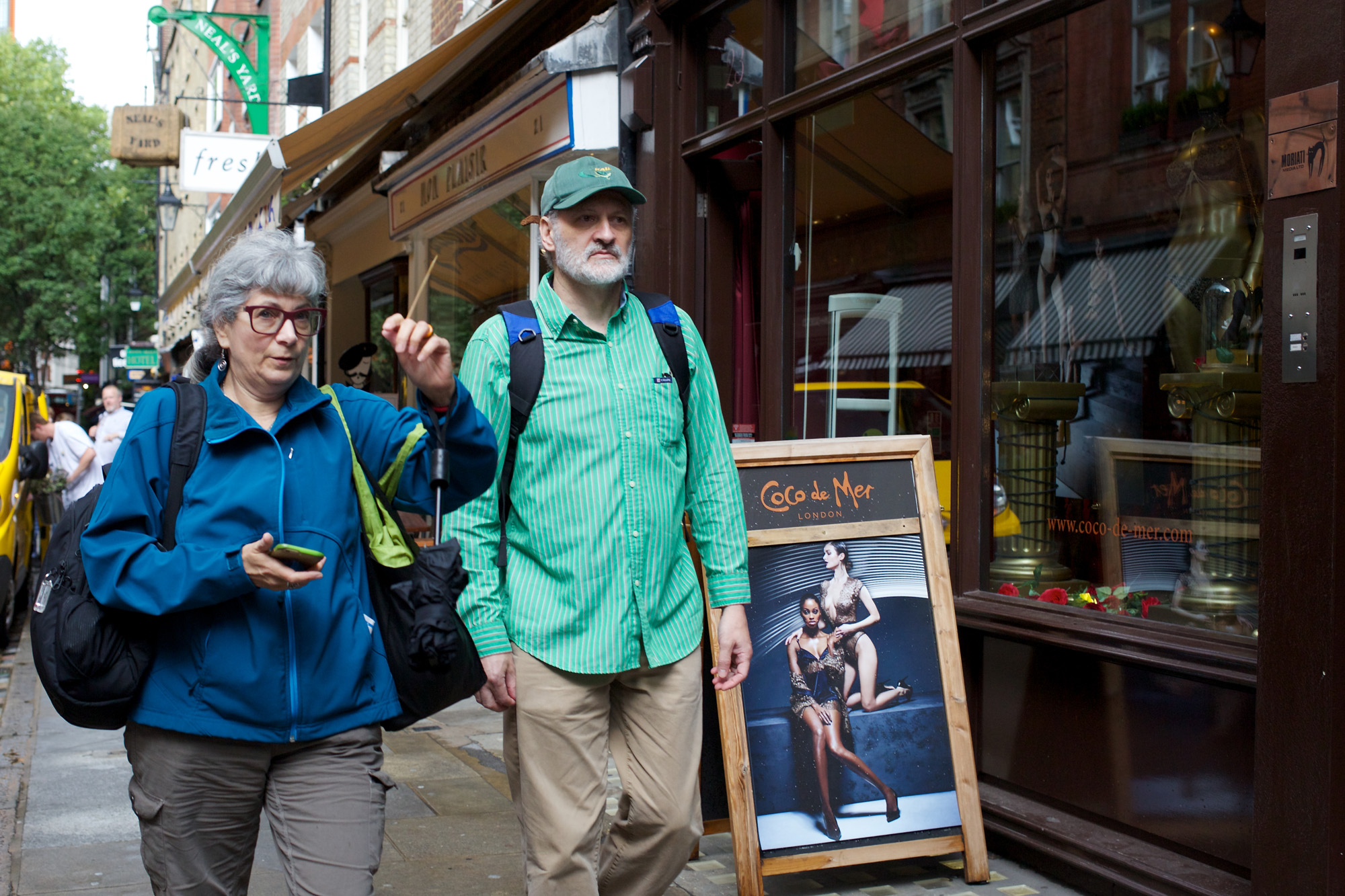
Here’s my parting shot: an example of shooting from the hip that was not “hit and miss” and didn’t sacrifice control or composition. In fact, it had been my explicit intention to photograph a tourist couple marching past London’s Coco-de-Mer shop (“Fashionable purveyor of designer sex toys, lingerie and other clothing, erotic books and gifts.”)

I was quickly rewarded with this photo, in which the man succeeds admirably in keeping his eyes in the direction of his companion’s gesture, despite the delights on offer elsewhere.

Neither of them looked in my direction, either. Thank heavens!

tourists walking past sex shop

Why It’s Best to Have Low Expectations in Street Photography

On the day after Twelfth Night the weather was dull, the light fading, and the Christmas lights had just been switched off. People seemed not to have recovered from their New Year’s hangovers. The chances of getting a good street photo in these circumstances were low, to say the least.

I was quite right. People were scurrying home when I walked into town. The High Street was forlorn without much illumination and getting a shot seemed all but impossible. Then I spotted someone loading a large chair into a vehicle, with two girls sipping drinks nearby, staring wistfully into the distance.

I crossed the road for a better angle, waited for passers-by to catch up — and took the shot you see above. It’s not perfect, but I like it. Somehow it seems to fit the mood and the moment.

Try “No Expectations”
So is it better to have low expectations rather than high ambitions when you go out to take some shots on the street?

Never mind “low expectations,” it’s best to have NO expectations in street photography. It’s the only way to avoid disappointment when you return home without the perfect shot.

Frankly, I never have any expectations of getting a decent shot on a quiet day in my home town, but one time I chanced upon five men in motorcycle outfits walking side-by-side. I’ve always valued this shot because I didn’t expect it.

Five men in motorcycling gear

I’m not suggesting street photography is a hit-and-miss activity. It isn’t. With flair, skill and lots of experience you can go out and give a wonderful performance. It’s the rest of the cast — the world at large — who may be having an “off day.”

It’s possible you’ll find yourself asking, somewhat ungrammatically: is it me or is it them? (‘Tis I? Nay, ’tis they!) In other words, have you failed to get the perfect shot because:

1. You didn’t try hard enough.
2. You weren’t looking properly.
3. You missed golden opportunities.
4. You didn’t use the right camera settings.

Or did you fail because:

1. The weather was too gloomy.
2. There were too few people around.
3. Those who were around were too gloomy.
4. No opportunity presented itself.

These two sets of possible reasons tend to play off each other. You start mixing them together. For example, you may think that no opportunity presented itself because you weren’t in the right place (very likely!) and therefore you weren’t trying hard enough.

However, you’d be wrong to beat yourself up. You were trying hard to be in the right place, but it didn’t work out. At that exact time, somewhere else in the world, another photographer was getting (and perhaps fluffing) a better opportunity. You just didn’t know where to go.

Empty Hand Syndrome
I’ve spoken with other street photographers about the “empty hand” syndrome — of returning home with nothing worth sharing — and I think it may affect the experienced photographer more than the beginner. It happens when nothing you see fits perfectly with your style. Beginners have not yet developed a style, so they can feel reasonably satisfied when returning with just a few visually interesting shots.

When you develop a style — when you start to notice certain configurations of people in the street and photograph them in your own particular way — you begin to have expectations which are not fulfilled every time. That’s why you should be prepared to have a post mortem analysis when you return home.

Was it I? Or was it the world? Just possibly it could have been both.

Should The Viewer Be Unable to Detect Your Enhancements?

I recently watched a YouTube video by Thomas Leuthard entitled “23 Ninja Tips For Your Next Photo Walk,” no.23 of which was: “Don’t overcook your photos with too much editing. If you can tell what photoshopping tools were used, you’ve used too much.”

My inner ninja started wondering if this is true — and if it is, WHY is it true?

If it’s a valid rule it would certainly exclude a lot of creative work, including the composite images by Danny Santos in Singapore which show an accumulation of figures in the frame, derived from shots taken with a remotely controlled camera.

It would also exclude my own composite artworks which I make mostly from street photo rejects — but then, I don’t claim this activity to be “photography” as such, let alone “street photography.”

However, I don’t think Thomas Leuthard is referring to deliberately prepared composites or to such routines as “convert to black and white” (bearing in mind that his own work is chiefly in black and white). I’m sure he’s talking mainly about processing routines such as sharpening, levels and curves adjustments, and colour correction. Any of these can lead to hideous examples of bad taste unless you use them with the utmost discretion.

Acceptable Enhancements
1. What about cropping? Surely we have to accept the need to crop street photos from time to time? Some photographers are steadfastly opposed to it in the belief that capturing the perfect whole-frame shot is their primary objective. Others, myself included, deliberately use a high resolution camera to enable some cropping at the editing stage.

However, I think Thomas Leuthard’s rule (or guideline) still applies, because if the composition looks impossibly perfect the onlooker will immediately detect it’s a crop — and downgrade it accordingly.

2. Another acceptable enhancement has to be straightening. Fortunately people are never going to notice it. This a godsend to the street photographer because plenty of pictures are taken in haste and a high proportion of them need to be corrected. Luckily, you can’t overdo straightening; the image is either straight or crooked.

3. Along with straightening there’s the whole issue of perspective adjustment to consider: whether or not to correct for converging verticals. If you’ve tilted the camera up or down, vertical lines will converge towards the top or bottom of the frame. Sometimes they look right — especially if you want to emphasise the elevation of the camera — but they can also be a distraction. Is it OK to pull them into shape?

Again, it’s a question that requires an individual answer in each specific case. If you have a large, flat-topped skyscraper in the background it will be distracting to correct the verticals. People will notice the correction because they expect the top to look narrower than you’ve shown it. Rule 23 still applies!

Unacceptable Enhancements
1. Along with many other photographers I strongly disapprove of “high dynamic range” (HDR). When it first came along it seemed new and exciting, showing detail in deep shadow even though the highlights were still intact. It had a positive impact — getting close to what we see with our eyes — until people started to overuse it.

Once exaggeration crept in, HDR found itself on the “naughty step,” with photographers condemning its use entirely. That’s a pity because I’ve seen many pictures in which it seems natural, despite there being thousands more where it looks truly awful.

Would my featured image (above) be better in HDR, with detail in the shadow and highlights? I don’t think so.

2. Deliberate distortion of objects and figures in the photo can be noticeable if the onlooker compares the image to others of the same subject. For example, making people fatter or thinner is completely unacceptable in street photography, as is transposing faces, beautifying or uglifying your subject, or adding figures that were never in the original shot.

If you make any of the above distortions, transpositions or additions, it’s very likely someone will see the discrepancy and call you out. Rule 23 wins again!

3. The majority of software filters are useless and completely unacceptable for street photography. Anything which crudely stylizes, pixelates, solarizes, posterizes, or texturizes the image is not OK (and please note that I’ve drifted into American spelling because these words are too familiar to write in British English). I know their exclusion deprives Photoshop Elements users of half their software controls, but you can’t “sketchify” or introduce “craquelure” (a brick-like texture) and expect to be taken seriously as a street photographer.

In my view (although I don’t use them) certain carefully judged presets are OK. After all, if you accept the JPEG that comes out of the camera you’re accepting the manufacturer’s preset which produces it. Similarly, you may like the “look” you can get from a complex combination of adjustments and wish to apply it to all your photos. If you shoot in RAW and always retain the RAW file — as I advise — the process is reversible.

Man cooking fish in golden sunlight

Refining the Rule
Overcooking your photos is every bit as bad overcooking your vegetables. It makes photos indigestible to the visual system, bringing discomfort rather than satisfaction.

However, I think there’s a more general rule you can apply to street photography. It’s simply this: “Don’t exaggerate.”

The English poet Eliza Cook (1818-1889) wrote: “Exaggeration misleads the credulous and offends the perceptive.”

She was right, up to a point. I think it’s OK — and perhaps even necessary — to exaggerate when you’re postulating ideas, but it’s not OK when you publish your conclusions.

So apply adjustments sparingly. Keep processes like sharpening and shadow lightening to a minimum. Before you commit yourself to anything as permanent as printing, return to each picture and see whether you’ve overdone the adjustments you’ve made.

I didn’t overcook the colour in the shot above (the sun was setting), but I think the fish are nearly done.

Why Did the Street Photographer Cross the Road?

The answer is: to escape! Having just taken a picture of people about to cross the road, I don’t really want to hang around for objections, so I cross the road in the opposite direction and make a safe retreat.

The technique works best when you’re sporting a medium telephoto, such as a 50mm on a crop-frame camera (my old Fuji S5Pro) giving the full frame equivalence of 75mm. This is what I used for taking my featured image (above).

The seven people in the shot had been waiting patiently for a gap in the traffic and were not going to miss their opportunity. They all set off with speed and determination — and I was fortunate to record them at the precise moment when this happened.

More Tech
I don’t often give all the technical details in a blog post, but I think they’re worth mentioning this time. I’d stopped down the lens from f/1.4 to f/4, ISO 400, 1/900th second. Because of the dark background I’d also set an exposure bias of -0.7 step (two thirds of a stop). This is the key to the success of the image because I’ve not had to tinker with the exposure in post-processing, which always results in a loss of tonality.

The Fuji colours really sing in this shot, helped by the pink car and other coloured objects in the background. By contrast the women and girls are dressed more soberly: five of them with white shirts or tee-shirts and one in brown.

I think the two central figures saw me raise my camera and they responded with a split-second “deer caught in the headlamps” reaction. It’s a good thing they did. The girl at the back has her eyes closed (someone in a large group often blinks, which is why group photographers take more than one shot). The contrast between “wide awake” and “a bit dozy” echoes that between the hesitation of the girl on the left and the full commitment of the girl with the black backpack, worn jauntily the wrong way round.

I took the picture because I liked the individual looks of the people — and they rewarded me by revealing their personalities in gesture and expression.

Same Idea, Different Everything
My second picture in this post is very different, although it’s the same subject: a group of people crossing the road. I took this one mainly because of the old tree in the background. Hong Kong has quite a few trees like this, sometimes, against all the odds, clinging to life on the side of an exposed rock face.


Somebody always sees you

Yes, everything is different: my camera (Canon 5DIII), the country, the light, the climate, and the style and culture of the people in the shot. This time only my lens has a slight similarity — in its angle of view (85mm on full frame). These people are at an official crossing. They have a green light, so they can all walk without fear of being run over. One of them — the tourist holding hands with her partner — can even do a bit of sight-seeing on the way across.

Again, I think the central figure has spotted me (quite an achievement as I’d popped out from behind some street furniture at the last moment. The settings (FYI) were: f/1.8 lens stopped down to F/5, ISO 800, 1/800th second (not too dissimilar from those of the Bangkok photo).

I hesitate to show these two images together because the photographic styles simply don’t match, despite the subject being the same. Yet I think it’s been worthwhile. Comparing them has given me the idea of “Same Subject, Different Cultures” — a possible project for the future. If I had the wanderlust of, say, travel photographer Forrest Walker (fd walker), I could photograph people crossing the road in every country on Earth.

Or maybe I’ll just stick with these.

Placing the Subject Off-Centre

If your first instinct is always to place the subject in the middle of the photo, think again. It’s often better in street photography to tuck the subject off to the left or the right, allowing the rest of the picture to counterbalance the composition.

I’m not talking about those impromptu street portraits which may very well have the subject somewhere near the middle of the frame. Rather, I’m talking about photos in which “the subject” is not just a single person or even a small group of people. It’s when the real subject is the whole scene: people in the context of their environment.

The Fortune Teller
For my featured image (above) I placed the three women in one quarter of the frame, letting the unusual background occupy most of the available space. I’m very glad I did. The small group is sufficiently engaging to hold our attention, yet the rest of the scene has its own charms which make us explore the image to see what’s there.

We can read the stickers, most of which are in English: “Whistle While You Work,” etc. We can check out the garden, which appears to be very well tended, complete with bird-feeders and neat pathways. Yet the eye constantly comes back to the group of three people, because each of them is caught mid-action while performing a particular activity.

Despite all the English stickers, unless you read Thai it’s hard to figure out exactly what’s happening in the photo. The two girls are deep in thought while enjoying their drinks because they’re having their fortune told for the very reasonable price of 39 baht. The sign on the left says they’ll learn all about what’s happening to them as regards work, money, luck, love, everyday life, enemies, partners, and the future. No wonder they look serious!

The image is another of those in which the real subject is “time.” This time it’s all about the future and what will happen in the future. By preserving the present moment, photography itself always has the concept of time embedded into it. Here, the present moment is full of life and movement, yet everyone is concerned about the future. Meanwhile, the past lingers in the stickers and in the can of discarded Nescafé in front of the fire hydrant.

Fifty Percent Off
The next image (below) has no messages about the passing of time, unless you count the limited time offer of a fifty percent discount.

Shoes Fifty Percent

Again, the subject is off to one side, leaving the large advert to dominate the image. Normally this would be an odd composition, but I think it works because of the unusual elevation of the camera. No, I wasn’t lying flat on the pavement to take the shot. Between me and the subject there was a steep flight of steps, enabling the style of shot you see.

Looking up at the subjects made the verticals converge, as you can see on the right. However, I’ve made the verticals truly upright on the left, so that the two figures can approach the entrance while seeming to be propelled towards it by the leaning verticals on the right. Meanwhile a mysterious, shadowy figure appears be reflected in the window at bottom right, helping to stop the image from tipping over completely.

Inside the Store
Having created such a lot of anticipation about entering the store, I guess we should go inside. You can tell this is Robinson’s Department Store from the above image, as the name appears in the large advert — and the reflected road sign says: “Charoen Krung Road.”

Star Product

This store always makes me think of green and turquoise blue because these always seem to be the dominant colours whenever I visit. In the pharmaceutical area especially, there’s a clinical feel of newly squeezed toothpaste, with very few warm shades to enliven the scene.

I was fortunate to find contrast in the figures on the right: flesh and blood human beings in the midst of an otherwise sterile environment. They can be at the side of the image because what matters is the contrast between them and the rest of the shop.

Placing the subject off-centre is a way of avoiding what’s obvious in favour of creating a more complete image. You still have to balance the composition, but there’s often something you can use. In the picture above I’ve chosen the glaring white of the displayed products to counterbalance the figures standing in shade. The distant figure in the background links the two halves of the picture.

I’ve Got Your Back

Please don’t believe street photography gurus who tell you not to take photos of people from behind. You must be the judge. Will the subject make a good photo? Take it. Are you “copping out” because you don’t want to be noticed? Then leave it. It’s that simple.

I’ve always liked paintings and drawings of people’s backs. As a student I purchased some Michelangelo reproductions from Fratelli Alinari (the world’s oldest photographic firm) in Florence. They included “Study for the Libyan Sibyl” (1511), a preparatory drawing for one of the sibyls (female oracles) in the Sistine Chapel. The figure has her head turned to one side so that we can see her features, but it’s her stance — with her back to the viewer — which delights us the most.

Michelangelo knew the human form could look as good from behind as it does from the front. I think his attitude stemmed from being a sculptor who necessarily had to see figures in the round. By contrast, a painter can show only one aspect of a person — and there’s usually more to be gained from the front rather than the back.

The Obvious Choice
The photographer, too, chooses a single viewpoint and meets onlookers’ expectations by shooting the image from the front. If a portrait photographer were to place his sitters with their backs to the camera they’d be very surprised and I doubt if they’d pay the bill.

Even at the most rarified levels of photographic theory we can find a bias towards the frontal pose. For example, theorist Roland Barthes had a distinct preference for portraits which looked him “straight in the eye.” He hated to be ignored.

In “Why Photography Matters As Art As Never Before” critic Michael Fried tries to accommodate Barthes’ theory by referring to what he calls “facingness.” Describing it as “a major strain…in modernist painting since Manet,” Fried is clearly uncomfortable with the idea. After all, he is the champion of the artist’s fight against theatricality: a fight which painters win by depicting people absorbed in various tasks.

I’m with Fried on this. I love to show people who are totally absorbed in what they’re doing. Not only does it make for a great image, the people in it don’t notice they’re being photographed. This is the only true way in street photography.

I’m not suggesting that “facingness” is impossible to achieve without the subject breaking the barrier between scene and onlooker. However, I do think it’s unusual. In his determination to recruit Barthes as a supporter of anti-theatricality (and without naming it as such) Fried resorts to a kind of “sightless facingness,” as when a person gazes at you absentmindedly. The photographs of industrial buildings by Bernd and Hilla Becher fulfil this sightless mode as far as Fried is concerned.

Further Complication
There’s an additional complication for the street photographer because it’s hard to get close-up shots of people from the front without them seeing the camera. As a result, many would-be street photographers tend to “chicken out” and take pictures from the side or back. Clearly, you’ll never climb far up the ladder of artistic ambition if you’re chicken.

I have no idea whether Justin Roberts and Bryn Fenech are brave or timid, but I quite like their Instagram account “New York from Behind.”  It’s a new take on the typical street fashion blog, made popular by The Sartorialist and StyleClicker.

Roberts and Fenech may not match the photographic quality of the others, but their images are revealing, quirky, and — when background plays a supporting role — street photography in a stricter sense.

Their figures do nothing significant. They just walk away from the camera as if it’s a movie camera. Of all possible subjects, these are the least likely to make eye-contact, the absence of which in movies Barthes so lamented: “in film, no one ever looks at me; it is forbidden — by the Fiction” (“Camera Lucida,” 1980).

At Last: The Pictures
In my own photography I’m not greatly interested in recording street fashions, but I sometimes see a potential shot when a person’s back is facing me. (I hope you like my idea of being “faced” by a back!)

I took the featured image (at the top) in a street market in Bangkok. If I’d taken a front view the photo would have been grossly inferior. The man’s face would have become the main subject. He would probably have grinned at me and I’d have yet another travel shot with “local colour.” As it is, the footstool-tray of confectionery is the main subject, with the added bonus of “Superstar c’est moi” on the tee-shirt, both in good light.

The second image (immediately above) is one of my favourites. I like the intense colours you can find in Bangkok’s Chinatown, entirely different from the equally appealing, softer shades of the other shot. The back viewpoint is right for this image, which shows a man struggling to tie a heavy load to a motorbike (in case you haven’t worked it out).

Parting Shot
I’ll conclude with a more complex composition, one which I hope viewers will come to like as much as I do. This, too, is from the dusty street markets of Bangkok.

A woman with an old and presumably fake YSL shoulder bag labours to shift crates of bottled water. More crates support the mini-mountain of fabrics in the background. There’s a subtle correspondence between the angle of the woman’s leg and the bare leg of the passer-by. A real bottle of water stands upright on the left, but it’s a different brand to the one advertised on the side of the cooler.

shoulder bag

To see this image properly you have to overcome any aversion to shabbiness. It’s not a fashion shot! Roland Barthes would have hated it — as will many street photographers who see only in black and white. Neither of the subjects takes any notice of the onlooker; they’re absorbed in their own activity. The image is cinematic, but the composition has an accuracy that you won’t find in many frames of film.

Yes, I know. I had to squarify it. No one’s perfect.

People from All Angles

If the proper subject of street photography is people, then it stands to reason we should photograph them from all angles. This means from above and below, as well as from left and right, back and front, when they’re standing up, lying down, or squatting on all fours.

Sometimes I succeed in getting a picture that incorporates a lot of angles all at the same time. For example, the featured image (above) shows four women sitting down, enjoying a dessert in the late afternoon. One of them is facing us, another is sitting sideways to the camera, the other two have their backs towards us — but one is looking to the left, giving us a glimpse of her profile.

Is it a satisfying composition? In many respects it is. I like the way the two people on the left overlap each other, whereas the others remain separate. Is it possible that the first pair are related while the others are just friends? I was also fortunate in taking the image at the moment the woman on the right turned her head. It directs the eye back to the main subject — the pair on the left (the major key), away from the pair on the right (the minor key).

You may not agree about the composition. Our eyes have become accustomed to seeing fashion and advertising photographs in which the subjects have been perfectly arranged. The onlooker — like the photographer — needs to be able see the subject from all angles. Here, in the picture of the four women, there’s a dividing line (the bench) above which everything is perfectly ordered, but below which the composition is non-existent.

Personally, I like the contrast between the upper and lower levels of the image. The discarded bag of food, the awkwardly placed pot plant, the diagonal lines of the bench supports and the A-sign on the left — they’re all trying to “mess up” the picture. Whether they succeed or not is entirely up to the onlooker. Frankly, I don’t mind, and neither do the subjects. We’re all above that kind of thing, aren’t we?

Looking Down
It’s fun to get right up above people and look down, but what we see normally is the tops of their heads. To solve this problem we need to contrive a situation in which the subjects — or at least one or two of the subjects — have to look up.

River cruise

One day, I’ll try to take this image properly. I’m sure others have done it successfully but I’d like finish the job.

When packed boats pass under the bridges on the River Thames the tourists usually look up. One or two people may wave, which can ruin the shot, but if they can’t see your face they’ll remain in natural positions. Only one person is waving in my photo — and fortunately she’s out-of-frame, so the only thing that’s visible is the shadow waving.

As you can see, I’ve turned the image on its side in order to give the shadows greater prominence. They’re the most interesting feature in an otherwise nondescript collection of people, viewed from too far away to reveal anything much about their individual characters. Yet even from this angle — and using an unsuitable lens (the 40mm I normally use for street photography) — we can still see fragments of personality in the passengers.

Personality is revealed in still photos by pose, gesture, expression, dress and possessions. Some of the passengers are bored, others are paying active attention to what they’re seeing. One guy wears a hood on a warm summer’s day. Only in the shadows does personality completely disappear, turning all of the figures into hunchbacks, except for the single shadow that takes a photo.

On the Level
In photographing “people from all angles” the two main factors are the angle of the camera (high/low, etc.) and the angle of the subject (facing, sideways, and so on). Most good street photography is conducted on the street itself, at the same level as the subjects. After all, we’re all in this together (as politicians love to tell us in a crisis of their own making).

The shot below is less about angles and more about “direction of travel.” Three people have just rounded a corner and are heading towards us, fully alert to the new scene. A man smoking a cigar struts rapidly from right to left, soon to encounter the group.

Covent Garden

Who’ll get to the bar first? Alas, the green tiled building which was clearly once a public house (a “London pub”) is now a clothes shop. The people on the bench have nothing to drink, so they carry on working. They’ve decided on their own direction of travel and it involves remaining where they are.

Nothing in the city stays in position for very long. I took the above shot at London’s Seven Dials intersection, where seven roads meet at a roundabout. In fact, each of the corner buildings at all seven of the apexes was once a pub where you could get a drink.

The whole Seven Dials area was known as one of the most notorious slums in London during the nineteenth century, being part of the so-called “rookery” of St Giles, a popular haunt of criminals and prostitutes. It figures frequently in literature: in Neil Gaiman’s short story “A Study in Emerald,” in Agatha Christie’s novel “The Seven Dials Mystery,” and, most famously, in Charles Dickens’ collection “Sketches by Boz.”

“The stranger who finds himself in the Dials for the first time…at the entrance of Seven obscure passages, uncertain which to take, will see enough around him to keep his curiosity awake for no inconsiderable time…”

Do I detect a hint of Dickensian London in my photo? Or have all the actors left, along with most of the stage? You could read Dickens’ sketch to find out. It’s street photography in prose.

Uncomfortable Cafés

London is full of uncomfortable cafés. That’s a pity because if there’s one thing I enjoy more than walking around taking street photos it’s sitting in a café looking through my morning’s work.

Sometimes I like to take revenge by photographing the cafés themselves, just to remind myself why I always go the nearest Caffé Nero with its assortment of sofas and easy chairs. I wonder, are comfortable seats so expensive as to be beyond the budgets of independent coffee houses?

Take my featured image (above), for example. If you’re out on a date with your girlfriend would you really consider taking the middle table? “This one will be fine, darling. Let’s have lunch here.”

Shabby Chic
Or how about the one below? I think this is taking “shabby chic” a bit too far. “Bloomin’ shabby cheek, if you ask me, mister.”

Comfort cafe

As you can see, my personal likes and dislikes do tend to influence my street photography. They direct my attention. I look at the scene for incidents, activities, combinations of forms and colours, interesting people — and so on — but what catches my eye is often something that triggers thoughts of approval or disapproval. In this sense my photography has the characteristic of being a kind of diary, not entirely unlike Sei Shonagon’s “Pillow Book” with its occasional lists of “Annoying Things,” “Very Tiresome Things” and “Pretty Things.”

There’s nothing wrong with finding a personal connection with the scene you’re taking. Any motivation is better than none. Perhaps a person in the street reminds you of someone you once knew. Or you see a name on a building that resonates in your mind because of some personal link to it. Or the subject of your photo can simply be “the sort of thing” you find fascinating, puzzling, attractive, beautiful, surprising, revealing — the adjectives could continue indefinitely. What they indicate is your reaction to the subject and its setting, your underlying motivation for taking the shot.

However, this initial impetus — the provocation which attracts your attention and draws you into the shot — is only a tiny part of the process of taking a street photo. You still have to figure out how to take the photo, how to make the subject and its surrounding context fit the frame in a way that will be most pleasing to you when you check your pictures back home.

A Clear Example
I hope you can grasp this difficult concept. Let me give you an example.

Man with ferret

London is full of people walking their dogs on a lead. However, it’s a bit unusual to see a man with a ferret on a lead. Who is he? Why does he have a ferret in the West End? I had to take a shot, but he was sitting on a window-ledge by himself and would see me if I approached.

Circling round the block I approached him from another angle, by which time he’d fallen into conversation with a passer-by. Now here’s the point. My shot makes the passer-by the centre of the image because his profile stands out sharply against the stone building. A bollard and some tourists balance the image on the right. The keeper of the ferret is tucked away on the left, and the ferret itself…well, that’s been relegated to a very minor role at the bottom of the image.

This is exactly how it should be. Ferrets are only a very small part of London’s cornucopia of photographic subjects. They can’t have a starring role, but they can provide the initial impetus for taking a picture. I’m just glad this one didn’t meet that lady with the rabbits I once photographed in Bangkok.

One Person, Centre Frame

One of the most difficult candid shots to get is the classic “one person, centre frame” composition, with the subject facing the camera. In this scenario, the likelihood of the subject looking up and reacting with alarm, delight, or some other emotion (most likely embarrassment or irritation) is probably around ninety percent.

I think it’s easy to underestimate the appeal of this basic style of composition. Although it’s identical to the composition used by millions of people every day when they snap each other with their mobile phones, it still has the power to hold our attention in a photograph taken with artistic intent.

Personally I don’t think there’s any need to “big up” the subject by getting close with a wide angle lens. That’s what street photographers do when they go over to the other side and start collaborating with the subject. My own motto is “Never Ask Permission,” a slogan I once found on a sticker in London (no, I didn’t put it there!)

How To Do It
The only way to get such a shot is to find a subject who is absorbed in some activity — or else sitting dreamily, staring into space and taking no notice of the camera whatsoever.

My featured shot (above) is an example. For obvious reasons I’ve called it “Relax Time.” The woman is sitting in a comfy and partly open-air bar which faces directly on to the street. Hence she is lit entirely by natural light, which is slightly unusual for an interior setting.

In the “one person, centre frame” composition the setting is every bit as important as the subject. Street photos — even those taken a couple of yards off the street like this one — show people in the context of an urban environment. For this particular shot I found a mini-environment, a true haven, adjacent to one of the main thoroughfares in Bangkok. I took the shot just as I was leaving — and the subject was completely unaware that she’d become part of my day’s work.

I doubt if I’d be able to get a similar shot unless I were in the mood for taking pictures. On this occasion I’d been sitting at the open window, observing pedestrians and photographing them in close-up as they passed the bar’s welcome sign. I was pleased with the results. Then, pausing just a yard or two away from the “Relax Time” subject I noticed this entirely new composition at once.

It’s divided into a “busy” half on the right and a “relaxing” half on the left. The jumble of decorations are confined to one corner and below them are the brightly lit table and cushion. On the other side are brown stools, a brown chair, a light brown wall and the edge of a picture frame.

In the late afternoon the bar is at its quietest, my partner and I being the only customers. Once the drinkers start arriving the subject of my photo will soon find that her “relax time” has come to an end. Her working day is divided into busy and relaxing spells — and my photo, similarly divided, encapsulates the story.

Another Example
I’ve been looking through my pictures to find other examples, but they are few and far between. Most of the time I’m not trying to place the subject centre frame and I tend to include several people in each shot.

However, here’s another one (below), taken in a busy street, with the subject in the centre of the frame. Like the other shot this one deliberately places the subject in context. People hurry past; I linger for a moment to take the shot. The man at his makeshift desk doesn’t take any notice, He’s completely absorbed in reading a message on his phone.

Broken Specs

I’m tempted to say: “That’s the best thing about mobile phones!” They distract people sufficiently to enable us to get a full frontal shot without being noticed. The downside is that you end up with a gallery of mobile phone shots — but that’s OK if they have some genuine quality.

I like to think this is the case with the image above. I took it partly because the light was particularly good at this location on the street. The red table was striking and I liked the glimpse of the stool to the right, plus the yellow sign which enlivens the image. I deliberately waited to catch a passer-by in mid-step, which adds a decisive moment to an otherwise static image. There’s also a sense of depth, added by the scene in the background where someone has paused, holding a blue suitcase.

Yet none of these qualities makes the image truly unique. There’s one detail which elevates it to my Chosen Few folder. Can you see what it is?

The subject has quizzical eyebrows which curl up at an angle. As if in sympathy, his spectacles do the same. One side of them is broken and the plastic rim points up at a noticeable angle. It looks as though it’s part of the man’s expression, perhaps one of shock or surprise at what he’s reading on the phone.

I’ve called the image “Broken Glasses” to draw attention to the detail. Many people who enjoy looking at photos don’t actually linger long enough to read them.

That’s really the secret of street photography. Look, linger, and see the image. Afterwards, you can only hope viewers of your image will do the same.

When Only Part of the Shot Has Visual Interest

All street photographers experience the moment when, having noticed a subject some distance away, they take the shot — only to find that three-quarters of the photo holds little or no visual interest.

One solution is to crop the image, reframing it exactly as you’d wish. Sure, that means throwing away several million pixels — maybe 31 million of them if you’re using a Sony A7RIII.

It sounds a bit extravagant, doesn’t it? Having bought a great camera you’re now reverting to the quality you were getting five years ago.

Maybe it’s time to re-think this problem. What can we do about it?

Possible Solutions
Frankly, if it’s happening to you frequently, you’re probably using the wrong lens. Instead of a wide-angle you may be better off with a medium telephoto, say 85mm. I love using my Canon 85mm for street photography, even though my standard lens is 40mm. It’s super-sharp, and it gives me the reach to shoot from the other side of the street when necessary. However, it’s not an easy lens to use in close situations because it isolates the subject (often just one part of the subject) and throws everything else out of focus.

But let’s say the problem of filling only a fraction of the image with visually interesting content happens only now and again. Is this because you can’t resist certain subjects, or because you were unable to get in close, or because, subconsciously, you think the blank area really ought to play a role in the image — but doesn’t live up to its promise?

Take my featured image (above), for example. This entrance to a narrow alleyway in Bangkok looks particularly forbidding because a graffiti artist has spray-painted a menacing, mouse-like face on the wall. The face is a cross between Mickey Mouse and The Scream. That can’t be good!

I wanted to show someone bravely entering the alley, but only motor-bikes ventured into it. I snapped one of them. Rather than walk, this guy took a “Bangkok rocket” (motor-bike taxi) to whisk him along the evil alley. On one side is an abandoned store, on the other a derelict building. I had no other way to frame the shot, except by standing back to feature the whole scene.

The result isn’t bad. I like the fact that over half the image shows plain corrugated iron. Its blankness enhances the slice of the photo that contains all the visual interest. At the same time, this plain area is not completely devoid of features. There are little details which break the monotony without spoiling the desolate effect: the log of wood and the lone plant springing up behind the barrier, the latter signifying a long-term closure of the site.

Did I overdo the shutter speed? The 1/800th second certainly froze the action — the bike looks as if it’s stationary, but I assure you it was nipping along quite briskly. I like this effect. It gives the photo a dreamlike quality that would otherwise be lacking. The riders look as if they are “stuck in time,” watched over by Menacing Mickey for eternity.

Menacing Mickey

That Mouse
Of course, I’d seen the evil mouse on other walls around the city and tried to make use of it in some candid portraits. Here’s one example (above). The man, the main subject of the photo, has such a pleasant face he erases the menace of the graffiti. His presence is strong and reassuring. You can see by his orange jacket that he, too, is a motor-cycle taxi driver. Could he be the same one who’s taking the boy down the narrow alley? No, that would be too great a coincidence. As I recall, the two scenes are several miles apart.

So that’s one way to deal with areas of little visual interest. Don’t just throw them away: use them constructively to enhance the main subject of your photograph. Of the two pictures I’ve shown to illustrate this point, I prefer the first one because it fulfils my original intention. The second image works, too, because it’s an “environmental portrait” — featuring a man-of-the-street in front of tough-looking graffiti — but the overall effect is not really menacing, despite the presence of the evil mouse.

Almost Rejected
Here’s another image (below) where more than half the frame is filled with grey or black. To make matters worse, the grey area has no direct light shining on it — and what’s more, it’s right in the centre of the picture! I puzzled about this for a while and was on the verge of rejecting it as unusable when something stopped me from throwing it away.

Sunlit plants

Of course! The man (in sunlight) is looking at the green vegetation (also in sunlight). Our eyes may very well be drawn down to the lower half of the image but the message is clear. This is fundamentally an upbeat, cheerful picture, even though the dull cardboard square and the grey grille behind it would have us think otherwise.

Areas of little visual interest can be vital to the success of a photo, as long we don’t get mesmerised by their blank gaze.

That’s right. We can look at our photographs but our photographs can also look back at us: daring us to destroy them unnecessarily. Don’t do it! They may be better than you think.